|
|
< Day Day Up > |
|
Laying Out the MenusBefore we get to the point of having the submenus appear and disappear, we're going to style them to look decent. In other words, we'll get the menus and submenus all styled and then take the steps necessary to make them appear and disappear in response to the user's actions. Planning AheadOur first step will be to call a behavior file using the Windows Internet Explorer杘nly property behavior. This lets us bring in a separate file that will add capabilities to IE/Win that it doesn't ordinarily have.
body {background: #EEE; color: #000;

  behavior: url(csshover.htc);} /* WinIE behavior call */
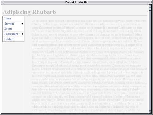
For this to work, you'll need to get the .htc file from the book's Web site or get a copy from its original author, Peter Nederlof. His demonstration of this technique, which uses the same .htc file that we'll be using here, can be found at http://www.xs4all.nl/~peterned/csshover.html. Before Peter's publication of csshover.htc, IE/Win could only support CSS-driven menu systems if the author added some JavaScript that added capabilities to IE/Win. In a sense, Peter did the same thing, except he put the additional capabilities into a Windows behavior file instead of a JavaScript file. This has one major advantage: Only IE/Win will try to download the behavior, which means that other browsers (which don't need it anyway) won't waste bandwidth getting the file. With the JavaScript solution, all browsers had to download the script. There is one disadvantage to using the behavior approach: The behavior declaration will prevent the style sheet from validating. If this is a major concern for you, you could move the behavior declaration into a separate style sheet and then @import it. This would allow the main style sheet to validate and would quarantine the nonvalid behavior declaration in a separate file. What you do will probably depend on how you regard validation. At the moment, the behavior file isn't changing anything about our page, mostly because we haven't gotten to the point where it would be useful. First we need to get our menus styled. The first step is to strip away all of the indentation and set the list widths to equal the width of the div. The result is shown in Figure 6.2. Figure 6.2. Having removed the indentation from the lists, they fit much better into the sidebar.
Margins and Padding
div#nav {float: left; width: 7em;

  background: #FDD;}

div#nav ul {margin: 0; padding: 0; width: 7em;}

</style>
For the moment, it's become much harder to tell where the submenus start and end. We'll fix that in a big way in the next phase of the project. Positioning the SubmenusThe next step is to place the submenus where we'll want them to appear when the system is fully working. A very common technique is to have a submenu appear to the right of the item that triggered its appearance, lined up along the top. We can very easily do this by positioning the lists with respect to the list items that contain them. To make this happen, we first need to make sure that every list item will act as a starting point for the position of its descendant submenu by establishing a containing block. That's as easy as relatively positioning the list items with no offsets.
div#nav ul {margin: 0; padding: 0; width: 7em;}

div#nav li {position: relative;}

</style>
By doing this, every list item sets up a containing block (think of it as a positioning context) for any descendant elements that are absolutely positioned. So, if we absolutely positioned the links inside the list items with right: 0;, each link would be positioned against the right edge of the list item that contained it. Instead of positioning links, of course, we're going to position unordered lists. For any list that's inside another list, we want to place it so that the top of the submenu is aligned with the top of the list item that contains it.
div#nav li {position: relative; list-style: none; margin: 0;}

div#nav ul ul {position: absolute; top: 0;}

</style>
This will place the top edge of each submenu along the top of its containing block. Now all we need to do is put the submenu just to the right of its containing list item. We'll pull a fast one to make this happen. Thanks to our div#nav ul rule, we know that the lists are all 7em wide. This means that the right edges of the list items are 7em to the right of their left edges. If we offset the positioned submenus by the same amount, they'll be placed exactly where we want them, as shown in Figure 6.3.
div#nav ul ul {position: absolute; top: 0; left: 7em;}
Figure 6.3. The submenu lists are positioned with respect to their containing list items.
There are four things to note in Figure 6.3:
div#nav li {position: relative; list-style: none; margin: 0;}
Thus, the bullets are removed, as we'll see in the next figure. Prettier Menu StylesNow that the submenus are placed where we want them, it's time to start fleshing out their appearance. Let's give them a white background and, for the moment, a one-pixel solid border whose color is taken from the color value of the ul elements.
div#nav ul {margin: 0; padding: 0; width: 7em;

  background: white; border: 1px solid;}
That will "box in" each unordered list, from the main level to the deepest submenu. Because some browsers (like Opera) apply margins to list items by default, we'll zero out their margins as well.
div#nav li {position: relative; list-style: none; margin: 0;}
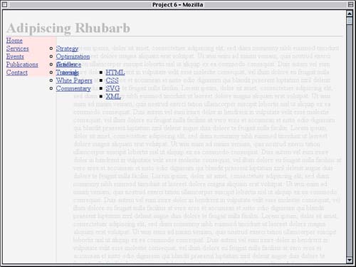
Class Naming Now, about those submenus. To make some later styling easier, we'll need to add some structural hooks to the markup. For each of the three list items that contains a submenu, we're adding a class attribute with a value of submenu, as shown here: <li class="submenu"><a href="/services/">Services</a> <li class="submenu"><a href="/pubs/">Publications</a> <li class="submenu"><a href="/pubs/tuts/">Tutorials</a> In effect, we're marking the submenu-containing list items with the label submenu. To make sure that we've classed the proper items, we'll add a highlighting rule, with the result shown in Figure 6.4.
div#nav li {position: relative; list-style: none; margin: 0;}

div#nav li.submenu {background: yellow;}

div#nav ul ul {position: absolute; top: 0; left: 7em;}
Figure 6.4. The submenus' appearance is improved, and list items that contain submenus are highlighted.
Now that the menus all have backgrounds, the overlap between the two first-level submenus is a little easier to understand. They still overlap, but the background of the second submenu obscures the first one entirely. As for the sub-submenu, we can now see that its left edge lines up quite nicely with the right edge of its parent list item. Blocking Out LinksIf you're following along with the project in your own file, you may have noticed something in the recent changes. The clickable area of the links in the menus aren't filling up the whole of each list item. This is because the links are inline elements. If we were to set a border on the links, for example, the border would wrap around just the text. For the menus to work correctly, and to act like users expect, we really need the links to fill up all of the list items. To do that, we'll change the kind of boxes the links create when they're laid out. Doubled Heights
div#nav li.submenu {background: yellow;}

div#nav li a {display: block;}

div#nav ul ul {position: absolute; top: 0; left: 7em;}
Now each link will generate a block-level box, much like a div or paragraph would. Note that we have not changed the nature of the links themselves. The a elements are still inline elements. All that's happened is that the CSS is getting them to generate block boxes. This is a subtle distinction but a good one to keep in mind. Now we not only can click anywhere within a menu entry and have it work (except in IE/Win, but we'll fix that in a moment), but we can style the links the same as we might a block-level element. To push the link text over to the right a bit, for example, we'd set a left padding for the links. We can also push the links apart a bit with some top and bottom padding.
div#nav li a {display: block; padding: 0.25em 0 0.25em 0.5em;}
We should also turn off the link underlining since users don't expect menu links to be underlined.
div#nav li a {display: block; padding: 0.25em 0 0.25em 0.5em;

  text-decoration: none;}
Now for IE/Win's problems. For whatever reason, block-box links like ours don't fill out the whole list item in IE/Win. This is a bug, but fortunately it's one we can work around. If we give the links an explicit width, we'll get the behavior we want. However, in other browsers, we just want them to set an automatic width, like they were doing before. To pull this off, we'll first set an explicit width for the links, and then we'll use a rule IE/Win doesn't understand to unset that width.
div#nav li a {display: block; padding: 0.25em 0 0.25em 0.5em;

  text-decoration: none; width: 6.5em;}

div#nav>ul a {width: auto;}

div#nav ul ul {position: absolute; top: 0; left: 7em;}
What's That Again? With a content width of 6.5em and a left padding of 0.5em, the link's element box will be 7em wide, just like its parent element. Now we can just add a light gray border to the bottom of each list item, visually separating them.
div#nav li {position: relative; list-style: none; margin: 0;

  border-bottom: 1px solid #CCC;}
We could have added the border to the bottom of the links, too. Given the way we've styled the menus, that would have worked as well as styling the list items does. The cumulative effect of these changes is shown in Figure 6.5. Figure 6.5. Padding the links spreads out the list items a bit, and the links fill out their list items.
Hovering EntriesIt's time to add a hover style to the menu entries so that when the user mouses over "Home," its background changes color. We can do this with the following rule:
div#nav li {position: relative; list-style: none; margin: 0;

  border-bottom: 1px solid #CCC;}

div#nav li:hover {background: #EBB;}

div#nav li.submenu {background: yellow;}
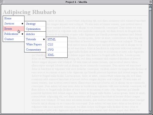
No, that isn't a mistake, so hold off on your errata reports. We are very intentionally applying a hover effect to the list items themselves and not the links. This is perfectly acceptable in CSS, which doesn't restrict hover effects to hyperlinks: Any element at all can be given hover styles. So, in this case, the background of any li element that's being hovered and that is descended from a div with an id of nav will change to #EBB. Why don't more authors do this kind of thing? Because IE/Win actually does restrict hover effects to hyperlinks and doesn't apply them to other kinds of elements. At least, that's how it acts by default. Remember the csshover.htc file we associated with the body element back at the outset? The sole purpose of that file is to add arbitrary-element hover capabilities to IE/Win. In other words, thanks to that behavior file, IE/Win will now allow hover styles on any element, the same as what we see in Figure 6.6. Figure 6.6. Adding hover effects to list items.
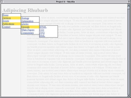
Again, the background is changing on the list item, not the link inside the list item. Those links all have transparent backgrounds so that we can see the list item backgrounds changing behind them. It's difficult to understate the importance of this capability. In addition to allowing for nested pop-up menus based on simple markup and CSS, it's possible to use this capability to change information on one part of a page by hovering over other parts梐nd a whole lot more. Being able to add arbitrary-element hovering to IE/Win seems more than worth the price of a small amount of nonvalid CSS. Special Submenu StylesTake a moment to catch your breath, and then we'll move on. The yellow highlighting of the submenu links served its purpose, but now it's starting to look distinctly icky. We still want a visual indication of which menu entries will open a new menu, so let's replace the yellow with a background image of a small arrow called submenu.gif.
div#nav li.submenu {background: url(submenu.gif) 95% 50% no-repeat;}
This will place a single instance of the image 95% of the way to the right of the submenu list items and vertically centered, as shown in Figure 6.7. Figure 6.7. Placing an arrow to show which entries will spawn submenus.
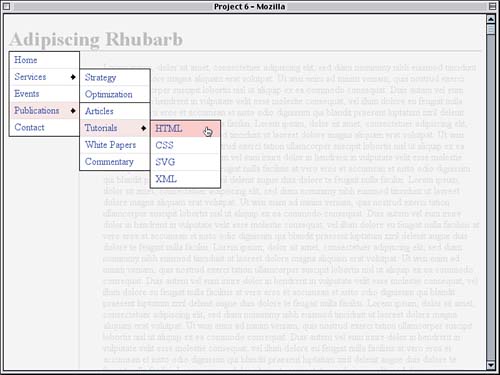
That's quite a bit nicer. However, it means now that the same exact hover effect will be applied to all list items: They'll all get the same background color whether or not a submenu is present. Let's lighten up the hover color for submenu entries. Again, instead of the links, we'll apply the hover styles directly to the list items. Explorer Weirdness
div#nav li.submenu {background: url(submenu.gif) 95% 50% no-repeat;}

div#nav li.submenu:hover {background-color: #EDD;}

div#nav li a {display: block; padding: 0.25em 0 0.25em 0.5em;

  text-decoration: none; width: 6.5em;}
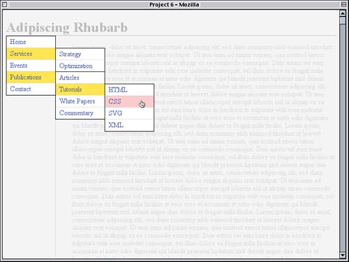
We could style the links themselves, of course, but if we did that for the submenu entries, the link's background would obscure the arrow graphic in the background of the list item. If that's what we wanted, it would be a great solution, but it isn't. By changing the background color of the list item, the color and image can exist together, as shown in Figure 6.8. Figure 6.8. Defining a different hover style for submenu entries.
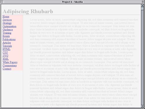
Preparing for Pop-UpsAt this point, we've really written all the styles we need for the presentation and placement of the menus, submenus, and individual entries. All that remains is to start the showing and hiding process. Before we add more CSS, let's look at a few changes that need to be made to the HTML itself. We're adding classes to the various lists so that we can actually control the appearance and disappearance of submenus via the style sheet. These changes are highlighted in Listing 6.3. Listing 6.3. Adding Level Information<div id="nav"> <ul class="level1"> <li><a href="/">Home</a></li> <li class="submenu"><a href="/services/">Services</a> <ul class="level2"> <li><a href="/services/strategy/">Strategy</a></li> <li><a href="/services/optimize/">Optimization</a></li> <li><a href="/services/guidance/">Guidance</a></li> <li><a href="/services/training/">Training</a></li> </ul> </li> <li><a href="/events/">Events</a></li> <li class="submenu"><a href="/pubs/">Publications</a> <ul class="level2"> <li><a href="/pubs/articles/">Articles</a></li> <li class="submenu"><a href="/pubs/tuts/">Tutorials</a> <ul class="level3"> <li><a href="/pubs/tuts/html/">HTML</a></li> <li><a href="/pubs/tuts/css/">CSS</a> <li><a href="/pubs/tuts/svg/">SVG</a> <li><a href="/pubs/tuts/xml/">XML</a> </ul> </li> <li><a href="/pubs/wpapers/">White Papers</a></li> <li><a href="/pubs/comment/">Commentary</a></li> </ul> </li> <li><a href="/contact/">Contact</a></li> </ul> </div> Here's why we need these changes: If we simply wrote in our CSS "Show any ul that's descended from a hovered submenu list item," then hovering over "Publications" would cause both the Publications submenu and the Tutorials submenu to appear at once. Instead, what we need to say is "Show any ul that's a child of a hovered submenu list item." The way to do that would be a child selector, which IE/Win doesn't understand. To work around this, we need to class the menus according to their nesting level. Because our submenus are already visible, we need to hide them. Since we're hiding any ul that's descended from a ul, we can modify an already-existing rule, with the result shown in Figure 6.9.
div#nav ul ul {position: absolute; top: 0; left: 7em;

  display: none;}
Figure 6.9. Hiding the submenus.
So, by default, all we can see is the top-level menu. That's good! It's exactly what we want. Now to control the appearance of submenus. We want a second-level menu to appear when its parent list item is hovered, and we make it reappear by changing its display to block.
div#nav ul ul {position: absolute; top: 0; left: 7em;

  display: none;}

div#nav ul.level1 li.submenu:hover ul.level2 {display:block;}

</style>
So now any level2 list that's descended from a hovered list item that is itself descended from a level1 list (which is in turn descended from a div with an id of nav) will change its display from none to block. That's fine for second-level menus, but how about third level? We only need to modify the selector.
div#nav ul.level1 li.submenu:hover ul.level2,

div#nav ul.level2 li.submenu:hover ul.level3 {display:block;}
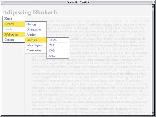
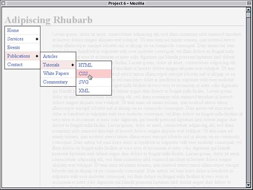
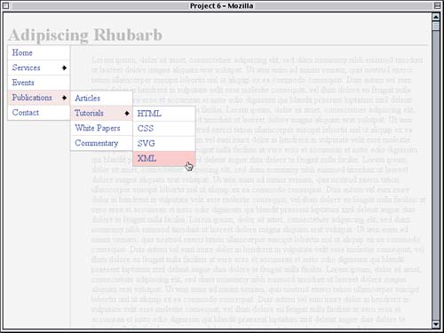
Now the rule will apply to third-level menus just as it does to second-level menus, with the result shown in Figure 6.10. Figure 6.10. Showing the submenus in response to user actions.
And that's really all it takes to create nested pop-up menus with CSS and a little bit of behavior scripting. Finishing TouchesWith our menu system working, let's add a couple of extra touches to the presentation. As we can see from the preceding figure, the menus stand out kind of starkly with their black borders, and the main-level menu's top and right borders double up with the borders on the main content and page title. We'll fix the first issue by pulling the menu up one pixel and to the left by the same amount, by way of negative margins.
div#nav {float: left; width: 7em; margin: -1px 0 0 -1px;

  background: #FDD;}
The list's borders can be toned down by making them match the border color already in use for the title. This is illustrated in Figure 6.11. Figure 6.11. Merging the menu's appearance more closely with the rest of the layout.
Negative Margin Clip
div#nav ul {margin: 0; padding: 0; width: 7em; background: white;

  border: 1px solid #AAA;}
Now everything fits together very neatly, and it's all thanks to the style sheet given in Listing 6.4 (plus the behavior file, which is not listed). Listing 6.4. The Menu Styles
body {background: #EEE; color: #000;

  behavior: url(csshover.htc);} /* WinIE behavior call */

h1 {color: #AAA; border-bottom: 1px solid; margin-bottom: 0;}

#main {color: #CCC; margin-left: 7em; padding: 1px 0 1px 5%;

  border-left: 1px solid;}

div#nav {float: left; width: 7em; margin: -1px 0 0 -1px;

  background: #FDD;}

div#nav ul {margin: 0; padding: 0; width: 7em; background: white;

  border: 1px solid #AAA;}

div#nav li {position: relative; list-style: none; margin: 0;

  border-bottom: 1px solid #CCC;}

div#nav li:hover {background: #EBB;}

div#nav li.submenu {background: url(submenu.gif) 95% 50% no-repeat;}

div#nav li.submenu:hover {background-color: #EDD;}

div#nav li a {display: block; padding: 0.25em 0 0.25em 0.5em;

  text-decoration: none; width: 6.5em;}

div#nav>ul a {width: auto;}

div#nav ul ul {position: absolute; top: 0; left: 7em;

  display: none;}

div#nav ul.level1 li.submenu:hover ul.level2,

div#nav ul.level2 li.submenu:hover ul.level3 {display:block;}
|
|
|
< Day Day Up > |
|