|
|
< Day Day Up > |
|
Styling the WeblogA good first step would be to define baselines for the background color, text color, and font family and sizing for the overall document. We're going to be aiming for a natural kind of feel, so we'll go with some green shades for the colors. The font will be, as is so often the case for personal sites, a smaller-than-default sans-serif font. <style type="text/css"> body {color: rgb(18%,19%,17%); background: rgb(85%,92%,81%); font: 0.85em Verdana, sans-serif;} </style> With that in place, we'll work our way down through the document source, styling pieces as we come to them. That puts the weblog's title at the head of the line. Tackling the TitleOur first stop is the title of the weblog, "Eric's Thoughts." Perhaps the simplest things to do are to make the font bigger and center the text. Ems or Percents?
body {color: rgb(18%,19%,17%); background: rgb(85%,92%,81%);

 font: 0.85em Verdana, sans-serif;}

#weblog h3 {font-size: 150%; text-align: center;}

</style>
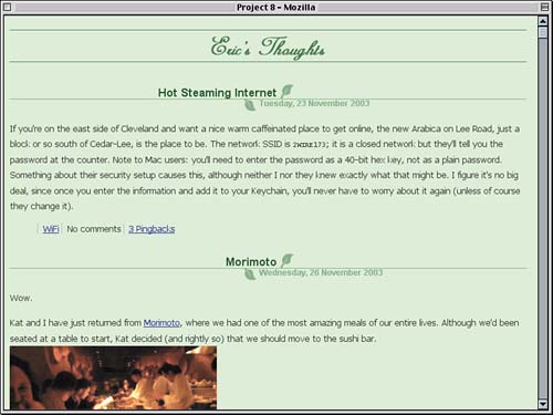
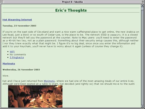
That, by itself, won't really set the title apart from the rest of the document, though. To give it more visual definition, we'll color the text, add top and bottom borders and also a bottom margin wider than usual. This will push the rest of the content downward a bit, as shown in Figure 8.2.
#weblog h3 {font-size: 150%; text-align: center;

  color: rgb(10%,30%,10%);

  border: 1px solid rgb(30%,50%,30%); border-width: 1px 0;

  margin-bottom: 1.5em;}
Figure 8.2. Some basic styles and title styles have been added.
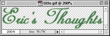
Okay, the title certainly stands out...but is it attractive? No, not really. It would look nicer with a script font, actually. CSS offers cursive as a generic font family type, but browsers tend not to support it very well. If the user has configured his or her browser to recognize a particular script font, you'll be all set. Most don't. So if we were to say font-family: cursive;, most users would just get a serif or sans-serif font. So, instead, we'll use an image in place of the text. This is what's known as an image-replacement technique. What we'll do is take an image (the one shown in Figure 8.3, in fact) and drop it into the background of the h3 while moving the text out of the way entirely. Figure 8.3. An image-based version of the weblog's title.
First we add the image to the h3's background, positioning it at the bottom center of the h3's background area and making sure it appears only once.
#weblog h3 {font-size: 150%; text-align: center;

  color: rgb(10%,30%,10%);

  border: 1px solid rgb(30%,50%,30%); border-width: 1px 0;

  margin-bottom: 1.5em;

  background: url(title.gif) 50% 100% no-repeat;}
Now we have the background image sitting underneath the foreground text, which can be a nice visual effect in some situations but not this one. We need to move the text entirely out of the way. Easier done than said: We'll just take the span element and throw it a long way offscreen. Although the color of the h3 won't be important any more, since the text won't be visible, we'll leave it in place anyway.
#weblog h3 {font-size: 150%; text-align: center;

  color: rgb(10%,30%,10%);

  border: 1px solid rgb(30%,50%,30%); border-width: 1px 0;

  margin-bottom: 1.5em;

  background: url(title.gif) 50% 100% no-repeat;}

#weblog h3 span {position: absolute; left: -50em; width: 50em;}

</style>
Now the span, and the text within it, has been placed so that the left edge of the span is 50em to the left of its containing block. In this case, the containing block is the root element, which means the span is about 50em to the left of the left edge of the browser window. We've also made the width of the span the same as the offset distance, just in case the h3 ever gets changed to have a whole bunch of content for some reason. That takes care of the text. Containing Root
There's a side effect we'll have to counteract, though. By absolutely positioning the span, we've removed it from the normal flow. That means the h3 has no normal-flow content and thus no height. If it has no height, the top and bottom borders will sit right next to each other, and we won't be able to see the background at all. To fix this, we need to force the h3 to have an explicit height, even though it has no content. We can do this easily enough with a height declaration. The background image is 38 pixels tall, so that plus a little more (to keep the top border a few pixels away from the background image) should be about right. Let's call it 45 pixels, which will give us the result shown in Figure 8.4.
#weblog h3 {font-size: 150%; text-align: center;

  color: rgb(10%,30%,10%);

  border: 1px solid rgb(30%,50%,30%); border-width: 1px 0;

  margin-bottom: 1.5em; height: 45px;

  background: url(title.gif) 50% 100% no-repeat;}
Figure 8.4. The title's appearance is improved with an image-replacement approach.
Effectively, we've visually replaced the text with a background image, which is where the term "image-replacement technique" arises. Obviously, the background image could be fancier than the one we're using, employing faded photos, blur lines, and anything else you can imagine. Note that there are a number of image-replacement techniques, many of which rely on removing the text by setting the span element to display: none; or visibility: hidden;. Others use a large negative text indentation or negative left margin. The positioning approach we've used here is another technique. Entry Title and DateNow that the title is all nice and pretty, it's time to work on the entries. At the top of each entry is an entry title and the date the entry was posted. To make the two consistent, let's give them some common styles: We'll strip away the margins and padding and set them both to use Arial as the preferred font (followed by Verdana and then by any available sans-serif font).
#weblog h3 span {position: absolute; left: -50em; width: 50em;}

#weblog h4.title, #weblog h5.date {margin: 0; padding: 0;

  font-family: Arial, Verdana, sans-serif; line-height: 1em;}

</style>
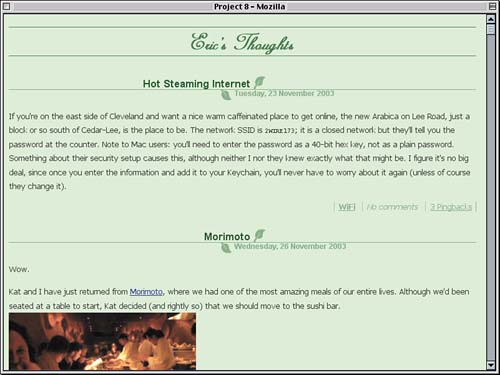
We can make the titles stand out in three ways. The most obvious is to bump up the font size a bit. Less obvious, but also important, is to give them a bit of top padding so that there's some blank space above the text. Finally, we'll run a border along the bottom. Padding Questions
#weblog h4.title, #weblog h5.date {margin: 0; padding: 0;

  font-family: Arial, Verdana, sans-serif; line-height: 1em;}

#weblog h4.title {font-size: 1.25em; padding: 5px 0 0;

  border-bottom: 1px solid rgb(50%,66%,50%);}

</style>
At the moment, all we really need to do to the date is reduce the font size a bit and set a color, as shown in Figure 8.5.
#weblog h4.title { font-size: 1.25em; padding: 5px 0 0;

  border-bottom: 1px solid rgb(50%,66%,50%);}

#weblog h5.date {font-size: 0.9em; color: rgb(50%,66%,50%);}

</style>
Figure 8.5. Entry titles and dates come closer together and change appearance.
Okay, it's progress, but so far it isn't very pretty progress. Don't worry梩hings will quickly get better. We're about to make the title and date look as if they're sitting next to a leafy stem. Splitting and RejoiningWhat these entries need is a really nice effect for the title and date. There are any number of things we could attempt, but what would be interesting is to have the title and date sort of meet in the middle, with a leaf image capping the end of each. For example, the title might sit just to the left of a leaf, while the date sits to the right. To pull this off, we'll need a couple of leaf images. How about the ones shown in Figure 8.6? Lovely. Figure 8.6. The leaf images we'll use to spruce up the entries.
Now for the CSS. Let's take the title first. If the upward-pointing leaf is going to sit to the right of the text, the text should also be right-aligned.
#weblog h4.title {font-size: 1.25em; text-align: right;

  padding: 5px 0 0;

  border-bottom: 1px solid rgb(50%,66%,50%);}
Now to add the leaf. We want it to the right, so we'll place it in the top-right corner of the title's background. Why the top right instead of the bottom right? Because this way, if the image is taller than the background, it will be "clipped" by the bottom border instead of disappearing along the top of the title.
#weblog h4.title {font-size: 1.25em; text-align: right;

  padding: 5px 0 0;

  background: url(leaf-up.gif) 100% 0 no-repeat;

  border-bottom: 1px solid rgb(50%,66%,50%);}
Having done this, however, the text of the title is more than likely to overlap the background image. We don't want that, so we'll add 25 pixels of right padding to the title. Also, to push the title's text near to the center of the layout, we'll add a large left margin. 45% is about right; we don't want to use 50% because we want both the title and the date to straddle the layout center. Our progress so far is shown in Figure 8.7.
#weblog h4.title {font-size: 1.25em; text-align: right;

  padding: 5px 25px 0 0; margin: 0 45% 0 0;

  background: url(leaf-up.gif) 100% 0 no-repeat;

  border-bottom: 1px solid rgb(50%,66%,50%);}
Figure 8.7. Adding an image and some margin to the entry titles.
Okay, the blue link text is starting to get annoying, and we really don't need the underline either. Let's fix both.
#weblog h4.title {text-align: right; font-size: 1.25em;

padding: 5px 25px 0 0; margin: 0 45% 0 0;

  background: url(leaf-up.gif) 100% 0 no-repeat;

  border-bottom: 1px solid rgb(50%,66%,50%);}

#weblog h4.title a {text-decoration: none;

  color: rgb(15%,30%,15%);}

#weblog h5.date {font-size: 0.9em; color: rgb(50%,66%,50%);}
Now for the dates. Effectively, what we need to do is invert the styles we applied to the titles. That would mean a 45% left margin, some left padding, left-aligned text, and a background image of a downward-pointing leaf placed into the lower-left corner of the element's background. Oh, and a top border as well. Let's do it all at once. Ready?
#weblog h5.date {font-size: 0.9em; text-align: left;

  padding: 0 0 5px 25px; margin: 0 0 0 45%;

  background: url(leaf-down.gif) 0 100% no-repeat;

  border-top: 1px solid; color: rgb(50%,66%,50%);}
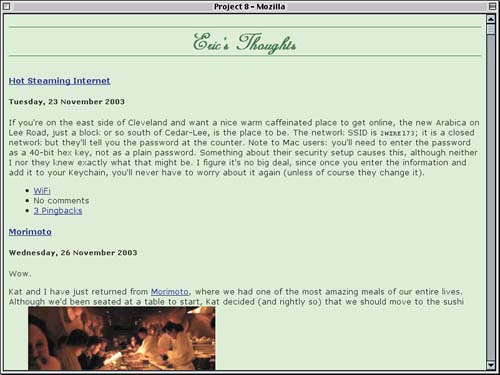
We're basically there except for one thing. The bottom border of the title and the top border of the date sort of stack on top of each other in the middle, which leads to a weird jag that doesn't look very nice. It would be better if the borders effectively merged into a single line. Rounding Errors How do we accomplish this? Simple: a one-pixel negative bottom margin on the title. This will pull the dates upward by a pixel and cause the borders to overlap each other. Visually, they'll create a single line, as shown in Figure 8.8.
#weblog h4.title {font-size: 1.25em; text-align: right;

  padding: 5px 25px 0 0; margin: 0 45% -1px 0;

  background: url(leaf-up.gif) 100% 0 no-repeat;

  border-bottom: 1px solid rgb(50%,66%,50%);}
Figure 8.8. The title and date borders come together thanks to a negative margin.
There's one thing we need to do before moving on. For some reason, IE/Win will mess up the margin calculations for the title and date if we leave things as they are. This may be related to the somewhat-infamous margin-doubling bug that IE/Win suffers, although the margins aren't really doubled. At any rate, this can be resolved by reducing the width of a containing element to less than 100%. Since the weblog div encloses all the entries, we'll just lower its width by one percent.
body {color: rgb(18%,19%,17%); background: rgb(85%,92%,81%);

 font: 0.85em Verdana, sans-serif;}

#weblog {width: 99%;}

#weblog h3 {font-size: 150%; text-align: center;

  color: rgb(10%,30%,10%);

  border: 1px solid rgb(30%,50%,30%); border-width: 1px 0;

  margin-bottom: 1.5em; height: 45px;

  background: url(title.gif) 50% 100% no-repeat;}
The solution is fairly inexplicable, but then so is the bug. Either way, this seems to solve the error in IE/Win, so we'll use it, shake our heads, and move on. Text and InformationThere really isn't a whole lot to do to the main text of the entries, but the entries themselves could stand to be spread out a bit. Because each entry is enclosed in a div, we can push them apart by adding some margins. Let's use bottom margins.
#weblog h3 span {position: absolute; left: -50em; width: 50em;}

#weblog .entry {margin: 0 0 2em;}

#weblog h4.title, #weblog h5.date {margin: 0; padding: 0;

  font-family: Arial, Verdana, sans-serif; line-height: 1em;}
Actually, there is something we could do for the entry text. If you examine the text in Figure 8.8 closely, it seems sort of spread out, as if the letters are too far apart. It would improve the appearance if we could tighten up that spacing. In typography, we'd set an autokerning feature or else mess with the kerning value ourselves. CSS isn't quite so advanced, but it will let you alter the distance between characters. Modifying Space
#weblog .entry {margin: 0 0 2em; letter-spacing: -1px;}
With that rule, we're also tightening up the text of the title and date, and it doesn't look so good. So we'll override the value using a rule we already have hanging around.
#weblog h4.title, #weblog h5.date {margin: 0; padding: 0;

  font-family: Arial, Verdana, sans-serif; line-height: 1em;

  letter-spacing: 0;}
One more thing: Let's spread the lines apart just a touch, but only for paragraphs of text. This will not touch other elements, like lists or preformatted text, but that's probably for the best anyway. We can see the results illustrated in Figure 8.9.
#weblog h5.date {font-size: 0.9em; text-align: left;

  padding: 0 0 5px 25px; margin: 0 0 0 45%;

  background: url(leaf-down.gif) 0 100% no-repeat;

  border-top: 1px solid; color: rgb(50%,66%,50%);}

#weblog p {line-height: 1.4;}

</style>
Figure 8.9. Tightening up letter spacing while spreading out line spacing.
Now for the information that comes at the end of each entry. We could use the Sliding Doors approach from Project 7, "Opening the Doors to Attractive Tabs," to makes these guys look really fancy, but that would actually be counterproductive. The information there should really fade into the background, so to speak, not call more attention to itself than the main entry text. So, even though we won't be trying something as complex as creating tabs, let's have the three pieces of information appear in a single line, each separated visually from the others. We can separate them using vertical bars, for example, or something similar. We'll start by lining up the three list items into a single line.
#weblog h5.date {font-size: 0.9em; text-align: left;

  padding: 0 0 5px 25px; margin: 0 0 0 45%;

  background: url(leaf-down.gif) 0 100% no-repeat;

  border-top: 1px solid; color: rgb(50%,66%,50%);}

#weblog .moreinfo li {display: inline;}

#weblog p {line-height: 1.4;}
Playing with Markers This will make the list items generate inline boxes, just like the links inside them do. That by itself should be enough to make the list items' markers (the bullets) disappear, but not every browser agrees, so let's make sure they go away.
#weblog .moreinfo li {display: inline; list-style: none;}
Now for some visual separation. In many cases, authors will use the vertical-bar character (|) to separate a line of links. We don't have any characters available, but we do have the edges of the list items' inline boxes. So if we add a left border to each list item, along with a little left padding, we'll get the result shown in Figure 8.10.
#weblog .moreinfo li {display: inline; list-style: none;

  border-left: 1px solid rgb(65%,75%,65%);

  padding-left: 0.5em;}
Figure 8.10. Stringing the list items into a single line of text.
Looking at this change closely, the borders are too close to adjacent text. For example, the space between "WiFi" and the border to its right (which is the left border on the "No comments" list item) is too narrow. So let's alter the last declaration to apply half an em of padding to both the left and right梑ut none to the top and bottom梠f the list item. Spacing
#weblog .moreinfo li {display: inline; list-style: none;

  border-left: 1px solid rgb(65%,75%,65%);

  padding: 0 0.5em;}
More important, at least for the moment, is the indentation of the list items. That's caused by the ul element that contains them, which still has a left margin (or, in Gecko-based browsers, left padding). Let's remove that completely.
#weblog h5.date {font-size: 0.9em; text-align: left;

  padding: 0 0 5px 25px; margin: 0 0 0 45%;

  background: url(leaf-down.gif) 0 100% no-repeat;

  border-top: 1px solid; color: rgb(50%,66%,50%);}

#weblog .moreinfo {margin: 0; padding: 0;}

#weblog .moreinfo li {display: inline; list-style: none;

  border-left: 1px solid rgb(65%,75%,65%);

  padding: 0 0.5em;}
Now the big question: Do we even want the links over to the left? It's certainly a defensible design decision, but let's shift them over to the right. That will let them stand apart from the main text and will set us up to "cap off" the set of links. Because the list items are now generating inline boxes, they are subject to values of text-align, just like any other inline text.
#weblog .moreinfo {margin: 0; padding: 0;

  text-align: right;}
Now to cap the links. Remember that we gave each list item a left border. Since they're all over to the right, we can use the right edge of the ul element to add a trailing separator, as it were. This is illustrated in Figure 8.11.
#weblog .moreinfo {margin: 0; padding: 0;

text-align: right;

  border-right: 1px solid rgb(50%,66%,50%);}
Figure 8.11. The links are shifted over to the right and "capped" with a border.
Okay, that's good, but the colors are bad. That blue really has to go. Changing it to a shade of green is easy enough.
#weblog .moreinfo li {display: inline; list-style: none;

  border-left: 1px solid rgb(65%,75%,65%);

  padding: 0 0.5em;}

#weblog .moreinfo a {color: rgb(50%,66%,50%);}

#weblog p {line-height: 1.4;}
Great, the blue is gone, but the "No comments" text, which isn't contained in a link, is still black. Fortunately, this is also easy to fix. All we have to do is add the color we want to either the list items or the ul element itself. Because color is inherited, the value we declare will be applied to the nonlink text. Because the links have an explicitly assigned color, they won't change. It's more or less a toss-up, but let's add the color to the ul element. Borders and Color
#weblog .moreinfo {margin: 0; padding: 0;

  text-align: right;

  border-right: 1px solid rgb(50%,66%,50%);

  color: rgb(50%,66%,50%);}
Let's use a similar technique to italicize any nonlink text but leave the links with a normal font style. We can add a declaration to italicize all text in the list like so:
#weblog .moreinfo {margin: 0; padding: 0;

  text-align: right; font-style: italic;

  border-right: 1px solid rgb(50%,66%,50%);

  color: rgb(50%,66%,50%);}
At the moment, links will be italicized along with nonlink text. To restore them to their normal appearance, we explicitly set font-style to be normal for the links. (Remember that the separators are borders, so they aren't affected by italicization.) No Comments Link
#weblog .moreinfo a {color: rgb(50%,66%,50%); font-style: normal;}
Before we move on, let's do one more thing: boldface the category ("WiFi") link. This is as simple as applying a font-weight declaration to the list item with the class name categories, as illustrated in Figure 8.12.
#weblog .moreinfo a {color: rgb(50%,66%,50%); font-style: normal;}

#weblog .moreinfo .categories {font-weight: bold;}

#weblog p {line-height: 1.4;}
Figure 8.12. Mixing italicized, boldfaced, and normal-style text.
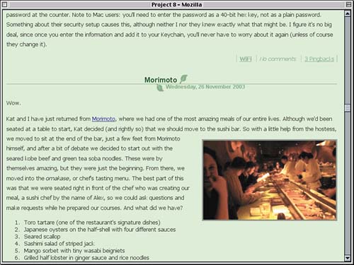
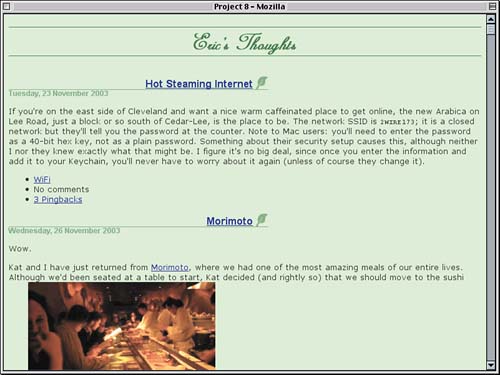
Finishing TouchesWe're almost done, but there is one major thing we need to fix. If you look at the picture in the second entry, it's just sitting in the middle of a paragraph of text, completely messing up the layout. That needs to be fixed. We could just float all images that appear in an entry, but there might be cases in which we don't want to float an image (say, for example, a small icon). We'll need to use another hook to float the picture, and fortunately we have one. Notice the class attribute just before the close bracket. <img src="morimoto.jpg" alt="A view of the sushi bar from our seats, with Morimoto and his sushi staff slicing away" title="Morimoto's Sushi Bar" class="pic border"> So the image has a class value containing two names: pic and border. These aren't technically separate class values, but they are separate names, and we can address them individually. For any pic image, we'll float it to the right and add some margins so that text doesn't flow too closely to the floated image. Multiclassing
#weblog p {line-height: 1.4em;}

#weblog .pic {float: right; margin: 1em 0 1em 2em;}

</style>
The class name border indicates a desire to have a border applied to the image. Let's be extra fancy and give the picture a gray double border and also a light green background. This will have the effect shown in Figure 8.13.
#weblog .pic {float: right; margin: 1em 0 1em 2em;}

#weblog .border {border: 3px double #666; background: #ABA;}

</style>
Figure 8.13. Floating and bordering the image.
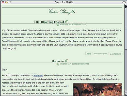
Yes, images can have backgrounds! Furthermore, since the background extends to the outer border edge of the element, the background is visible in the gap between the two lines in the double border. Subtle, yet slick. To close out this project, let's add something advanced. Most browsers won't recognize this, but they won't be missing anything if they don't. Let's look at the entry titles again, specifically at the links within them. These links are what are called "permalinks," or pointers to archived copies of the entry. This allows other people to link to the entry without fear that it will disappear in the future. A common way of denoting a permalink is with an octothorpe (#). It would be interesting if an octothorpe appeared when the user moved the mouse pointer over the permalink, wouldn't it? Let's have it appear before the link and also be a lighter color than the link text.
#weblog h4.title a {text-decoration: none;

  color: rgb(15%,30%,15%);}

#weblog h4.title a:hover:before {content: "# ";

  color: rgb(50%,61%,48%);}

#weblog h5.date {font-size: 0.9em; text-align: left;

  padding: 0 0 5px 25px; margin: 0 0 0 45%;

  background: url(leaf-down.gif) 0 100% no-repeat;

  border-top: 1px solid; color: rgb(50%,66%,50%);}
What this will do is actually insert the string we declared (an octothorpe followed by a blank space) as content at the beginning of the link. Content added in this manner is called generated content. The generated content is set to the declared shade of green without changing the color of the overall link. As of this writing, you're only going to see the effect in recent versions of Mozilla (1.5+) and Opera (7+). Safari 1.1+ should show it, but we'll need a slight hack to make it work. If we add a border to the link itself, suddenly the generated content will appear. A Better Safari
#weblog h4.title a {text-decoration: none;

  color: rgb(15%,30%,15%);}

#weblog h4.title a:hover {border-top: 1px dotted rgb(50%,61%,48%);}

#weblog h4.title a:hover:before {content: "# ";

  color: rgb(50%,61%,48%);}
It's not clear why adding a border to the link gets Safari doing what it should, but it does. As a bonus, the border will appear in most browsers, including Internet Explorer, which won't show the generated content. So, in advanced browsers, you'll see the result shown in Figure 8.14, and it's all thanks to the style sheet given in Listing 8.2. Listing 8.2. The Complete Style Sheet
body {color: rgb(18%,19%,17%); background: rgb(85%,92%,81%);

 font: 0.85em Verdana, sans-serif;}

#weblog {width: 99%;}

#weblog h3 {font-size: 150%; text-align: center;

  color: rgb(10%,30%,10%);

  border: 1px solid rgb(30%,50%,30%); border-width: 1px 0;

  margin-bottom: 1.5em; height:45px;

  background: url(title.gif) 50% 100% no-repeat;}

#weblog h3 span {position: absolute; left: -50em; width: 50em;}

#weblog .entry {margin: 0 0 2em; letter-spacing: -1px;}

#weblog h4.title, #weblog h5.date {margin: 0; padding: 0;

  font-family: Arial, Verdana, sans-serif; line-height: 1em;

  letter-spacing: 0;}

#weblog h4.title {font-size: 1.25em; text-align: right;

  padding: 5px 25px 0 0; margin: 0 45% -1px 0;

  background: url(leaf-up.gif) 100% 0 no-repeat;

  border-bottom: 1px solid rgb(50%,66%,50%);}

#weblog h4.title a {text-decoration: none;

  color: rgb(15%,30%,15%);}

#weblog h4.title a:hover {border-top: 1px dotted rgb(50%,61%,48%);}

#weblog h4.title a:hover:before {content: "# ";

  color: rgb(50%,61%,48%);}

#weblog h5.date {font-size: 0.9em; text-align: left;

  padding: 0 0 5px 25px; margin: 0 0 0 45%;

  background: url(leaf-down.gif) 0 100% no-repeat;

  border-top: 1px solid; color: rgb(50%,66%,50%);}

#weblog .moreinfo {margin: 0; padding: 0;

  text-align: right; font-style: italic;

  border-right: 1px solid rgb(50%,66%,50%);

  color: rgb(50%,66%,50%);}

#weblog .moreinfo li {display: inline; list-style: none;

  border-left: 1px solid rgb(65%,75%,65%);

  padding: 0 0.5em;}

#weblog .moreinfo a {color: rgb(50%,66%,50%); font-style: normal;}

#weblog .moreinfo .categories {font-weight: bold;}

#weblog p {line-height: 1.4;}

#weblog .pic {float: right; margin: 1em 0 1em 2em;}

#weblog .border {border: 3px double #666; background: #ABA;}
Figure 8.14. Applying some dynamic styles to the title links.
|
|
|
< Day Day Up > |
|


