|
|
< Day Day Up > |
|
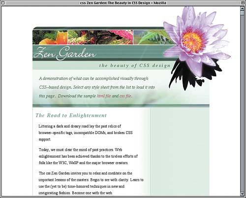
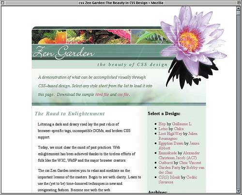
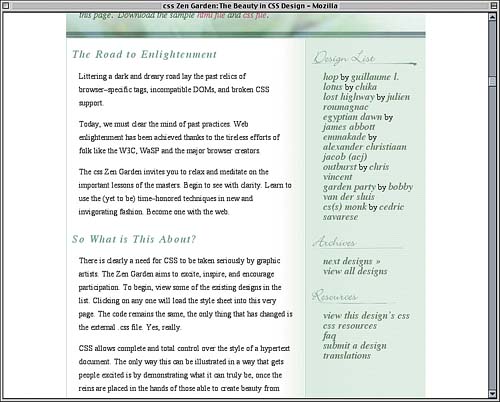
Creating the DesignTo start out, we'll set some "global" styles: rules that will apply throughout the document. This includes stripping off the page margins (or padding), setting basic background and foreground colors, and removing the borders and underlines from acronym and link elements, respectively. <style type="text/css" title="currentStyle"> body {margin: 0; padding: 0; text-align: center; color: #000; background: #FFF;} acronym {border: none;} a {text-decoration: none;} </style> As you can see, we also centered all the text in the document. That was done because we want the design to be centered, and the best way to center elements in IE5.5/Win is to declare text-align: center;. The CSS specification is clear that text-align shouldn't center elements, but it does anyway in IE5.5/Win. We'll compensate for this very soon, but first let's define some link styles. We'll make unvisited links a pinkish red color, visited links a dull red, and any hovered link will get an underline, as shown in Figure 10.2.
a {text-decoration: none;}

a:link {color: rgb(179,63,96);}

a:visited {color: rgb(90,32,48);}

a:hover {text-decoration: underline;}

</style>
Figure 10.2. The first styles are applied.
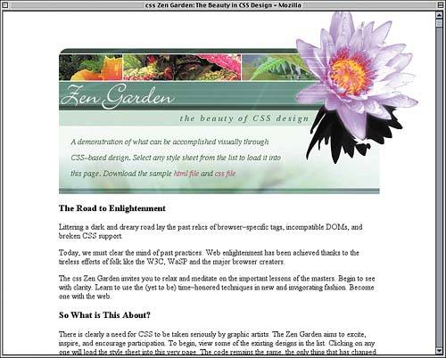
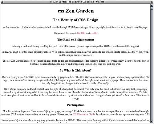
Remember, the text centering is a temporary effect, undertaken solely to work around the bug in IE5.5/Win. In the next section, in fact, we're going to override it and get the text back on the left where it belongs. Planting the SeedsIf you refer back to Listing 10.1, you'll find that the entire page content is enclosed in a div with an id of container. Therefore, our first step in actually styling the content is to set some basic parameters for this container. Let's refer back to Figure 10.1. The width of the main column (not counting the large flower in the upper-right corner) is 647 pixels. We don't know why that's the width梚t just is. So we'll make the container that wide. At the same time, we'll strip off any padding and set a specific top margin as well as auto side margins. Fixed Versus Liquid Design
a:hover {text-decoration: underline;}

#container {width: 647px; margin: 75px auto 0; padding: 0;}

</style>
The 75-pixel top margin is just a working figure, something we can change later if necessary. The idea is to create enough space above the masthead for the big flower to fit. As for the auto margins, they will center the container, but only because it has an explicit width. In CSS, a block-level element that is given an explicit width and auto right and left margins is centered inside its containing block. IE5.5/Win doesn't do that, but it does center elements if their parent is set to text-align: center;. Thus, we centered text in the body element in order to center the container in IE5.5/Win, and we set the auto margins to center the container in more recent browsers. Because text-align is an inherited property, text within the container will still be centered. So let's override that centering within the container by giving it a different text-align value.
#container {width: 647px; margin: 75px auto 0; padding: 0;

  text-align: left;}
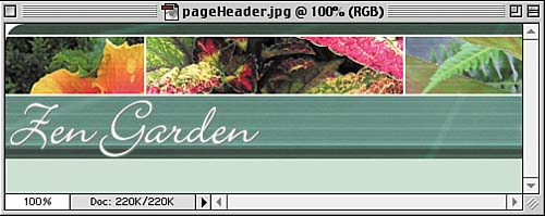
This will restore text to be left-aligned within the container without breaking the centering in IE5.5/Win. The Page HeaderOnce we get inside the container, the first thing we find is the page header, whose markup is given in Listing 10.2. Listing 10.2. The Page Header Markup<div id="pageHeader"> <h1><span>css Zen Garden</span></h1> <h2><span>The Beauty of <acronym title="Cascading Style Sheets">CSS</acronym> Design</span></h2> </div> As it happens, that's far more than we need to re-create the page header design. Figure 10.3 shows one of the two images we'll be using in the page header. Its dimensions are 477 pixels wide by 157 pixels tall. Figure 10.3. The page header image we'll be using.
All we need to do is add this image to the background of the pageHeader and make sure that the div will be tall enough to show the whole image. We'll also want the image to appear just once, so we'll make sure it doesn't repeat. Case-Sensitive
#container {width: 647px; margin: 75px auto 0; padding: 0;

  text-align: left;}

#pageHeader {background: url(pageHeader.jpg) 0 0 no-repeat;

  height: 157px; width: auto;}

</style>
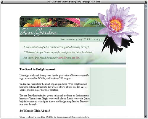
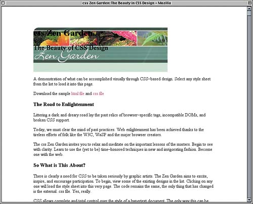
Although we made the height exactly as tall as the image itself, we've left the width to be automatically calculated. This means it will be as wide as possible while still fitting inside its parent element, which is the container. So we know that the pageHeader will be 647 pixels wide, the same as the container. That's why, in Figure 10.4, the image isn't as wide as the text that follows. Figure 10.4. The image added to the background of the page header.
This is not a problem at all because we need space to drop in our big decorative flower. You may also note that the text of the h1 and h2 elements is still visible over the background. That, too, is to be expected. Not to worry, we're about to use them both to good effect. Before we more on, we need to back up a step and do something we overlooked. Because we can only use CSS to create this layout, we'll need to position various elements. To have them all positioned with respect to the container, it needs to be relatively positioned with no offset.
#container {width: 647px; margin: 75px auto 0; padding: 0;

  text-align: left; position: relative;}
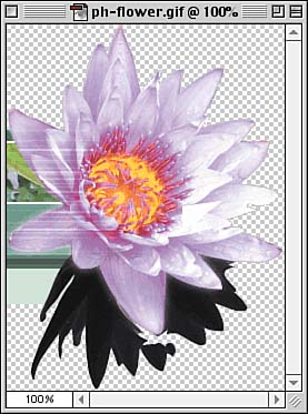
This establishes a containing block for any relatively positioned elements inside the container without actually moving the container from its position in the document's normal flow. Adding a Floral TouchNow we're ready to place the flower image shown in Figure 10.5. Its dimensions are 250 pixels wide by 333 pixels tall, and it has transparent areas (represented in Figure 10.5 by the gray-and-white checkerboard pattern) through which other backgrounds or even content will be visible. Figure 10.5. The image that will decorate the right side of the page header.
GIF Versus PNG
So now we just have to figure out how to get it in place. We can't use the pageHeader background because it already has an image. Instead, we'll use the h1 itself, sizing its content to be the exact size of the background image.
#pageHeader {background: url(pageHeader.jpg) 0 0 no-repeat;

  height: 157px; width: auto;}

#pageHeader h1 {background: url(ph-flower.gif) 0 0 no-repeat;

  height: 330px; width: 250px;}

</style>
Great! Except that makes it taller than its parent (div#pageHeader), and it's on the left, nowhere near where it needs to be. So we'll absolutely position the h1 to sit in the top right of its containing block.
#pageHeader h1 {background: url(ph-flower.gif) 0 0 no-repeat;

  height: 330px; width: 250px; position: absolute; z-index: 101;

  top: 0; right: 0; margin: 0;}
The Big Z This places the h1 in the top-right corner of the container, which we turned into a containing block at the end of the last section. As an added bonus, absolutely positioning it takes it completely out of the normal flow, so its height no longer affects the height of the pageHeader div. There's just one problem: Putting it in the top-right corner of the container isn't enough. It's nowhere close to lining up with the rest of the masthead. By referring to the original design, we discover that the top of the flower is 95 pixels above the top of the masthead, and its right edge is 80 pixels to the right of the right edge of the main content column. So we pull it up and over by those distances.
#pageHeader h1 {background: url(ph-flower.gif) 0 0 no-repeat;

  height: 330px; width: 250px; position: absolute; z-index: 101;

  top: -95px; right: -80px; margin: 0;}
Now it lines up perfectly. All we need to do is suppress display of the text within the h1, and we'll have the result shown in Figure 10.6.
#pageHeader h1 {background: url(ph-flower.gif) 0 0 no-repeat;

  height: 330px; width: 250px; position: absolute; z-index: 101;

  top: -95px; right: -80px; margin: 0;}

#pageHeader h1 span {visibility: hidden;}

</style>
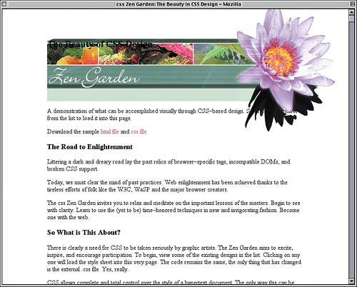
Figure 10.6. The flower is placed where we want it by way of the h1.
Although the original design didn't have the top of the flower being cut off by the top of the browser window, it's a nice effect so we'll keep it. If we change our minds later, all we have to do is change the top margin of the container to 100px or thereabouts. Now for the h2, which is currently appearing as plain black text in the upper-left corner of the masthead. We want to place it in that light green stripe, so the obvious solution is to position it. Some quick measurements reveal that its top edge should be 134 pixels below the top of the masthead and its right edge 140 pixels to the left. Thus:
#pageHeader h1 span {visibility: hidden;}

#pageHeader h2 {position: absolute; z-index: 102;

  top: 134px; right: 140px; margin: 0; padding: 0;}

</style>
Of course, the text looks nothing like that in the design shown in Figure 10.1, so we'll start by making the serif text slightly larger than normal, bold, and italicized. We'll also right-align it.
#pageHeader h2 {position: absolute; z-index: 102;

  top: 134px; right: 140px; margin: 0; padding: 0;

  font: bold italic 1.1em/1em Times, serif; text-align: right;}
Clipped Fonts To get the color needed, we'll sample the pixels in the original design. While there, notice that everything but the acronym "CSS" is lowercase, and the letters are spread out a bit more than usual.
#pageHeader h2 {position: absolute; z-index: 102;

  top: 134px; right: 140px; margin: 0; padding: 0;

  color: rgb(91,131,104);

  text-transform: lowercase; letter-spacing: 0.2em;

  font: bold italic 1.1em/1em Times, serif; text-align: right;}
Of course, this will also lowercase "CSS," so we'll have to make sure it's uppercased. We can do this by overriding the text-transform value that the acronym element inherits, just as we overrode the inherited text-align on the container. The result is illustrated in Figure 10.7.
#pageHeader h2 {position: absolute; z-index: 102;

  top: 134px; right: 140px; margin: 0; padding: 0;

  color: rgb(91,131,104);

  text-transform: lowercase; letter-spacing: 0.2em;

  font: bold italic 1.1em/1em Times, serif; text-align: right;}

#pageHeader h2 acronym {text-transform: uppercase;}

</style>
Figure 10.7. The beauty of CSS design is demonstrated.
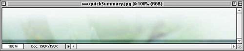
Styling the SummaryAs you probably guessed, this is another area of the design that needs a background image. We can see this image in Figure 10.8; its dimensions are 647 pixels wide by 100 pixels tall. Figure 10.8. The background image for the quick summary area.
As we did with the page header, we're going to drop this into the background of the quick summary area, but we are not going to set an explicit height. Let's drop in the font styles and the background all at once.
#pageHeader h2 acronym {text-transform: uppercase;}

#quickSummary {font: italic 1em/2 Times, "Times New Roman", serif;

  background: url(quickSummary.jpg) 0 100% no-repeat;}

</style>
In addition to double-spacing the text (with the line-height value of 2), we've placed the background image in the bottom-left corner of the element's background. To cover whatever portion of the background the image doesn't cover, we'll add the same color as that along the top edge of the image. While we're at it, let's change the text color to be a dark green.
#quickSummary {font: italic 1em/2 Times, "Times New Roman", serif;

  background: rgb(94%,98%,96%) url(quickSummary.jpg) 0 100% no-repeat;

  color: rgb(42,92,42);}
It's time to add the margins and padding. What margins? Well, refer to Figure 10.1 and notice the thin white lines along the top and bottom of the quick summary area. We're going to re-create those by giving the quick summary area a one-pixel top and bottom margin. This will let the page's white background "show through" and will separate the quick summary from the masthead before it and the main content that follows it. Backgrounds and Borders
#quickSummary {font: italic 1em/2 Times, "Times New Roman", serif;

  background: rgb(94%,98%,96%) url(quickSummary.jpg) 0 100% no-repeat;

  color: rgb(42,92,42);

  margin: 1px 0;}
As for the padding, that's an interesting mix. To keep the text within the quick summary away from the edges of its element box, we'll add top, bottom, and left padding in the one- to one-and-a-half-em range. On the right side, though, we need to provide enough padding so that the text and flower don't overlap. Since the flower is an image and thus has a width based in pixels, the quick summary area's padding on that side will be measured in pixels.
#quickSummary {font: italic 1em/2 Times, "Times New Roman", serif;

  background: rgb(94%,98%,96%) url(quickSummary.jpg) 0 100% no-repeat;

  color: rgb(42,92,42);

  margin: 1px 0; padding: 1em 180px 1.5em 1.5em;}
"Wait a minute," you might be thinking. "The paragraph margins would have kept the text away from the edges of the quick summary area." In the first place, that's not true because the paragraph margins would have stuck out of the quick summary, visually pushing it away from the masthead and main content. Second, the paragraphs aren't going to have margins that affect layout. Notice in the original design that the quick summary appears to be a single paragraph of text, even though it contains two p elements. To reproduce this effect, we'll have those paragraphs generate inline boxes, with the result shown in Figure 10.9.
#quickSummary {font: italic 1em/2 Times, "Times New Roman", serif;

  background: rgb(94%,98%,96%) url(quickSummary.jpg) 0 100% no-repeat;

  color: rgb(42,92,42);

  margin: 1px 0; padding: 1em 180px 1.5em 1.5em;}

#quickSummary p {display: inline;}

</style>
Figure 10.9. The quick summary area in its fully styled glory.
Those of you using IE/Win might notice that the two paragraphs are now jammed close together, as if there were no space between them. Of course, there is space, but never mind that now; let's push them apart a bit by adding a left margin to the second paragraph. We can do that because it has a class of p2.
#quickSummary p {display: inline;}

#quickSummary p.p2 {margin-left: 0.25em;}

</style>
This will add a quarter-em margin to the left side of the first line in the element; in other words, at the very beginning of the second paragraph. This will mean a little more separation than normal in non-IE browsers, but not so much that it will look bad. We're already writing styles specific to the second paragraph, so let's tack a period onto the end of the sentence. We aren't allowed to change the HTML, but we can insert some generated content.
#quickSummary p.p2 {margin-left: 0.25em;}

#quickSummary p.p2:after {content: ".";}

</style>
No, Explorer won't render the generated content, but that's okay. It's a minor effect, and IE users won't be missing anything if they don't see it. Main Content StylingWith the top of the design complete, let's turn our attention to the main content of the document. This is where it really gets interesting because, to reproduce the visual design we've been given, we'll have to get creative. A comparison of the partial document structure in Listing 10.3 with the design shown in Figure 10.1 illustrates why. Listing 10.3. A Partial Document Skeleton
<div id="intro">

    [...page header and quick summary...]

    <div id="preamble">

      <h3><span>The Road to Enlightenment</span></h3>

      [...content...]

    </div>

  </div>

  <div id="supportingText">

    <div id="explanation">

      <h3><span>So What is This About?</span></h3>

      [...content...]

    </div>

    <div id="participation">

      <h3><span>Participation</span></h3>

      [...content...]

    </div>

    <div id="benefits">

      <h3><span>Benefits</span></h3>

      [...content...]

    </div>

    <div id="requirements">

      <h3><span>Requirements</span></h3>

      [...content...]

    </div>

    <div id="footer">

      [...content...]

    </div>

  </div>
Seeing Double?
For example, there's a thin green border down the left side of the main content, stretching from the quick summary to the footer. (Refer to Figure 10.1 if you don't remember it.) Ordinarily, we might just add a left border to a div that contains all that text. This document, though, has only one div that qualifies梩he one with an id of supportingText. The footer is also inside that div, so any border we add to its side will stretch down to the bottom of the footer. Furthermore, the preamble (the first paragraph in the main content column) is outside of supportingText, so the border wouldn't appear next to it. Both are unacceptable. As another example, the list of links that goes in the right-hand sidebar has a background that stretches the entire height of the content. Because the links come after the footer, we're going to have to position them into place. Positioned elements, though, are only as tall as their content. If we want that sidebar to visually stretch from quick summary to footer, we'll have to do it in some other way than just adding a background to the link list. Let's address this last problem first. We know that we're going to position the link list, so we need to get the main column content out of its way. We could do so with a right margin, but instead we're going to apply consistent right padding to the preamble and supporting text. The exact amount of padding was determined by measuring the width of the sidebar background and the border that divides it from the content column.
#quickSummary p.p2:after {content: ".";}

#preamble, #supportingText {padding-right: 217px;}

</style>
The padding leaves us room to start on the sidebar's background, and at the same time introduce the gradient fade along the right edge of the content, as shown in Figure 10.10.
#preamble, #supportingText {padding-right: 217px;}

#preamble {background: url(side.jpg) 100% 100% repeat-y;}

</style>
Figure 10.10. Adding the first part of the sidebar and main content background.
What you see in Figure 10.10 is a background image 302 pixels wide by 4 pixels tall that starts in the lower-right corner of the preamble and then repeats vertically梪p as well as down, although we don't see any downward repetition because the image started at the bottom of the element. This image contains not only the sidebar's background pattern but also the vertical line that runs between the sidebar and main content, and also the right-to-left gradient that appears now behind the main content. It's all one image repeated vertically. Because the right padding of the preamble is equal to the sidebar-plus-separator portion of the background image, the content can be placed over the gradient portion of the background. Now, to make the pattern continue, we need only add the same image to the background of the supporting text div, starting it in the upper-right corner and repeating it vertically.
#preamble {background: url(side.jpg) 100% 100% repeat-y;}

#supportingText {background: url(side.jpg) 100% 0 repeat-y;}

</style>
Remember that border along the left side of the design? Now's the time to add it. As was discussed, we can't use div#supportingText since it doesn't contain the preamble and does contain the footer. On the other hand, we can add a border to each of the preamble, explanation, participation criteria, benefits, and requirements divs. Good thing they all have ids we can use! The result of adding borders to each of these divs is shown in Figure 10.11.
#supportingText {background: url(side.jpg) 100% 0 repeat-y;}

#preamble, #explanation, #participation, #benefits, #requirements {

  border-left: 1px solid rgb(184,214,194);}

</style>
Figure 10.11. Borders are added to various divs.
Wait a minute! The border is broken up into pieces, and there's a big gap in the sidebar. How did that happen? It happened because the margins of the h3 and p elements collapsed with梚n this case, through梩he margins on the divs. That's part of how margin collapsing works. It allows the margins of an element to stick out of the element box of its parent element. Understanding Collapsing Fortunately, there's a way around this. If the divs have any top and bottom padding, they will expand to contain their descendant elements and all of their margins. So we'll just add one pixel of top and bottom padding to each of those divs.
#preamble, #explanation, #participation, #benefits, #requirements {

  border-left: 1px solid rgb(184,214,194);

  padding-top: 1px; padding-bottom: 1px;}
Creeping Text Bug
This will bring the borders together, as we'll see in the next figure. Before we do, though, let's start styling the actual content of these divs. We don't want the paragraphs running up against the edges of the column, for example, so some padding is in order for them as well. We also should define the separation between paragraphs via margins, crank down the text size just a bit, and spread the lines of text apart with an increased line-height.
#preamble, #supportingText {padding-right: 217px;}

#preamble p, #supportingText p {font-size: 90%; line-height: 1.66em;

   margin: 0 1.5em; padding: 0.5em 0;}

#preamble {background: url(side.jpg) 100% 100% repeat-y;}
In a similar manner, we can give appropriate margins, color, and text styling to the h3 elements in these divs.
#preamble p, #supportingText p {font-size: 90%; line-height: 1.66em;

   margin: 0 1.5em; padding: 0.5em 0;}

#preamble h3, #supportingText h3 {letter-spacing: 0.1em;

  font: italic 1.2em Times, "Times New Roman", serif;

  color: rgb(107,153,139); margin: 1em 0 0.5em 0.5em;}

#preamble {background: url(side.jpg) 100% 100% repeat-y;}
There's one more touch to be added to the top of the main content. If you look closely at the original design, there's a green border running across the top of the main content and sidebar, the same color as the left borders we've added. We can drop that into place by adding a top border to the preamble梤emember that it actually does stretch from one side of the container to the other, as we can see in Figure 10.12.
#preamble {border-top: 1px solid rgb(184,214,194);

  background: url(side.jpg) 100% 100% repeat-y;}
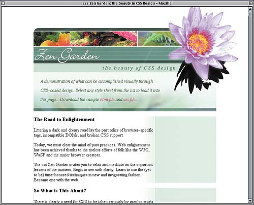
Figure 10.12. The borders come together, and the main column content becomes more stylish.
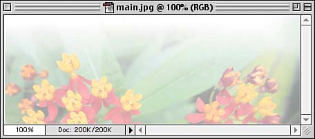
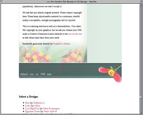
At this point, the main content is basically styled as desired except for one thing, and that's the flowery background at the bottom of the column. Fancy Footer WorkIn the original visual design file, there was a faded background at the bottom of the main content column, so we need to have one in our styles. The trick is to pick the right element, and in this case it's the div with an id of requirements. It can't be the supportingText div because that already has a background and goes past the footer anyway. So we'll have to use the requirements div. The image we'll use is shown in Figure 10.13; its dimensions are 429 pixels wide by 159 pixels tall. Figure 10.13. The image to be placed at the bottom of the main content column.
Notice the right-to-left gradient in the top-right corner of the image. If we get our styles right, this will line up with the gradient already in place, providing a seamless transition between the two. Also notice the white stripe around the sides and bottom of the image. This will provide visual separation between the background and the borders that surround it. The obvious first step is to place the image in the background; a related step will be to add a bottom border to the element.
#preamble, #explanation, #participation, #benefits, #requirements {

  border-left: 1px solid rgb(184,214,194);

  padding-top: 1px; padding-bottom: 1px;}

#requirements {border-bottom: 1px solid rgb(184,214,194);

  background: url(main.jpg) 100% 100% no-repeat;}

</style>
Why place the image in the bottom-right corner? To avoid a subtle problem in IE5/Mac, which calculates background placement with respect to the outer border edge of the element instead of the outer padding edge (otherwise known as the inner border edge). If we put it in the bottom-left corner, the white stripe along the left side of the background image would slide underneath the left border. However, since the right side of the element has no border, the border edge and padding edge are in the same place, and the layout is more consistent. A Slight Difference A quick check of the design reveals that the text intrudes a little too far into the background we just added, making the last few lines difficult to read. Correcting this is simple: We'll just add a bottom padding to the div, with the result shown in Figure 10.14.
#requirements {border-bottom: 1px solid rgb(184,214,194);

  background: url(main.jpg) 100% 100% no-repeat;

  padding-bottom: 100px;}
Figure 10.14. The main content column is finished off with a background.
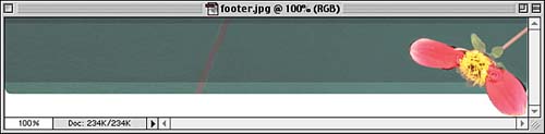
Now we can turn our attention to the actual footer梩hat is to say, the div with an id of footer. It doesn't have a lot of content: five hyperlinks. That's all. We have to somehow get it to look like the footer in the design with a div and five links. The first challenge is getting it to be the right width at all. If you'll recall, the footer is contained inside the supporting text div, and that div has a right padding of 217px. As we can see in Figure 10.15, the image we have to place in the background of the footer is wider than that. It is, in fact, 647 pixels wide by 123 pixels tall. Figure 10.15. The image to be placed behind the content of the footer.
Thanks to the padding, the content area of the supporting text div is just 430 pixels wide (647?17). So we have a 647-pixel-wide footer and only 430 pixels of width to work with. We'll just have to bust out of that content area and set the footer's height at the same time.
#requirements {border-bottom: 1px solid rgb(184,214,194);

  background: url(main.jpg) 100% 100% no-repeat;

  padding-bottom: 100px;}

#footer {margin: 0 -217px 0 0; height: 123px;}

</style>
By giving the footer a negative right margin that exactly equals the right padding of its parent element, we've basically counteracted the padding, visually speaking. The content area of the footer itself is now 647 pixels wide, leaving us exactly the amount of room we need to display the image. So let's add it!
#footer {margin: 0 -217px 0 0; height: 123px;

  background: #FFF url(footer.jpg) 100% 1px no-repeat;}
Why did we put it on the right again? Not due to IE5/Mac, as it happens. Instead, we're doing this to avoid a bug in IE6/Win. The bug is an odd one in that it seems to add a few-pixel negative margin to the left side of the footer. There's no reason on earth why it should do this, but it does. The effect is that the footer's background is pulled to the left and is also cut off. This throws off the alignment of the design and looks pretty dumb to boot. By putting the footer background over to the right, we can sidestep the bug. It doesn't matter how much negative margin IE/Win incorrectly applies if the background image never goes over there. Now we just need to use the footer's padding to get the links into place. A little experimentation shows that we need about 60 pixels of top padding to push the text down where we want it. We'll add in a one-em right padding for the heck of it and a half-em left padding to keep the first link from getting too close to the left edge of the footer.
#footer {margin: 0 -217px 0 0; height: 123px;

  background: #FFF url(footer.jpg) 100% 1px no-repeat;

  padding: 60px 1em 0 0.5em;}
Now all we have to do is style the actual links to match (as closely as possible) their appearance in the visual design. The primary points of interest are their color and size, although setting a line-height and font-weight will help them be as close as possible to what was designed, as we can see in Figure 10.16.
#footer {margin: 0 -217px 0 0; height: 123px;

  background: #FFF url(footer.jpg) 100% 1px no-repeat;

  padding: 60px 1em 0 0.5em;}

#footer a {color: rgb(207,216,214); line-height: 1em;

  font-size: 1.25em; font-weight: 100;}

</style>
Figure 10.16. The fully styled footer.
So that finishes the main column! All we have to do now is place and style the sidebar, and we'll be all done. Sidebar StyleThis is actually one of the easiest parts of the project because all we have to do is put the list of links where we want it and style its contents. Thanks to the work we've already put in, we don't have to worry about the background or any of that other stuff. It's already been done for us. So let's position the link list. To start with, we'll position it in the top-right corner of its containing block and define its width to be 216 pixels (the same width as the sidebar pattern).
#footer a {color: rgb(207,216,214); line-height: 1em;

  font-size: 1.25em; font-weight: 100;}

#linkList {position: absolute; z-index: 11;

  width: 216px; top: 0; right: 0;}

</style>
A Fragile Solution
As always, an absolutely positioned element's containing block is the closest ancestor element that's been absolutely or relatively positioned. For the link list, that's the container itself, so at the moment the link list is overlapping the flower in a pretty serious way. We need to get it down into the sidebar where it belongs. Here's where it gets a little challenging, but not much. A quick measurement shows that the distance from the top of the container to the top of the quick summary is 157 pixels. No problem there. But what about the height of the quick summary? It wasn't set in pixels, so instead it's dependent on the height of its content. If we add up the top and bottom padding and line heights inside the quick summary, we get a result of 8.5em. We'll add just a bit to that and get 8.6em. To add the two together, we'll set the link list's top to be 157px and its margin-top to be 8.6em, with the result shown in Figure 10.17.
#linkList {position: absolute; z-index: 11;

  width: 216px; top: 157px; right: 0;

  margin-top: 8.6em;}
Figure 10.17. The link list is positioned and is ready for styling.
Okay, the links are where we want them, but they don't look much like what was in the original design. As an example, these lists have bullets, which the design does not. So we'll just remove them from the list items.
#linkList {position: absolute; z-index: 11;

  width: 216px; top: 157px; right: 0;

  margin-top: 8.6em;}

#linkList li {list-style: none;}

</style>
We don't want to lose the indentation of the lists since that was a feature of the design, but we don't really want to leave the indentation up to chance, either. So we'll explicitly set some margins for the unordered lists within the link list div and make sure they have no padding.
#linkList {position: absolute; z-index: 11;

  width: 216px; top: 157px; right: 0;

  margin-top: 8.6em;}

#linkList ul {margin: 0.5em 1em 0 2em; padding: 0;}

#linkList li {list-style: none;}
The links themselves could use a little help since they need to be italicized, green, and slightly larger than normal text. They are also, in the design, all lowercase. A quick set of declarations gives us all that, as Figure 10.18 shows.
#linkList li {list-style: none;}

#linkList a {color: rgb(99,131,101);

  font: italic 1.15em Times, serif;

  text-transform: lowercase;}

</style>
Figure 10.18. Basic styling is applied to the lists within the sidebar.
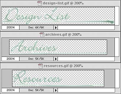
It's progress, but it's also a little crowded in the sidebar all of a sudden. We need to spread the entries apart, and so we shall, but first let's consider the three h3s ("Design List" and so on). In Figure 10.1, they're each in a lovely script font and have some unique underlining effects. That's obviously well beyond the capabilities of regular text, so we'll have to use the three images shown in Figure 10.19. Figure 10.19. The three images used to replace the heading text in the sidebar.
As you can see, the images are all GIFs with transparent parts, which will enable them to blend nicely with the sidebar background. To place them, we'll actually style all three h3 elements in the sidebar at once. This will let us set not only common margins but also the same width and height for each one. We'll also give them all the "Resources" image for a background, prevent it from repeating, and place it 10 pixels to the right of the element's left edge and centered vertically.
#linkList a {color: rgb(99,131,101);

  font: italic 1.15em Times, serif;

  text-transform: lowercase;}

#linkList h3 {margin: 1em 0 0; width: 216px; height: 35px;

  background: url(resources.gif) 10px 50% no-repeat;}

</style>
Having done this, we can now leave it in place and just change the images used in the background of the "Design List" and "Archives" headings.
#linkList h3 {margin: 1em 0 0; width: 216px; height: 35px;

  background: url(resources.gif) 10px 50% no-repeat;}

#lselect h3 {background-image: url(design-list.gif);}

#larchives h3 {background-image: url(archives.gif);}

</style>
By taking this approach, it becomes much easier to rework the heading styles as a group. If we ever decide to change the placement of the images within their headings, we just have to edit the background-position keywords in the #linkList h3 rule. The last thing we need to do to the headings is remove the text from the foregrounds, with the end result shown in Figure 10.20.
#larchives h3 {background-image: url(archives.gif);}

#linkList h3 span {display: none;}

</style>
Figure 10.20. The headings are replaced with images.
Now for those links梩hey've been scrunched together for far too long. Since the "Design List" links are styled differently than those in the other two sidebar sections, we'll take them each in turn. If you look closely at the entries in the "Design List" in the visual design, you'll see that the second line of each entry (the author line) is a little smaller than normal. The name of each design, though, is about as big as regular text. If we just set the list items in this list to be about 85% of normal size, we'll be close to getting this exact effect. That's because we already wrote a rule (#linkList a) that sets the links in the sidebar to be 1.15 times the size of their parent's font-size. If we reduce the size of the list items to 0.85 times normal, the links will be 0.9775 times normal size梒lose enough to 1.0 to satisfy our needs. So we'll do that and add a bottom margin to the list items at the same time.
#linkList h3 span {display: none;}

#lselect li {font-size: 85%; margin-bottom: 1.5em;}

</style>
Okay, now for the links themselves. Each design name needs to be on its own line and boldfaced. The name should also be all lowercase and the letters spread out a bit. We can easily make this the case for all links in the "Design List" section.
#lselect li {font-size: 85%; margin-bottom: 1.5em;}

#lselect li a {display: block; font-weight: bold;

  letter-spacing: 0.2em; text-transform: lowercase;}

</style>
Oops梬e just applied these styles to all of the links in the "Design List," including the links containing the author names, which aren't supposed to look anything like that. In fact, they're just supposed to be boldfaced text梩he same size and appearance as the word "by" that sits next to each name. And, for that matter, the author names have to sit next to the word "by," which means that they can't be block-level. In other words, we need to undo all the styles we just applied to them. Fortunately, the author-name links share one thing in common: a class of c. With that class to guide our selector, we can fix the link appearance in just four declarations, with the result shown in Figure 10.21.
#lselect li a {display: block; font-weight: bold;

  letter-spacing: 0.2em; text-transform: lowercase;}

#lselect li a.c {display: inline;

  font: bold 1em Times, serif;

  letter-spacing: 0; text-transform: none;}

</style>
Figure 10.21. Spreading out the "Design List" links and formatting them as desired.
We are very, very close to being done. Really, all we have to do now is get the links in the "Archives" and "Resources" sections to look like they do in the original design. Although they are spread out a bit, it isn't as much as the links in the "Design List" section. So we'll go with a half em.
#lselect li a.c {display: inline;

  font: bold 1em Times, serif;

  letter-spacing: 0; text-transform: none;}

#larchives li, #lresources li {margin-bottom: 0.5em;}

</style>
The other difference is that the links in this section are a much lighter weight than those in the "Design List" section. Ideally, we'd set them to be incredibly light using something like font-weight: 100;, but that isn't really very well supported. Instead, we'll blend the color of the links into the background a little more than the dark green of the "Design List" links, using a lighter green to lessen the visual weight.
#larchives li, #lresources li {margin-bottom: 0.5em;}

#larchives li a, #lresources li a {color: rgb(126,164,139);}

</style>
With that small little color change, which has the result shown in Figure 10.22, we've reached the end of our style sheet, which is given in Listing 10.4. Listing 10.4. The Complete Style Sheet
body {margin: 0; padding: 0; text-align: center;

  color: #000; background: #FFF;}

acronym {border: none;}

a {text-decoration: none;}

a:link {color: rgb(179,63,96);}

a:visited {color: rgb(90,32,48);}

a:hover {text-decoration: underline;}

#container {width: 647px; margin: 75px auto 0; padding: 0;

  text-align: left; position: relative;}

#pageHeader {background: url(pageHeader.jpg) 0 0 no-repeat;

  height: 157px; width: auto;}

#pageHeader h1 {background: url(ph-flower.gif) 0 0 no-repeat;

  height: 330px; width: 250px; position: absolute; z-index: 101;

  top: -95px; right: -80px; margin: 0;}

#pageHeader h1 span {visibility: hidden;}

#pageHeader h2 {position: absolute; z-index: 102;

  top: 134px; right: 140px; margin: 0; padding: 0;

  color: rgb(91,131,104);

  text-transform: lowercase; letter-spacing: 0.2em;

  font: bold italic 1.1em/1em Times, serif; text-align: right;}

#pageHeader h2 acronym {text-transform: uppercase;}

#quickSummary {font: italic 1em/2 Times, "Times New Roman", serif;

  background: rgb(94%,98%,96%) url(quickSummary.jpg) 0 100% no-repeat;

  color: rgb(42,92,42);

  margin: 1px 0; padding: 1em 180px 1.5em 1.5em;}

#quickSummary p {display: inline;}

#quickSummary p.p2 {margin-left: 0.25em;}

#quickSummary p.p2:after {content: ".";}

#preamble, #supportingText {padding-right: 217px;}

#preamble p, #supportingText p {font-size: 90%; line-height: 1.66em;

   margin: 0 1.5em; padding: 0.5em 0;}

#preamble h3, #supportingText h3 {letter-spacing: 0.1em;

  font: italic 1.2em Times, "Times New Roman", serif;

  color: rgb(107,153,139); margin: 1em 0 0.5em 0.5em;}

#preamble {border-top: 1px solid rgb(184,214,194);

  background: url(side.jpg) 100% 100% repeat-y;}

#supportingText {background: url(side.jpg) 100% 0 repeat-y;}

#preamble, #explanation, #participation, #benefits, #requirements {

  border-left: 1px solid rgb(184,214,194);

  padding-top: 1px; padding-bottom: 1px;}

#requirements {border-bottom: 1px solid rgb(184,214,194);

  background: url(main.jpg) 100% 100% no-repeat;

  padding-bottom: 100px;}

#footer {margin: 0 -217px 0 0; height: 123px;

  background: #FFF url(footer.jpg) 100% 1px no-repeat;

  padding: 60px 1em 0 0.5em;}

#footer a {color: rgb(207,216,214); line-height: 1em;

  font-size: 1.25em; font-weight: 100;}

#linkList {position: absolute; z-index: 11;

  width: 216px; top: 157px; right: 0;

  margin-top: 8.6em;}

#linkList ul {margin: 0.5em 1em 0 2em; padding: 0;}

#linkList li {list-style: none;}

#linkList a {color: rgb(99,131,101);

  font: italic 1.15em Times, serif;

  text-transform: lowercase;}

#linkList h3 {margin: 1em 0 0; width: 216px; height: 35px;

  background: url(resources.gif) 10px 50% no-repeat;}

#lselect h3 {background-image: url(design-list.gif);}

#larchives h3 {background-image: url(archives.gif);}

#linkList h3 span {display: none;}

#lselect li {font-size: 85%; margin-bottom: 1.5em;}

#lselect li a {display: block; font-weight: bold;

  letter-spacing: 0.2em; text-transform: lowercase;}

#lselect li a.c {display: inline;

  font: bold 1em Times, serif;

  letter-spacing: 0; text-transform: none;}

#larchives li, #lresources li {margin-bottom: 0.5em;}

#larchives li a, #lresources li a {color: rgb(126,164,139);}
Figure 10.22. The "Archive" and "Resources" links are styled to have a little less visual weight.
|
|
|
< Day Day Up > |
|