Since this is a programming book, you might be wondering why there is any mention of report wizards. However, wizards are an integral part of Access. If you build solutions and fail to take advantage of wizards that can address your problems meaningfully, you might as well use another development environment instead. In addition, wizards can create report shells that are well suited for customization via programming. The best way to learn about the various features and capabilities of Access wizards is to experiment with them.
Report wizards are great for performing tasks that are awkward to execute programmatically. The first example in this section builds a basic telephone directory report like the one discussed in the preceding section (see Figure 6-1). However, the Report Wizard automatically performs a lot of formatting, even with the most basic choices. In addition, the Report Wizard makes it easy to choose many formatting options and build many other kinds of reports. The second and third examples we'll look at in this section illustrate the capabilities of more specialized report wizards.
The Chart Wizard creates charts in Access reports. This wizard's charting capabilities resemble those available in Microsoft Excel, except that you can tap the wizard's charting capabilities more easily than you can by programmatically automating Excel. The charting examples presented in this section highlight how you can readily manipulate a chart both manually and programmatically with Access.
The Label Wizard integrates a highly functional label generator with a full-featured database manager. Later in this section, you'll see how to build a mailing label application.
The Access user interface makes it easy to create a report like the one shown in Figure 6-1. Because that report requires a subset of the columns in the Customers table, you can either invoke the AutoReport Wizard with a custom query that selects just the columns for the report or you can invoke the Report Wizard and select just the four report columns from the Customers table. Recall that the AutoReport Wizard creates a columnar report instead of a tabular one, such as the report shown in Figure 6-1. However, you can generate the columnar report with a single click. An AutoReport Wizard exists for tabular reports, but you must start it through the New Reports dialog box. After selecting the wizard in the New Reports dialog box, you must designate a record source in the drop-down box below the box listing the report wizards. You create the report by clicking OK.
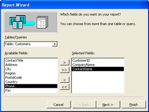
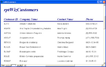
The Report Wizard can produce many kinds of reports, including one similar to the customer phone list. You launch the Report Wizard from the New Report dialog box by double-clicking its name. On the wizard's first page, use the Tables/Queries drop-down list to select a table or query as a record source for the report. Figure 6-2 shows the Report Wizard with three columns selected and one more column about to be selected for inclusion in the report. After adding the Phone column to the Selected Fields list, you can accept the defaults through the wizard's last dialog box. The default naming convention for the report is to use the name of the record source. If a report with that name already exists, the wizard adds a number to the end of the report name to differentiate it from the names of other existing reports. You can override the default report name on the wizard's last page. I assigned the name rptWizCustomers to the report created with the help of the Report Wizard.
Figure 6-3 shows an excerpt from the report generated by the Report Wizard. If you compare Figure 6-3 with Figure 6-1, you will see the contrast between programmatically and manually prepared reports. The wizard-generated report clearly looks better. For example, the wizard adds a report title, rptWizCustomers. The wizard inserts the label displaying the title in the Report Header section so that it appears only on the report's first page. The column headers appear above a horizontal line that separates them from the data rows. You can't see it in this excerpt, but the wizard-generated report also includes a Page Footer section that marks each report page with the date the report prints, the current page number, and the total number of pages in the report. In addition, the Report Wizard offers many formatting and data layout options that this basic sample does not exploit.
The preceding example demonstrates the power of the Report Wizard in relation to a programmatic solution for creating a similar report. Although we could create the same report programmatically, doing so would substantially lengthen the code, which already exceeds several score of lines. When you simply need to crank out an ad hoc report or create a prototype for a collection of reports, using the Report Wizard can be an excellent choice.
Using the Chart Wizard is a little more complicated than using the Report Wizard. There are two reasons for this. First, the Chart Wizard adds an OLE object to the report. This OLE object actually charts the data. The Chart Wizard often aggregates data before charting it. Second, you frequently will find it useful to prepare a query for your charts so that you can merge data from two record sources or restrict the result set with a criterion.
To prepare a chart that shows sales (quantity) by month, you must prepare a query that contains both the OrderDate and Quantity fields. The following SQL statement does this. The statement joins the Orders and Order Details tables by their OrderID fields so that it can include the OrderDate and Quantity fields in a result set. Additionally, a WHERE clause restricts the output to orders made in 1997.
SELECT OrderDate, Quantity AS Sales
FROM Orders INNER JOIN [Order Details]
ON Orders.OrderID = [Order Details].OrderID
WHERE Year(OrderDate)=1997
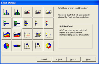
After saving the query statement with a name such as qryForChart, you can launch the Chart Wizard from the New Report dialog box. To proceed to the first Chart Wizard page, you must designate the source of data for the chart. For example, select qryForChart from the drop-down list below the Wizard list. After clicking OK, move the OrderDate and Sales fields to the Fields For Chart box and click Next. Select a chart type, such as a 3-D Bar Chart. The wizard uses graphic images to denote the appearance of the various chart type options. (See Figure 6-4.) Click Next. To change the layout of your chart, you can move the fields around on the next wizard page. Simply click Next to bypass this page in the current sample.
In the final Chart Wizard page, you can assign your chart a title, specify whether it will have a legend, and decide whether to view the chart or open it in Design view. The chart title is not the report name—it is merely a label that appears at the top of the chart. Select the No Don't Display A Legend option because we have just one field to plot against another. Choose to open the report with the chart displayed on it (instead of choosing to modify the report).
| Note |
The appearance of the chart can depend on your Microsoft Data Access Component (MDAC) references. These references need to be present and valid in the database file with which you're working. If you attempt to generate a chart from an Access database file with missing MDAC references, the chart described in the example will not appear. This can be confusing since a database's MDAC references can be valid on one computer, but invalid on another computer. However, no matter what computer you use, the problem can be fixed by choosing valid MDAC references from the Visual Basic Editor (VBE) window. For a more extensive discussion of MDAC versions for Access developers see the "ADO Overview" section in Chapter 1. |
Clicking Finish on the final Chart Wizard page generates our example's initial chart. After the chart appears, you can revert to Design view to edit its layout on the report. You can right-click on the chart in Design view and choose Chart Options to modify the chart itself.
When Access opens the chart in Design view, it presents you with three nested containers. The outer container is the report. The middle container is the Detail section of the report. This container holds an unbound OLE object, which is your interface to the Microsoft Graph 2000 Chart object. Actually, the Class property for the unbound OLE object indicates that it's a holdover from Access 97. The Class property setting is MSGraph.Chart.8. The RowSource property is an especially important property of the unbound OLE object. The setting for this property is a SQL statement that determines the record source for the chart. You can programmatically update this property to dynamically assign different record sources to a single chart. In addition, if the Chart Wizard fails to perform the aggregation that your application requires, you can enter a revised SQL string as the Row Source setting on the Properties dialog box for the unbound OLE object.
The kind of editing you are likely to perform includes removing unused report sections, resizing the chart so that it's bigger and easier to examine, and changing the page orientation if you're printing just one chart per page. Double-click the unbound OLE object to expose the Access menu's Chart menu command. For example, you can add a title for the horizontal axis by choosing Chart, Chart Options. Then, type the title you want for the horizontal axis into the Value (Z) Axis text box on the Titles tab in the Chart Options dialog box.
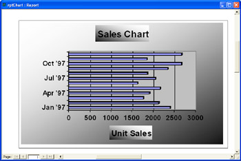
Figure 6-5 shows a completed chart for the SQL statement shown at the beginning of this section. The Chart Wizard has automatically aggregated the underlying data by month. You can verify or modify the chart's aggregation scheme by examining the unbound OLE object's Row Source property setting on its Properties dialog box. I added Unit Sales as the title for the horizontal axis using the technique described in the preceding paragraph. The chart's overall title, Sales Chart, came from a setting made on the last Chart Wizard page. After selecting the OLE object, you can double-click the chart's title to open a dialog box to modify the title's formatting. In fact, you can double-click on any chart element to update its formatting. The chart in Figure 6-5 is available in the rptChart report for this chapter's sample file (Chapter06.mdb). Use it as a basis to experiment with custom formatting. The sample chart appears with gradient format effects. The chart area gradient runs in a direction counter to the gradient of the chart and axis titles.
The Label Wizard is a great tool for creating reports that print batches of labels. The variety of label formats available is overwhelming. Standard label formats are available from 40 label manufacturers, and you can choose sheet or continuous-feed labels in either English or metric measurements. (The fact that selecting the right label format is one of the most difficult aspects of using the Label Wizard is a testimony to its flexibility.)
In addition, the Label Wizard offers tools to help you build and save your own label printing formats. This can be convenient if your application calls for printing to custom-sized labels or you want to develop a custom format for printing on a standard-sized label.
As with the Chart Wizard, you must specify a record source to start the Label Wizard from the New Report dialog box. For this example, you can choose the Suppliers table from the Northwind database; the sample database for this chapter links all the Northwind tables. In the first wizard page, select 5260 from the Product Number list and click Next. The next wizard page offers controls for altering the font and color of labels. For this example, click Next to bypass this page.
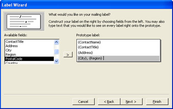
The next page is more critical since it allows you to pick and format fields from the record source for inclusion on the label. Figure 6-6 displays the design of a label just before adding the final field, PostalCode, to the label. You can insert carriage returns, punctuation marks, and blank spaces between the fields on a label.
After you pick the fields to include on your label, the wizard offers you the opportunity to sort the order in which records appear as labels in the printed report. Sorting and bundling by ZIP code, or even subsets of a ZIP code, can sometimes help reduce mailing costs.
Finally, you can assign a name to the report. The default name is the word Labels followed by a space and the report's record source name. This name is how you will refer to the report in the Database window and programmatically in the AllReports and Reports