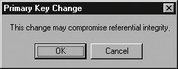
Putting Users in ChargeJust behind "user-friendly" in the nice-but-useless terminology stakes is the expression "user-centered." What does that mean? Well, unlike "userfriendly," it does have a meaning, albeit a rather vague one. A system is user-centered if it always responds to the users' requests and never imposes a specific method of working. This principle is perhaps easiest to understand by way of an example. An acquaintance of mine, a developer for whom I have a great deal of respect, described his method to ensure that users enter data in the order most convenient for the system. He locks all the controls on the form except for the first one; once data is entered in that control, he unlocks the second, and then the third, and so forth. Not only is this technique as far from user-centered as one can get, it's not going to work in the long run. Actually, I'm surprised it ever worked in the short run. Users often have good reasons for not entering data in a specific order. It might be unavailable, or simply inconvenient to enter at the moment. If you force them to enter something, they will. They'll enter any old garbage that the system will accept. So by forcing an entry, you've offended them, imposed on them, and ultimately accomplished nothing. We'll look at this issue in some detail in Chapter 19, when we discuss data integrity. Artificially enforcing data integrity is the primary way database systems try to wrestle control from users. The second way is by being obsessively modal. A mode is a system condition that limits users' interactions. The classic modes in database systems are add, edit, and view. A system that requires users to return to a main menu before editing the record they've just been looking at is ridiculously inefficient. Requiring them to choose a menu item or click a button before editing is not much better. Unfortunately, many designers implement this kind of modality as a matter of course. Perhaps in a mistaken attempt to protect users from accidental changes or because the use of Add, Edit, and View menu items was conventional 20 years ago, they perpetuate the paradigm in the Windows environment, where it is inappropriate. I strongly recommend that you assume the users know what they're doing. (I realize this is a shocking proposition, but trust me. More importantly, trust them.) If a user wants want to change a record, let her. Nobody should be forced to ask permission to do her job. Of course, if you're going to allow users this much freedom, you must give them safety nets. Multiple levels of undo are easy to implement. You might even want to include a "Revert to Last Saved" menu option to allow a user to discard all changes to the current record. Applying the same theory, I don't like asking users to confirm changes before saving a record, although in some situations it might be justified. The whole idea of "saving" is foreign to most users. Remember the users' mental model. They've just made a change, and now you're asking them if they want to make the change, which is very confusing. Confirmation messages of this type are another instance of imposing on users without accomplishing much. Once they sort out what this whole "saving" thing means, most people just get in the habit of choosing "OK" every time the confirmation dialog box appears anyway, so the dialog box doesn't do much good. In the few instances when I have implemented confirmation messages (usually at the insistence of the client), I've provided a mechanism for turning them off (generally in the Properties dialog box). However, some extensive changes can't be undone, or at least not easily. Accidentally changing a field on a record can be easily fixed. Accidentally deleting all the records in a table can't. If you allow users to do things that you consider really dangerous, the best option is to provide a method for undoing the action. If that's not feasible, then by all means get them to confirm the action. Just be sensible about how you define "really dangerous" and give your users useful information about the implications of their actions. The message box shown in Figure 15-1 will only scare them. Figure 15-1. This Is a Spectacularly Unhelpful Message Box
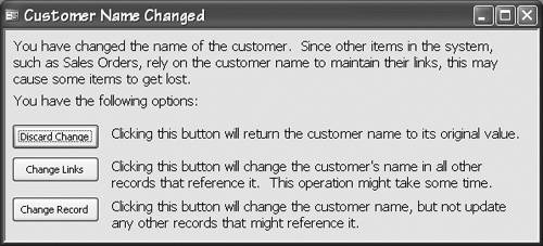
The message box shown in Figure 15-2 is much better. Not great, perhaps, but better. Not only does it explain the situation in the users' terms, it also provides them with options besides OK and Cancel (which the average user interprets as "I am an idiot" and "I am an idiot. I offer my most humble apologies," respectively.) Figure 15-2. This Message Box Explains the Implications of a User's Actions and Gives Her Several Options
|