|
|
< Day Day Up > |
|
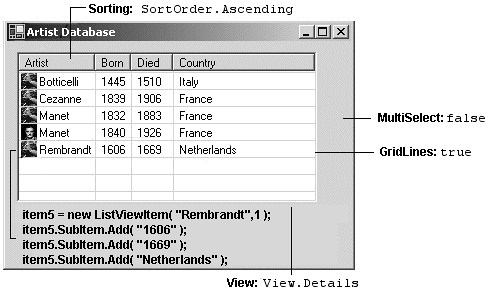
7.5. The ListView and TreeView ClassesThe ListView ClassListView is another control that displays lists of information. It represents data relationally as items and subitems. The data can be represented in a variety of formats that include a multi-column grid and large or small icons to represent item data. Also, images and check boxes can adorn the control. Figure 7-11 illustrates the basic properties and methods used to lay out a Details view of the control梐 format obviously tailored to displaying database tables. The first column contains text for an item梐s well as a picture梩he remaining columns contain subitems for the parent item. Figure 7-11. ListView control
Let's look at how this style of the ListView is constructed. Creating a ListView ObjectThe ListView is created with a parameterless constructor: ListView listView1 = new ListView(); Define Appearance of ListView Object// Set the view to show details listView1.View = View.Details; The View property specifies one of five layouts for the control:
Core Note After the Details view is selected, other properties that define the control's appearance and behavior are set: // Allow the user to rearrange columns listView1.AllowColumnReorder = true; // Select the entire row when selection is made listView1.FullRowSelect = true; // Display grid lines listView1.GridLines = true; // Sort the items in the list in ascending order listView1.Sorting = SortOrder.Ascending; These properties automatically sort the items, permit the user to drag columns around to rearrange their order, and cause a whole row to be highlighted when the user selects an item. Set Column HeadersIn a Details view, data is not displayed until at least one column is added to the control. Add columns using the Columns.Add method. Its simplest form is ListView.Columns.Add(caption, width, textAlign) Caption is the text to be displayed. Width specifies the column's width in pixels. It is set to ? to size automatically to the largest item in the column, or ? to size to the width of the header.
// Create column headers for the items and subitems

   listView1.Columns.Add("Artist", -2, HorizontalAlignment.Left);

   listView1.Columns.Add("Born", -2, HorizontalAlignment.Left);

   listView1.Columns.Add("Died", -2, HorizontalAlignment.Left);

   listView1.Columns.Add("Country", -2, HorizontalAlignment.Left);
The Add method creates and adds a ColumnHeader type to the ListView's Columns collection. The method also has an overload that adds a ColumnHeader object directly: ColumnHeader cHeader: cHeader.Text = "Artist"; cHeader.Width = -2; cHeader.TextAlign = HorizontalAlignment.Left; ListView.Columns.Add(ColumnHeader cHeader); Create ListView ItemsSeveral overloaded forms of the ListView constructor are available. They can be used to create a single item or a single item and its subitems. There are also options to specify the icon associated with the item and set the foreground and background colors. Constructors: public ListViewItem(string text); public ListViewItem(string[] items ); public ListViewItem(string text,int imageIndex ); public ListViewItem(string[] items,int imageIndex ); public ListViewItem(string[] items,int imageIndex, Color foreColor,Color backColor,Font font); The following code demonstrates how different overloads can be used to create the items and subitems shown earlier in Figure 7-8:
// Create item and three subitems

ListViewItem item1 = new ListViewItem("Manet",2);

item1.SubItems.Add("1832");

item1.SubItems.Add("1883");

item1.SubItems.Add("France");

// Create item and subitems using a constructor only

ListViewItem item2 = new ListViewItem

       (new string[] {"Monet","1840","1926","France"}, 3);

// Create item and subitems with blue background color

ListViewItem item3 = new ListViewItem

       (new string[] {"Cezanne","1839","1906","France"}, 1,

       Color.Empty, Color.LightBlue, null);
To display the items, add them to the Items collection of the ListView control:
// Add the items to the ListView

   listView1.Items.AddRange(

      new ListViewItem[]{item1,item2,item3,item4,item5});
Specifying IconsTwo collections of images can be associated with a ListView control as ImageList properties: LargeImageList, which contains images used in the LargeIcon view; and SmallImageList, which contains images used in all other views. Think of these as zero-based arrays of images that are associated with a ListViewItem by the imageIndex parameter in the ListViewItem constructor. Even though they are referred to as icons, the images may be of any standard graphics format. The following code creates two ImageList objects, adds images to them, and assigns them to the LargeImageList and SmallImageList properties:
// Create two ImageList objects

   ImageList imageListSmall = new ImageList();

   ImageList imageListLarge = new ImageList();

   imageListLarge.ImageSize = new Size(50,50); // Set image size

   // Initialize the ImageList objects

   // Can use same images in both collections since they're resized

   imageListSmall.Images.Add(Bitmap.FromFile("C:\\botti.gif"));

   imageListSmall.Images.Add(Bitmap.FromFile("C:\\cezanne.gif"));

   imageListLarge.Images.Add(Bitmap.FromFile("C:\\botti.gif"));

   imageListLarge.Images.Add(Bitmap.FromFile("C:\\cezanne.gif"));

   // Add other images here

   // Assign the ImageList objects to the ListView.

   listView1.LargeImageList = imageListLarge;

   listView1.SmallImageList = imageListSmall;

   ListViewItem lvItem1 = new ListViewItem("Cezanne",1);
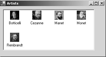
An index of 1 selects the cezanne.gif images as the large and small icons. Specifying an index not in the ImageList results in the icon at index 0 being displayed. If neither ImageList is defined, no icon is displayed. Figure 7-12 shows the ListView from Figure 7-11 with its view set to View.LargeIcon: listView1.View = View.LargeIcon; Figure 7-12. LargeIcon view
Working with the ListView ControlCommon tasks associated with the ListView control include iterating over the contents of the control, iterating over selected items only, detecting the item that has focus, and梬hen in Details view梥orting the items by any column. Following are some code segments to perform these tasks. Iterating over All Items or Selected ItemsYou can use foreach to create nested loops that select an item and then iterate through the collection of subitems for the item in the outside loop:
foreach (ListViewItem lvi in listView1.Items)

{

   string row = "";

   foreach(ListViewItem.ListViewSubItem sub in lvi.SubItems)

   {

      row += " " + sub.Text;

   }

   MessageBox.Show(row); // List concatenated subitems

}
There are a couple of things to be aware of when working with these collections. First, the first subitem (index 0) element actually contains the text for the item梟ot a subitem. Second, the ordering of subitems is not affected by rearranging columns in the ListView control. This changes the appearance but does not affect the underlying ordering of subitems. The same logic is used to list only selected items (MultiSelect = true permits multiple items to be selected). The only difference is that the iteration occurs over the ListView.SelectedItems collection: foreach (ListViewItem lvisel in listView1.SelectedItems) Detecting the Currently Selected ItemIn addition to the basic control events such as Click and DoubleClick, the ListView control adds a SelectedIndexChanged event to indicate when focus is shifted from one item to another. The following code implements an event handler that uses the FocusedItem property to identify the current item: // Set this in the constructor listView1.SelectedIndexChanged += new EventHandler(lv_IndexChanged); // Handle SelectedIndexChanged Event private void lv_IndexChanged(object sender, System.EventArgs e) { string ItemText = listView1.FocusedItem.Text; } Note that this code can also be used with the Click events because they also use the EventHandler delegate. The MouseDown and MouseUp events can also be used to detect the current item. Here is a sample MouseDown event handler:
private void listView1_MouseDown(object sender, MouseEventArgs e)

{

   ListViewItem selection = listView1.GetItemAt(e.X, e.Y);

   if (selection != null)

   {

      MessageBox.Show("Item Selected: "+selection.Text);

   }

}
The ListView.GetItemAt method returns an item at the coordinates where the mouse button is pressed. If the mouse is not over an item, null is returned. Sorting Items on a ListView ControlSorting items in a ListView control by column values is a surprisingly simple feature to implement. The secret to its simplicity is the ListViewItemSorter property that specifies the object to sort the items anytime the ListView.Sort method is called. Implementation requires three steps:
The following code implements the logic: When a column is clicked, the event handler creates an instance of the ListViewItemComparer class by passing it the column that was clicked. This object is assigned to the ListViewItemSorter property, which causes sorting to occur. Sorting with the IComparer interface is discussed in Chapter 4, "Working with Objects in C#").
// Connect the ColumnClick event to its event handler

listView1.ColumnClick +=new ColumnClickEventHandler(ColumnClick);

// ColumnClick event handler

private void ColumnClick(object o, ColumnClickEventArgs e)

{

   // Setting this property immediately sorts the

   // ListView using the ListViewItemComparer object

   this.listView1.ListViewItemSorter =

       new ListViewItemComparer(e.Column);

}

// Class to implement the sorting of items by columns

class ListViewItemComparer : IComparer

{

   private int col;

   public ListViewItemComparer()

   {

      col = 0;   // Use as default column

   }

   public ListViewItemComparer(int column)

      {

      col = column;

   }

   // Implement IComparer.Compare method

   public int Compare(object x, object y)

   {

      string xText = ((ListViewItem)x).SubItems[col].Text;

      string yText = ((ListViewItem)y).SubItems[col].Text;

      return String.Compare(xText, yText);

   }

}
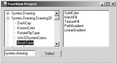
The TreeView ClassAs the name implies, the TReeView control provides a tree-like view of hierarchical data as its user interface. Underneath, its programming model is based on the familiar tree structure consisting of parent nodes and child nodes. Each node is implemented as a treeNode object that can in turn have its own Nodes collection. Figure 7-13 shows a treeView control that is used in conjunction with a ListView to display enum members of a selected assembly. (We'll look at the application that creates it shortly.) Figure 7-13. Using TReeView control (left) and ListView (right) to list enum values
The TreeNode ClassEach item in a tree is represented by an instance of the TReeNode class. Data is associated with each node using the TReeNode's Text, Tag, or ImageIndex properties. The Text property holds the node's label that is displayed in the TReeView control. Tag is an object type, which means that any type of data can be associated with the node by assigning a custom class object to it. ImageIndex is an index to an ImageList associated with the containing TReeView control. It specifies the image to be displayed next to the node. In addition to these basic properties, the treeNode class provides numerous other members that are used to add and remove nodes, modify a node's appearance, and navigate the collection of nodes in a node tree (see Table 7-3).
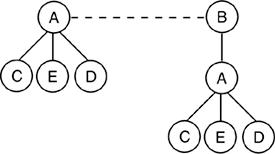
Let's look at how treeView and treeNode members are used to perform fundamental treeView operations. Adding and Removing NodesThe following code creates the tree in Figure 7-14 using a combination of Add, Insert, and Clone methods. The methods are performed on a preexisting TReeView1 control.
TreeNode tNode;

// Add parent node to treeView1 control

tNode = treeView1.Nodes.Add("A");

// Add child node: two overloads available

tNode.Nodes.Add(new TreeNode("C"));

tNode.Nodes.Add("D"));

// Insert node after C

tNode.Nodes.Insert(1,new TreeNode("E"));

// Add parent node to treeView1 control

tNode = treeView1.Nodes.Add("B");
Figure 7-14. TReeView node representation
At this point, we still need to add a copy of node A and its subtree to the parent node B. This is done by cloning the A subtree and adding it to node B. Node A is referenced as treeView1.Nodes[0] because it is the first node in the control's collection. Note that the Add method appends nodes to a collection, and they can be referenced by their zero-based position within the collection: // Clone first parent node and add to node B TreeNode clNode = (TreeNode) treeView1.Nodes[0].Clone(); tNode.Nodes.Add(clNode); // Add and remove node for demonstration purposes tNode.Nodes.Add("G"); tNode.Nodes.Remove(tNode.LastNode); Iterating Through the Nodes in a TreeViewAs with any collection, the foreach statement provides the easiest way to loop through the collection's members. The following statements display all the top-level nodes in a control:
foreach (TreeNode tn in treeView1.Nodes)

{

   MessageBox.Show(tn.Text);

   // If (tn.IsVisible) true if node is visible

   // If (tn.IsSelected) true if node is currently selected

}
An alternate approach is to move through the collection using the treeNode.NextNode property:
tNode = treeView1.Nodes[0];

while (tNode != null) {

   MessageBox.Show(tNode.Text);

   tNode = tNode.NextNode;

}
Detecting a Selected NodeWhen a node is selected, the TReeView control fires an AfterSelect event that passes a TReeViewEventArgs parameter to the event handling code. This parameter identifies the action causing the selection and the node selected. The TReeView example that follows illustrates how to handle this event. You can also handle the MouseDown event and detect the node using the GetNodeAt method that returns the node梚f any梐t the current mouse coordinates.
private void treeView1_MouseDown(object sender, MouseEventArgs e)

{

   TreeNode tn = treeView1.GetNodeAt(e.X, e.Y);

   // You might want to remove the node:  tn.Remove()

}
A TreeView Example That Uses ReflectionThis example demonstrates how to create a simple object browser (refer to Figure 7-13) that uses a treeView to display enumeration types for a specified assembly. When a node on the tree is clicked, the members for the selected enumeration are displayed in a ListView control. Information about an assembly is stored in its metadata, and .NET provides classes in the System.Reflection namespace for exposing this metadata. The code in Listing 7-4 iterates across the types in an assembly to build the treeView. The parent nodes consist of unique namespace names, and the child nodes are the types contained in the namespaces. To include only enum types, a check is made to ensure that the type inherits from System.Enum. Listing 7-4. Using a treeView and Reflection to List Enums in an Assembly
using System.Reflection;

//

private void GetEnums()

{

   TreeNode tNode=null;

   Assembly refAssembly ;

   Hashtable ht= new Hashtable();  // Keep track of namespaces

   string assem = AssemName.Text;  // Textbox with assembly name

   tvEnum.Nodes.Clear();           // Remove all nodes from tree

   // Load assembly to be probed

   refAssembly = Assembly.Load(assem);

   foreach (Type t in refAssembly.GetTypes())

   {

      // Get only types that inherit from System.Enum

      if(t.BaseType!=null && t.BaseType.FullName=="System.Enum")

      {

         string myEnum  = t.FullName;

         string  nSpace =

                   myEnum.Substring(0,myEnum.LastIndexOf("."));

         myEnum= myEnum.Substring(myEnum.LastIndexOf(".")+1) ;

         // Determine if namespace in hashtable

         if( ht.Contains(nSpace))

         {

            // Find parent node representing this namespace

            foreach (TreeNode tp in tvEnum.Nodes)

            {

              if(tp.Text == myEnum) { tNode=tp; break;}

            }

         }

         else

         {

            // Add parent node to display namespace

            tNode = tvEnum.Nodes.Add(nSpace);

            ht.Add(nSpace,nSpace);

         }

         // Add Child - name of enumeration

         TreeNode cNode = new TreeNode();

         cNode.Text= myEnum;

         cNode.Tag = t;     // Contains specific enumeration

         tNode.Nodes.Add(cNode);

      }

   }

}
Notice how reflection is used. The static Assembly.Load method is used to create an Assembly type. The Assembly.GetTypes is then used to return a Type array containing all types in the designated assembly.
refAssembly = Assembly.Load(assem);

foreach (Type t in refAssembly.GetTypes())
The Type.FullName property returns the name of the type, which includes the namespace. This is used to extract the enum name and the namespace name. The Type is stored in the Tag field of the child nodes and is used later to retrieve the members of the enum. After the treeView is built, the final task is to display the field members of an enumeration when its node is clicked. This requires registering an event handler to be notified when an AfterSelect event occurs: tvEnum.AfterSelect += new TreeViewEventHandler(tvEnum_AfterSelect); The event handler identifies the selected node from the treeViewEventArgs.Node property. It casts the node's Tag field to a Type class (an enumerator in this case) and uses the GetMembers method to retrieve the type's members as MemberInfo types. The name of each field member梕xposed by the MemberInfo.Name property梚s displayed in the ListView:
// ListView lView;

// lView.View = View.List;

private void tvEnum_AfterSelect(Object sender,

                                TreeViewEventArgs e)

{

   TreeNode tn = e.Node;   // Node selected

   ListViewItem lvItem;

   if(tn.Parent !=null)    // Exclude parent nodes

   {

      lView.Items.Clear(); // Clear ListView before adding items

      Type cNode = (Type) tn.Tag;

      // Use Reflection to iterate members in a Type

      foreach (MemberInfo mi in cNode.GetMembers())

      {

         if(mi.MemberType==MemberTypes.Field &&

                           mi.Name != "value__" )  // skip this

         {

            lView.Items.Add(mi.Name);

         }

      }

   }

}
|
|
|
< Day Day Up > |
|