|
|
< Day Day Up > |
|
16.2. Web Forms ControlsThe designer of an ASP.NET Web page can choose from three types of controls for the GUI design: client-side HTML controls, HTML server controls, and Web Forms controls. Client-side controls are the traditional controls defined by HTML tags (<table>, <button>, <input>, and others). These controls are still useful for client-side form validation and creating hyperlinks. HTML server controls are server-side versions of the standard HTML controls (see Listing 16-2). As we have seen, they're created by adding a runat = server attribute to the HTML tag. The main reason they are included in .NET is to ease the transition from legacy HTML files to ASP.NET. However, except for incurring less overhead, there is no real advantage in using HTML server controls. Web controls梐 much more powerful alternative梐re nearly as easy to implement and unlock the full capabilities of ASP.NET. Web controls are native ASP.NET controls that extend the features of the HTML server controls and add non-HTML controls, such as a calendar and data grid. They are actual classes in the .NET Framework and expose properties that enable the developer to exert much more control over their appearance and behavior than is possible with server controls. With the exception of the Table梩he HTML table is easier to work with for general use梂eb controls should be the control of choice for ASP.NET pages. Web Controls OverviewWeb controls behave much like the HTML server controls: Each has a corresponding class; those with a user interface render themselves in HTML understandable by a browser; and most expose events that are handled on the server. A significant difference from the HTML controls is that Web controls provide a richer object model. From the WebControl class, they inherit properties that affect their appearance: ForeColor, BackColor, BorderColor, BorderStyle, Height, and Width. In addition, many can be bound to a data source that provides their content. A Web control is declared using the asp: prefix. For example, a TextBox and Button are declared as
<asp:TextBox  type="text" runat="server" />

<asp:Button   Text="Save Data" runat="server"

      OnClick="SaveBtn_Click" />
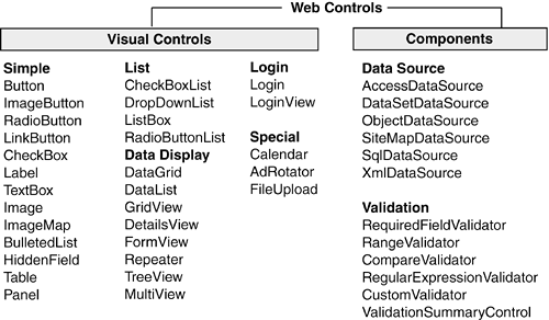
ASP.NET Web controls are defined in the System.Web.UI.WebControls namespace. There are a lot of them梞ore than 70 with the release of ASP.NET 2.0. They naturally fall into functional categories that provide a convenient way to present them (see Figure 16-7):
Figure 16-7. ASP.NET Web controls
In addition to these, there are a few of highly specialized controls: Calendar, AdRotator, and FileUpload. This section provides examples of commonly used visual controls, as well Validation controls and the new (.NET 2.0) Data Source controls. Before examining specific controls, let's look at the properties shared by all Web controls that govern their appearance. Specifying the Appearance of a Web ControlAll Web controls inherit numerous properties from the base WebControl class that can be used to set their appearance and behavior. The properties are most effective when used to decorate simple controls where their effect is more pronounced than with complex controls. Table 16-4 demonstrates how these properties can be used to alter the appearance of a simple Button control.
Other useful properties include Enabled, Visible, and TabIndex. The latter indicates the tab order of a control. Note that browsers may render these properties differently or ignore some of them altogether. For example, Firefox and Netscape tend to ignore the Width property. Simple ControlsThe simple controls are typically used in combination to create an interface for users to enter data or make selections. The easiest way to present and manage controls that are related by function and style is to place them in a common container. In traditional HTML, the <DIV> element is used for this purpose; in ASP.NET, the panel control serves as a generic container (and is often rendered in browsers as a <DIV> element). There are many advantages to using a panel to layout controls:
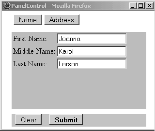
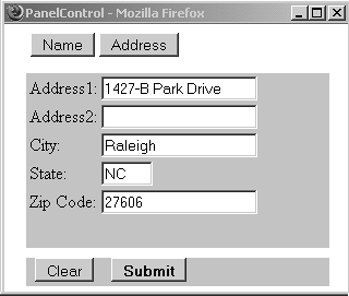
The screens in Figure 16-8 are created using a combination of button, label, text box, and panel controls. The page consists of a form that accepts name and address information. Controls to accept name fields are contained on one panel, whereas address fields are on another. Clicking the Name and Address buttons toggles the visibility property of the two panels. The effect is to reuse the same display space for both types of data梠bviating the need for a long scrolling form or multiple Web pages. Figure 16-8. Using panels to manage simple controls
A look at the underlying code reveals the syntax and mechanics of working with Web controls. We'll look at the three most interesting areas of the code: the Page_Load event handler, the button declarations and event handlers, and the layout of the panels. Using the Page_Load Event to Initialize the ScreenWhen the page is loaded for the first time, the panel that accepts name fields, pnlName, is made visible, whereas pnlAddress has its visibility turned off. <script runat="Server"> void Page_Load(object sender, EventArgs e) { if(!this.IsPostBack) { pnlName.Visible = true; pnlAddress.Visible = false; } } ButtonsThe two menu buttons across the top of the form are declared as
<asp:Button  CommandName="name"

      OnCommand="Button_Command" text="Name" Runat="server" />

<asp:Button  CommandName="address"

      OnCommand="Button_Command" text="Address" Runat="server" />
The buttons specify Button_Command as an event handler to be called when each button is clicked. As shown in the event handler code, the buttons' CommandName property identifies the button raising the event. This enables a single method to handle multiple button clicks, which is a useful way to group code performing similar tasks. It's most commonly used with buttons that control column sorting in a grid.
void  Button_Command(Object sender, CommandEventArgs e) {

   // CommandName identifies control invoking event

   switch(e.CommandName)

   {

      case "address":

         pnlName.Visible = false;

         pnlAddress.Visible = true;

         break;

      case "name":

          pnlAddress.Visible= false;

          pnlName.Visible = true;

          break;

      default:

          break;

   }

}
The Clear and Submit buttons use the OnClick property梤ather than OnCommand梩o specify their Click event handlers as separate methods:
<asp:Panel
style="Z-INDEX:103; LEFT:20px;POSITION:absolute; TOP: 240px"
runat="server"
BackColor=#cccccc
Height="26px"
Width="278px">
<asp:Button Text="Clear" OnClick="clear_Form"
runat="server" />
<asp:Button Text="Submit" Font-Bold="true"
OnClick="store_Form" runat="server" />
</asp:Panel>
The most important thing to note about the event handlers is their signature. The Click event requires an EventArgs type as the second parameter; the Command event requires a CommandEventArgs type.
private void clear_Form(object sender, System.EventArgs e)

{

   if(pnlName.Visible)

   {

      txtFirstName.Text  ="";

      txtLastName.Text   ="";

      txtMiddleName.Text ="";

   } else

   {

      // Clear fields on pnlAddress

   }

}

private void store_Form(object sender, System.EventArgs e)

{

   // Code to verify and store Form

}
Core Note
Using PanelsThe panel declaration specifies its location, size, and appearance attributes such as background color. Controls are placed on the panel by declaring them within the <asp:Panel /> tags. In this example, the text box and label controls are members of the panel's control collection:
<asp:Panel  runat="server"

   style="Z-INDEX: 101; LEFT: 20px;

   POSITION: absolute; TOP: 64px"

   BackColor = "LightGreen" Height="160px" Width="278px">

<TABLE>

   <TR>

      <TD><asp:Label  Runat="server"

              text="First Name:"></asp:Label></TD>

      <TD><asp:TextBox  MaxLength=30

              Runat="server"></asp:TextBox></TD></TR>

   <TR>

      <TD><asp:Label  Runat="server"

              text="Middle Name:"></asp:Label></TD>

      <TD><asp:TextBox  MaxLength=30

              Runat="server"></asp:TextBox></TD></TR>

   <TR>

      <TD><asp:Label  Runat="server"

              text="Last Name:"></asp:Label></TD>

      <TD><asp:TextBox  MaxLength=30

              Runat="server"></asp:TextBox></TD></TR>

</TABLE>

</asp:Panel>
It is interesting to note how ASP.NET tailors the HTML code to capabilities of the client browser. The HTML returned to Internet Explorer renders the panel as a <div> element.
<div  style="background-color:LightGreen;

      height:160px;width:278px;Z-INDEX: 103; LEFT: 20px;

      POSITION: absolute; TOP: 64px">
The Firefox and Netscape browsers receive HTML in which the panel is rendered as a table:
<table  cellpadding="0" cellspacing="0" border="0"

      bgcolor="LightGreen" height="160" width="278"

      style="Z-INDEX: 101; LEFT: 20px; POSITION: absolute;

      TOP: 64px"><tr><td>
Core Note
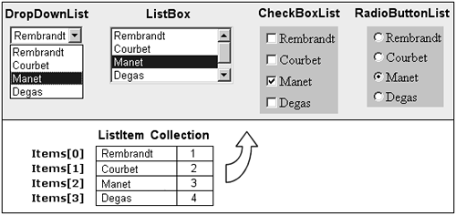
Text BoxWith the exception of the MaxLength property that limits the amount of text entered in the control, the text box controls in this example rely on default property values. However, they can be customized easily to present a more meaningful interface. The most useful properties include Width and Column, which both specify the width of the control (Column is the better choice since all browsers recognize it); ReadOnly, which can be used to prevent the user from changing the content; Rows, which specifies the number of rows in a multi-line text box; and TextMode, which indicates whether the text box is SingleLine, MultiLine, or contains a Password. In the latter case, text entered into the text box is masked. The text box also supports an OnTextChanged property that specifies an event handler method to call when text in the box is changed. However, this is a delayed event that is not processed on the server until a round-trip event occurs. You can prevent the event from being delayed by adding the AutoPostBack = true property to the control's declaration. However, for best performance, the program should be designed to process all control content in one trip. List ControlsThe four ASP.NET list controls?tt>DropDownBox, ListBox, CheckBoxList, and RadioButtonList梡rovide alternative ways of representing a collection of data. All are data-bound controls that provide a visual interface for an underlying ListItemCollection; and all are derived from the System.Web.UI.WebControls.ListControl class that contributes the properties and methods used to populate the controls with data and detect selected control items (see Figure 16-9). Figure 16-9. List control display data from underlying ListItem collection
Filling the Control with DataIndividual data items within a list control are represented as a ListItem control. There are several ways to specify the text displayed for an item in the list control. The most common method is by placing text between the opening and closing tags of the ListItem control梤eferred to as the inner HTML content. You can also use the Text property to specify the text displayed in the list control for the item.
<asp:RadioButtonList  BackColor="LightBlue"

       RepeatColumns=1 RepeatDirection="Vertical" runat="server">

   <asp:ListItem Value="1">Rembrandt />

   <asp:ListItem Value="2">Courbet />

   <asp:ListItem Value="3" Text="Manet" />

   <asp:ListItem Value="4">Degas />

</asp:RadioButtonList>
The ListItem control also exposes a Value property that allows you to associate a value with the item in the list control, in addition to the text displayed in the control. This is often used as a key when retrieving data related to the selected item from a database table. As mentioned, list controls are data bound, which means they expose a DataSource property that can be set to reference a collection of data. The control's DataBind method is called to load the data from the source into the control. It is possible to bind to many kinds of data sources, such as database tables, hash tables, XML files, and even other controls. As an example, let's declare a ListBox that will be bound to an array: <asp:ListBox runat="server" Rows=4 Width=150px> </asp:ListBox> In the script section of the .aspx page, we define an array and bind its contents to the ListBox. The DataBind method copies the data from the array into the control, creating a ListItem collection (see Figure 16-9).
<script  runat="Server">

void Page_Load(object sender, EventArgs e) {

   string[] artists = new string[4] {"Rembrandt","Courbet",

                   "Manet","Degas"};

   //

   if( !this.IsPostBack) {

      // Bind the first time the page is loaded

      ListBox.DataSource = artists;

      ListBox.DataBind();

   }

}
Note that the binding occurs only when the page is loaded the first time. ViewState is used to populate the control on subsequent postbacks. Selecting an ItemWhen an item in a list control is selected, the SelectedIndexChanged event occurs. A postback to the server occurs only if the control specifies an event handler to be called, and sets the AutoPostBack attribute to true. <asp:ListBox runat="server" SelectionMode="Multiple" Rows=4 AutoPostBack="true" OnSelectedIndexChanged="ShowSelections" Width=150px> </asp:ListBox> The event handler declaration has the familiar parameters of the EventHandler delegate declaration.
public void ShowSelections(Object sender, EventArgs e) {

   Label1.Text="";

   foreach (ListItem item in ListBox.Items)

   {

      if(item.Selected)

      {

         Label1.Text += item.Text + "<br>";

      }

   }

}
The event handler iterates through the items in the ListBox and displays those that are selected. By default, the ListBox permits only one item to be selected, but this can be overridden by setting SelectionMode to Multiple. A single selected item is available through three properties: SelectedIndex returns the index of a selected item in the list; SelectedItem returns the entire item; and SelectedValue returns the value of the selected item. If there are multiple selected items, these properties return information on the selected item having the lowest index. The DataList ControlThe DataList control makes it easy to display data in a repeating pattern. The idea is to create a template that defines the layout for items it contains. Each "item" is defined as a mixture of visual Web controls and HTML. Item content comes from one or more fields in a data source. When an instance of the DataList control is set to a data source, such as a DataReader, each row of the data source is represented as an item in the DataList. The DataList is processed much like a ListBox control: Items.Count provides the number of items in the control, and the SelectedIndex and SelectedItem properties reference a specific item. To illustrate the use of this control, let's create a Web page that lists DVDs for sale. The items for sale are displayed in two-column rows as shown in Figure 16-10. The row/column layout is specified in the DataList declaration: <ASP:DataList RepeatColumns="2" RepeatDirection="Horizontal" OnItemCommand="Item_Command" runat="server"> Figure 16-10. DataList control is used to display items in repeated format The RepeatColumns property specifies the number of columns displayed, and RepeatDirection indicates the direction in which items are displayed. OnItemCommand specifies the method to be called when a button in the DataList control is clicked. In this example, the ItemCommand event fires when the user adds an item to the cart. Here is an example of the code to handle this event:
private void Item_Command(object source,

       System.Web.UI.WebControls.DataListCommandEventArgs e)

{

   // (1) Crucial: select an item in the DataList

   MyDataList.SelectedIndex = e.Item.ItemIndex;

   // (2) Get the value of a control in the selected item

   string id= ((Label)

        MyDataList.SelectedItem.FindControl("movID")).Text;

}
An item selected in the DataList is indexed by the SelectedIndex property. After an item is selected, the FindControl method can be used to obtain a reference to any control in the item definition. In this case, the value of the Label containing the movie's ID is assigned to a variable. The ItemTemplate shown in Listing 16-5 describes the appearance of each item. The most important thing to note in this code is the use of DataBinder.Eval to bind to a property or column in the data source. As shown here, the method has two overloads, one of which takes a formatting parameter.
<%# DataBinder.Eval(Container.DataItem, "movie_ID") %>

<%# DataBinder.Eval(Container.DataItem,"r_price", "  {0:c2}") %>
Note that ASP.NET 2.0 offers a simpler, but equivalent version:
<%# Eval("movie_ID") %>
Either construct is replaced by the corresponding data from the data source. It can be displayed directly in the HTML stream or assigned to a control's property. Listing 16-5. Defining an ItemTemplate for a DataList Control
<ItemTemplate>

   <table cellpadding=10 style="font: 10pt verdana" width=380>

      <tr>

         <td width=1 bgcolor="00000"/>

         <td valign="top">

         <a href=showdvd.aspx?id=<%# DataBinder.Eval(

            Container.DataItem, "movie_ID") %>>

         <img align="top" border=0

            src='./images/<%# DataBinder.Eval(

            Container.DataItem, "movie_ImgID") %>' ></a>

         </td>

         <td valign="top">

         <b>Title: </b><%# DataBinder.Eval(

               Container.DataItem, "movie_title") %><br>

         <b>ID: </b>

            <asp:Label

               Text=<%# DataBinder.Eval(Container.DataItem,

                  "movie_ID") %>

               runat="server" >

            </asp:Label></b><br>

         <b>Year:  </b><%# DataBinder.Eval(

               Container.DataItem, "movie_Year") %><br>

         <b>Price: </b><%# DataBinder.Eval(Container.DataItem,

               "r_price", "  {0:c2}") %><br>

         <%# DataBinder.Eval(Container.DataItem,

               "movie_shortdesc") %> <br>

         <asp:Button  Value="Select"  Text="Add to Cart"

               BackColor="#bda563"

               CommandName="cart"

               runat=server>

         </asp:Button> <br>

         </td>

      </tr>

   </table>

</ItemTemplate>
The easiest part of working with a DataList is binding it to a data source. In this example, we use a DataReader to load rows from a database. To display these rows as items in the control, set the DataSource to the reader and then bind it: rdr= cmd.ExecuteReader(); MyDataList.DataSource= rdr; MyDataList.DataBind(); The contents of the DataList can be changed at any time by reassigning and binding a new data source. Core Note
In summary, the DataList acts as composite control that can be configured to display data in just about any format. In addition to the ItemTemplate, it supports header, footer, edit, and select templates that can be used to expand its capabilities beyond those described in this section. |
|
|
< Day Day Up > |
|