One of the most thankless tasks in Web programming is building calendars into Web pages. Creating an HTML table that resembles a calendar is easy enough. Writing code that customizes that table to display an arbitrary month and year and to allow the user to select dates from the calendar is not.
Creating calendars is a piece of cake in Web forms thanks to the FCL’s Calendar class. The following statement displays the calendar seen in Figure 6-14. The calendar automatically shows the current month unless told to do otherwise, automatically fires an event when a date is selected, and automatically shows the next or previous month when either of its navigation buttons (the arrows in the control’s title bar) is clicked:
<asp:Calendar?RunAt="server" />
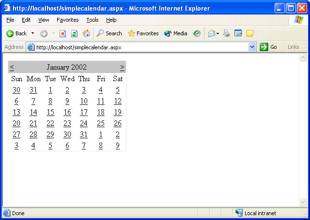 Figure 6-14
Of course, self-respecting developers want controls to be attractive as well as functional. Calendar controls expose a rich assortment of properties and subproperties that allow them to be customized in a variety of ways. Here’s an excerpt from a Web form that uses some of those properties to customize a calendar’s UI:
<asp:Calendar
??DayNameFormat="FirstLetter"
??ShowGridLines="true"
??BackColor="beige" ForeColor="darkblue"
??SelectedDayStyle-BackColor="red"
??SelectedDayStyle-ForeColor="white"
??SelectedDayStyle-Font-Bold="true"
??TitleStyle-BackColor="darkblue"
??TitleStyle-ForeColor="white"
??TitleStyle-Font-Bold="true"
??NextPrevStyle-BackColor="darkblue"
??NextPrevStyle-ForeColor="white"
??DayHeaderStyle-BackColor="red"
??DayHeaderStyle-ForeColor="white"
??DayHeaderStyle-Font-Bold="true"
??OtherMonthDayStyle-BackColor="white"
??OtherMonthDayStyle-ForeColor="lightblue"
??Width="256px" RunAt="Server">
</asp:Calendar>
Among other things, the attributes added to the control tag display one-letter (rather than three-letter) abbreviations for the days of the week, add grid lines, and customize the control’s colors. They even highlight the days in the current month using a different color. Figure 6-15 shows the result.
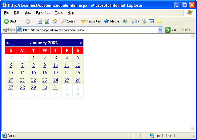 Figure 6-15
Calendar controls fire three kinds of events:
-
SelectionChanged events, which indicate that the user has selected a new date.
-
VisibleMonthChanged events, which indicate that the user has navigated to another month.
-
DayRender events, which fire as the calendar renders individual cells, giving the developer the opportunity to customize each cell’s appearance.
A server-side script can select a date in a Calendar control by writing to the calendar’s SelectedDate property. If “MyCalendar” is a Calendar control, the following statement selects today’s date:
MyCalendar.SelectedDate?=?DateTime.Now;
Similarly, a script can retrieve the currently selected date by reading SelectedDate. The next example responds to SelectionChanged events by writing the date that’s currently selected to a Label control whose ID is “Output”:
<asp:Calendar?ID="MyCalendar" OnSelectionChanged="OnDateSelected"
??RunAt="server" />
????.
????.
????.
<script?language="C#" runat="server">
??void?OnDateSelected?(Object?sender,?EventArgs?e)
??{
??????Output.Text?=?MyCalendar.SelectedDate.ToLongDateString?();
??}
</script>
By default, a Calendar control allows only one day to be selected at a time. You can change that by setting the control’s SelectionMode property, which defaults to Day, to DayWeek, DayWeekMonth, or None. DayWeek allows days or weeks to be selected; DayWeekMonth permits days, weeks, or entire months to be selected; and None prevents anything—even individual days—from being selected. DayWeek adds arrows to the left margin of the calendar for selecting entire weeks. DayWeekMonth adds arrows for selecting weeks and a double arrow for selecting the entire month. Regardless of what the user selects—a day, a week, or a month—the control fires a SelectionChanged event. A server-side script determines which dates are selected by reading the Calendar’s SelectedDates property. SelectedDates is a SelectedDatesCollection containing a list of all the dates that are currently selected. The following example sets the calendar’s SelectionMode to DayWeekMonth and writes the entire array of selected dates to a Label control:
<html>
??<body>
????<form?runat="server"><br>
??????<asp:Calendar?ID="MyCalendar" SelectionMode="DayWeekMonth"
????????OnSelectionChanged="OnDateSelected" RunAt="server" />
??????<br>
??????<asp:Label?ID="Output" RunAt="server" />
????</form>
??</body>
</html>

<script?language="C#" runat="server">
??void?OnDateSelected?(Object?sender,?EventArgs?e)
??{
??????StringBuilder?builder?=?new?StringBuilder?();
??????foreach?(DateTime?date?in?MyCalendar.SelectedDates)?{
??????????builder.Append?(date.ToLongDateString?());
??????????builder.Append?("<br>");
??????}
??????Output.Text?=?builder.ToString?();
??}
</script>
If you run this sample and select the week of January 6, 2002, you’ll see the following output:
Sunday,?January?06,?2002
Monday,?January?07,?2002
Tuesday,?January?08,?2002
Wednesday,?January?09,?2002
Thursday,?January?10,?2002
Friday,?January?11,?2002
Saturday,?January?12,?2002
A server-side script can select a range of dates by calling the SelectRange method on the control’s SelectedDates collection. The following code selects January 1, 2002, through January 3, 2002, and changes the month displayed by the calendar to January 2002 so that the selection can be seen:
DateTime?start?=?new?DateTime?(2002,?1,?1);
DateTime?end?=?new?DateTime?(2002,?1,?3);
MyCalendar.SelectedDates.SelectRange?(start,?end);
MyCalendar.VisibleDate?=?start;
Calendar controls render a lengthy mix of HTML and JavaScript to browsers. Do a View/Source on a page containing a Calendar control and you’ll see what I mean. The JavaScript is necessary to force a postback when the visible month or selection changes. Fortunately, the JavaScript is benign enough to permit Calendar controls to work with virtually any browser that supports client-side scripting.
Whenever I speak about Calendar controls in classes and at conferences, I’m inundated with questions about customization. A typical question is, “Is it possible to restrict the dates the user can select from?” or, “Can I add text or images to individual cells in a Calendar control?” The answer is almost always yes, thanks to DayRender events.
DayRender events are fired for each and every cell that a Calendar control renders. By processing DayRender events, you can customize individual cells (“days”) by inserting your own HTML. The following example displays the word “Christmas” in tiny red letters on December 25 (shown in Figure 6-16):
<asp:Calendar?ID="MyCalendar" ShowGridLines="true"
??OnDayRender="OnDayRender" RunAt="server" />
????.
????.
????.
<script?language="C#" runat="server">
??void?OnDayRender?(Object?sender,?DayRenderEventArgs?e)?
??{
??????e.Cell.Width?=?80;
??????e.Cell.Height?=?64;

??????string?html?=
????????? "<br><font?color=\"red\" face=\"verdana\" size=\"1\">" +
????????? "Christmas</font>";

??????if?(e.Day.Date.Month?==?12?&&?e.Day.Date.Day?==?25)?{
??????????e.Cell.Controls.AddAt?(0,?new?LiteralControl?("<br>"));
??????????e.Cell.Controls.Add?(new?LiteralControl?(html));
??????}
??}
</script>
DayRender event handlers receive DayRenderEventArgs parameters whose Day and Cell properties contain everything a handler needs to customize a calendar cell. Day contains a Date property that identifies the date being rendered. Cell is a TableCell object that provides programmatic access to the corresponding table cell. Cell’s Controls collection exposes the controls defined in the table cell. By default, the Controls collection contains a LiteralControl that renders a number into the cell. The OnDayRender method in the previous example calls AddAt on the Controls collection to insert a line break (<br>) before the number and Add to insert additional HTML after. You could modify this sample to inject images into a Calendar control by emitting <img> tags instead of text.
 Figure 6-16
That’s one example of what you can accomplish with DayRender events. Here’s another. Suppose you want to place a calendar in a Web form but prevent the user from selecting anything other than weekdays. The following DayRender handler demonstrates the solution:
void?OnDayRender?(Object?sender,?DayRenderEventArgs?e)?
{
????e.Day.IsSelectable?=
????????!(e.Day.Date.DayOfWeek?==?DayOfWeek.Saturday?││
????????e.Day.Date.DayOfWeek?==?DayOfWeek.Sunday);
}
How does it work? Day is an instance of CalendarDay, which features a get/set property named IsSelectable that can be set to false to prevent the control from placing a hyperlink in the corresponding cell. This example sets IsSelectable to false for Saturdays and Sundays and true for other days, producing the calendar shown in Figure 6-17. A similar technique can be used to prevent dates prior to today’s date from being selected:
void?OnDayRender?(Object?sender,?DayRenderEventArgs?e)?
{
????e.Day.IsSelectable?=?e.Day.Date?>=?DateTime.Today;
}
A little knowledge of DayRender events goes a long way when it comes to making Calendar controls work the way you want them to.
 Figure 6-17
The Web form shown in Figure 6-18 is the front end for an online ordering service that allows patrons to order Broadway show tickets. It uses a DropDownList, a Calendar, and, for good measure, a graphical ImageButton. Pick a show and a date and your selections appear at the bottom of the Web page.
The program’s source code appears in Figure 6-19. The Calendar control uses a DayRender handler to limit the user to Fridays and Saturdays that occur on or after today’s date and also to highlight selectable dates by painting their background color beige. The code that changes the cell’s background color refrains from acting if the day being rendered is the day selected in the Calendar control. This simple precaution prevents OnDayRender from overriding the colors specified in the control tag with SelectedDayStyle.
 Figure 6-18
<html>
??<body>
????<h1>Showtime</h1>
????<hr>
????<form?runat="server">
??????Pick?a?show:<br>
??????<asp:DropDownList?ID="ShowName" RunAt="Server">
????????<asp:ListItem?Text="Cats" Selected="true" RunAt="server" />
????????<asp:ListItem?Text="Phantom?of?the?Opera" RunAt="server" />
????????<asp:ListItem?Text="Les?Miserables" RunAt="server" />
????????<asp:ListItem?Text="Cabaret" RunAt="server" />
??????</asp:DropDownList>
??????<br><br>
??????Pick?a?date:<br>
??????<asp:Calendar
????????ID="ShowDate"
????????ShowGridLines="true"
????????ForeColor="darkblue"
????????SelectedDayStyle-BackColor="darkblue"
????????SelectedDayStyle-ForeColor="white"
????????SelectedDayStyle-Font-Bold="true"
????????TitleStyle-BackColor="darkblue"
????????TitleStyle-ForeColor="white"
????????TitleStyle-Font-Bold="true"
????????NextPrevStyle-BackColor="darkblue"
????????NextPrevStyle-ForeColor="white"
????????DayHeaderStyle-BackColor="beige"
????????DayHeaderStyle-ForeColor="darkblue"
????????DayHeaderStyle-Font-Bold="true"
????????OtherMonthDayStyle-ForeColor="lightgray"
????????OnSelectionChanged="OnDateSelected"
????????OnDayRender="OnDayRender"
????????RunAt="Server" />
??????<br>
??????<asp:ImageButton?ImageUrl="OrderBtn.gif" OnClick="OnOrder"
????????RunAt="server" />
??????<br><br><hr>
??????<h3><asp:Label?ID="Output" RunAt="server" /></h3>
????</form>
??</body>
</html>

<script?language="C#" runat="server">
??void?OnOrder?(Object?sender,?ImageClickEventArgs?e)
??{
??????if?(ShowDate.SelectedDate.Year?>?1900)
??????????Output.Text?= "You?selected " +
??????????????ShowName.SelectedItem.Text?+ " on " +
??????????????ShowDate.SelectedDate.ToLongDateString?();
??????else
??????????Output.Text?= "Please?select?a?date";
??}

??void?OnDateSelected?(Object?sender,?EventArgs?e)
??{
??????Output.Text?= "";
??}

??void?OnDayRender?(Object?sender,?DayRenderEventArgs?e)
??{
??????e.Day.IsSelectable?=
??????????(e.Day.Date.DayOfWeek?==?DayOfWeek.Friday?││
??????????e.Day.Date.DayOfWeek?==?DayOfWeek.Saturday)?&&
??????????e.Day.Date?>=?DateTime.Today?&&
??????????!e.Day.IsOtherMonth;

??????if?(e.Day.IsSelectable?&&?e.Day.Date?!=?ShowDate.SelectedDate)
??????????e.Cell.BackColor?=?System.Drawing.Color.Beige;
??}
</script>