|
|
< Day Day Up > |
|
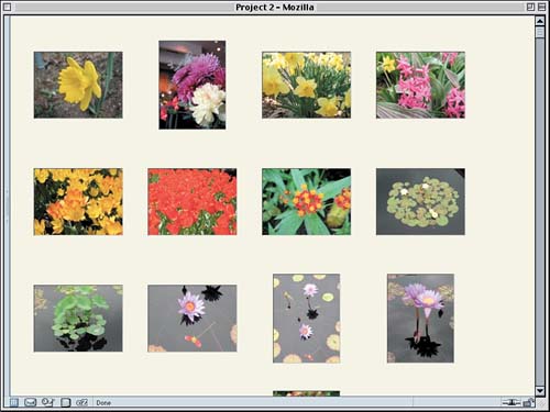
Creating the Gallery ViewAs interesting as the preceding style sheet may be, the drawback is that it doesn't show us what photos are called. This might be a perfect presentation for the artist himself, who probably knows what they're all called and just wants to see everything in a compact form. For visitors, though, it won't be nearly as useful. Therefore, let's turn our slides into a gallery of photos, each one captioned with its title. Removing the Slide StylesTo clear the field, so to speak, we'll want to drop the styles that place the background images into place (see Figure 2.7). This leaves us with the style sheet in Listing 2.2. Listing 2.2. The Reduced Style Sheet
body {background: #EED; margin: 1em;}

div#footer {clear: both; padding-top: 3em;

  font: 85% Verdana, sans-serif;}

div.pic {float: left; height: 130px; width: 130px;

  padding: 15px; margin: 5px 3px;}

div.pic img {border: 1px solid; border-color: #444 #AAA #AAA #444;}

div.ls img {height: 96px; width: 128px; margin: 16px 0;}

div.pt img {height: 128px; width: 96px; margin: 0 16px;}

div.pic ul {display: none;}
Figure 2.7. Stripping out the slide frames.
With this style sheet, we're actually most of the way to where we want to be. The next step is to reveal the titles. Titular RevelationsTo make this happen, we'll need to unhide the ul elements and hide the parts we don't want to see at this point. The unhiding part is simple enough: We remove display: none; from the div.pic ul rule. Of course, that leaves us with an empty declaration block:
div.pic ul {}
This is legal, even if it's kind of useless: The elements will be selected, but no styles will be applied. So let's fill in the blank. We'll set the padding and margins for the ul as well as its font styles.
div.pic ul {margin: 0.25em 0 0; padding: 0;

  font: bold small Arial, Verdana, sans-serif;}
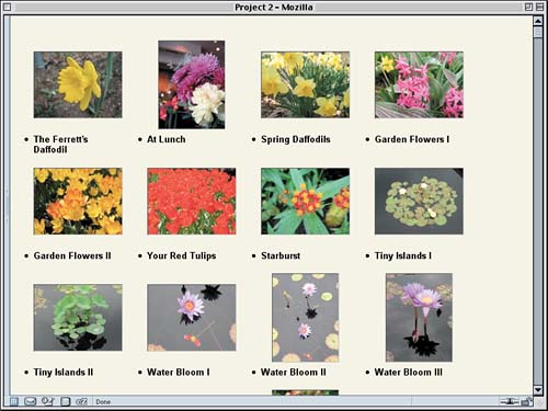
Now the list will be visible again梐ll of it. Since we only want the titles to appear, we'll hide the other list items, as shown in Figure 2.8.
div.pic ul {margin: 0.25em 0 0; padding: 0;

  font: bold small Arial, Verdana, sans-serif;}

li.catno, li.price {display: none;}

</style>
Figure 2.8. Revealing the title while hiding the rest.
Not bad, but there's obviously still some work to do. We'll want to get rid of the bullets since they only serve to distract and look ugly. We could remove them using the property list-style, but on the other hand we could just change the li element so that it's no longer a list item. This would work great, except that IE/Win preserves the bullets, so we'll actually want to do both. While we're at it, we'll center the text.
div.pic ul {margin: 0.25em 0 0; padding: 0;

  font: bold small Arial, Verdana, sans-serif;}

li.title {display: block; list-style: none; text-align: center;}

li.catno, li.price {display: none;}
Now we'll move the titles up close to the images. If you remember, we added margins to the images while creating the "slides" style sheet in the preceding section. That margin is what is pushing the titles away from the landscape images. Note that I say the landscape images. The portrait images have no top or bottom margins. Thus, we really only need to alter the margins on landscape images. Also note something interesting in Figure 2.8: The first lines of the captions in each row all line up. That's an effect worth preserving, so rather than just removing the bottom margin on landscape images, we're going to shift the entire margin to the top.
div.ls img {height: 96px; width: 128px; margin: 32px 0 0;}
So far so good, but there's something we haven't considered yet: the height of the divs. They're still locked at 130px tall plus some padding. All of that together means the captions are in danger of spilling out of the divs. If we add a subtle border to the divs, we can see what's happening without detracting too much from the overall progress we've made, as shown in Figure 2.9. Figure 2.9. We're almost there, but there are some excesses.
Explorer Watch
div.pic {float: left; height: 130px; width: 130px;

  padding: 15px; margin: 5px 3px; border: 1px dotted silver;}
Cleaning UpAt this stage, all we really need to do is increase the height of the divs so that the text has room to fit. Why bother? One reason is that, if we don't, the layout will be broken in Internet Explorer for Windows. Another reason is that, if a long title appears above a portrait image, the chance of overlap is fairly high. A third reason is that it just seems untidy to have elements intentionally sticking out of their parent elements (for the moment, anyway; we'll actually take advantage of that behavior in a later phase of the project). So what we'll do is remove the top and bottom padding of the divs and increase their height. Oh, and remove that dotted border while we're at it.
div.pic {float: left; height: 190px; width: 130px;

  padding: 0 15px; margin: 5px 3px;}
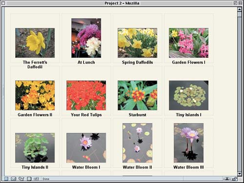
With this change, we've arrived at our gallery style sheet, provided in Listing 2.3 and displayed in Figure 2.10. Figure 2.10. A gallery of garden delights.
Listing 2.3. The Gallery Style Sheet
body {background: #EED; margin: 1em;}

div#footer {clear: both; padding-top: 3em;

  font: 85% Verdana, sans-serif;}

div.pic {float: left; height: 190px; width: 130px;

  padding: 0 15px; margin: 5px 3px;}

div.pic img {border: 1px solid; border-color: #444 #AAA #AAA #444;}

div.ls img {height: 96px; width: 128px; margin: 32px 0 0;}

div.pt img {height: 128px; width: 96px; margin: 0 16px;}

div.pic ul {margin: 0.25em 0 0; padding: 0;

  font: bold small Arial, Verdana, sans-serif;}

li.title {display: block; text-align: center;}

li.catno, li.price {display: none;}
Height and TablesA value of 190px was chosen to give enough room for the captions to be placed even if they go to three lines, but there's a potential flaw lurking there. Suppose the user resizes the text or a caption goes to five or six lines. If either happens, the layout will effectively be broken, with no real way to fix it. This is an inescapable limitation of floated elements. In effect, every element is an island unto itself: Its dimensions are completely free of association with any other element. Put another way, the only elements in all of Web design that will size themselves to match their neighbors are table cells. This means that there are times when a table is the best layout for a photo gallery. If you have a situation in which your captions are of unpredictable length, or if you just want each picture to occupy a box as tall as the tallest one in the row, you'll need to use a table. You can, of course, style the contents of that table using CSS and many of the techniques we've explored here. Another situation in which using a table makes sense is if you want a certain number of images per row, no more or less. It's possible to hack the document structure to do this using CSS, of course. For example, consider this skeleton: <div class="row"> <div class="pic ls">...</div> <div class="pic pt">...</div> <div class="pic ls">...</div> <div class="pic ls">...</div> </div> Tableless Table Layout!
By grouping every four pictures together, we can make sure there are ever only four pictures per row. But why would we bother, when we could just as easily use a table? The markup we just proposed is practically a table as it is. Consider this: <tr> <td class="pic ls">...</td> <td class="pic pt">...</td> <td class="pic ls">...</td> <td class="pic ls">...</td> </tr> The table markup, in this case, is easier, requires fewer characters, and will easily limit the number of pictures per row. That's one of the things tables do. Remember, though, that our original purpose was to allow the pictures to "flow," with each row containing as many images as possible, no matter how wide or narrow the window becomes. Tables can't do that, but floats can. So, as always, choose the tool most appropriate for the job and use it well. |
|
|
< Day Day Up > |
|