|
|
< Day Day Up > |
|
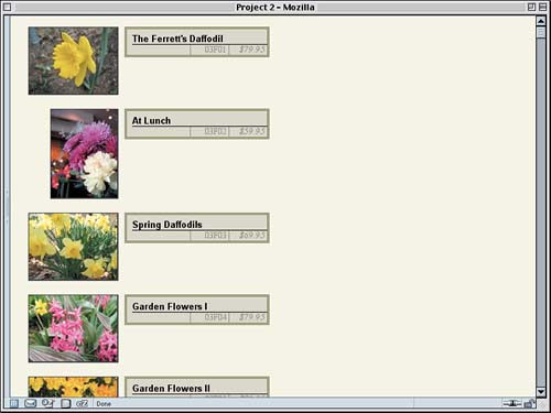
Creating the Catalog ViewNow that we've seen how to create flowing grids of pictures, let's consider a different approach. This time, we'll set up a vertical listing of images, next to each of which will be placed the title, catalog number, and price of the image. To do this, we'll toss out nearly all of the styles we had before and start over. The only things we'll keep are the body and footer styles, as shown in Listing 2.4. We're basically back to where we were at the beginning of the project (see Figure 2.1 for an illustration). Listing 2.4. Starting Nearly from Scratch
body {background: #EED; margin: 1em;}

div#footer {clear: both; padding-top: 3em;

  font: 85% Verdana, sans-serif;}
Floating AgainTo keep the layout from getting too outrageously long, we want to put the title and other information next to each image instead of beneath each one. Getting text next to an image is easy: You float the image. Except in this case, we're going to float the link that contains the image.
div#footer {clear: both; padding-top: 3em;

  font: 85% Verdana, sans-serif;}

div.pic a.tn {float: left;}

</style>
Because the link is floated, the image will come along with it, just as text will come along with a floated div. In both cases, the content gets placed into the float. We'll also add a little styling to the divs, just a small margin and a border to help us see how the layout is progressing. The result is shown in Figure 2.11.
div#footer {clear: both; padding-top: 3em;

  font: 85% Verdana, sans-serif;}

div.pic {margin: 10px; padding: 0; border: 1px dotted gray;}

div.pic a.tn {float: left;}
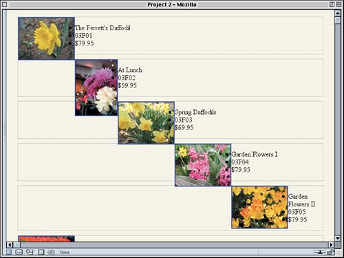
Figure 2.11. Floating can be dangerous if you aren't careful.
Yikes! If we'd meant to do that, then great, no problem; but that's not at all what we want for this layout. What happened? Exactly what we asked to have happen. When you float something, it's removed from the normal flow, which means it doesn't participate in the height of any of its ancestors. Therefore, every div is as tall as its normal-flow content (in this case, the information list). Furthermore, floats start from where they would fall if they were in the normal flow, and then they float to the side. In this case, we're floating left. So the second linked thumbnail started floating from the top of its div and headed to the left. Before reaching the left edge of the layout, it encountered another float (the first link), so it stopped and placed itself to the right of that other float. The same thing happened to the third, the fourth, and so on, each one floating over and stopping to the right of the link that came before it. There are a number of ways we could fix this. If we wanted each picture's div to "stretch around" the floated links, we could also float the divs. In current browsers (and CSS2.1), a floated element will stretch to enclose any floated descendants. However, we don't actually want that here because the dotted borders are going to be removed later. They're really only for diagnostic purposes. How's That Again?
So, instead, we clear each div. Since the floats are all to the left, we can simply clear to the left. We'll also set the width of the divs because we'll want it to be restrained later on.
div.pic {margin: 10px; padding: 0; border: 1px dotted gray;

  clear: left; width: 350px;}
This will push each div below any leftward float that comes before it in the layout條ike floated links, for example梐s shown in Figure 2.12. Figure 2.12. Clearing away the float problems.
Alignment and PlacementIn looking at Figure 2.12, we can see one thing that needs to be fixed: The portrait image doesn't line up with the others. In a table, the image would probably be in its own cell, and we could just right align it, but we aren't afforded the same luxury here. Fortunately, we can just fiddle with the floated link's margin to get the effect we want. We'll just set its width to match the image it contains and set the left margin to make up the difference between its width and the width of landscape links.
div.pic a.tn {float: left;}

div.pt a.tn {width: 96px; margin-left: 32px;}

</style>
Since we've explicitly set the width of portrait links, we may as well go ahead and do it for landscape links. It won't hurt anything, and it might come in handy in the future.
div.pt a.tn {width: 96px; margin-left: 32px;}

div.ls a.tn {width: 128px;}

</style>
Since we're working on the images, let's replace those ugly blue borders with something a little less garish.
div.ls a.tn {width: 128px;}

a.tn img {border: 1px solid #333; border-width: 1px 2px 2px 1px;}

</style>
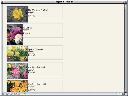
The setting of a thicker right and bottom border will lend a barely noticeable "drop shadow" effect to each image. This can be seen on some of the images in Figure 2.13. Figure 2.13. Lining up and shadowing the images with borders.
If you look closely at Figure 2.13, you'll notice two things. The first is that the text and the image borders are overlapping just a bit. That's because, thanks to the borders we just added, the images are now wider than the floating links that contain them. We should increase their widths to compensate. Actually, let's bump them up to be slightly wider than the images, just for the heck of it.
div.pt a.tn {width: 100px; margin-left: 32px;}

div.ls a.tn {width: 132px;}
The second thing you'll notice is that the list bullets are overlapping the images. This happens due to the way floats work and the way bullets are placed梐nd it doesn't happen in all browsers. If we wanted to keep these as a bulleted list, we might have problem, but we're going to take them away, so it's kind of irrelevant. In fact, let's do that now. Bullet Placement
a.tn img {border: 1px solid #333; border-width: 1px 2px 2px 1px;}

div.pic li {list-style: none;}

</style>
That's good for preventing overlaps, but it still leaves the text right up against the floated links. Let's move the text over a little bit by using a combination of margins and padding. We'll add in a left border just so we can see where the list's border ends up. This will have the result shown in Figure 2.14.
a.tn img {border: 1px solid #333; border-width: 1px 2px 2px 1px;}

div.pic ul {margin: 0 0 0 140px; padding: 0 0 0 0.5em;

  border-left: 1px solid;}

div.pic li {list-style: none;}
Figure 2.14. Margins and padding help separate the text from the linked images.
How did that work? The 140-pixel left margin is actually "sliding beneath" the floated link, extended all the way to the left edge of the div. If you look at the second div in Figure 2.14, you can see the div continuing on to the right of the link. In fact, that happens in all the divs, but only with the portrait links is it really obvious. Improving the ListingsNow that the images and links are all lined up and the lists have been placed so that they're separated from the images a bit, let's turn our attention to the text inside those lists. The first thing we want to do is get rid of those borders since they're starting to get in the way. Thus, the div.pic rule should now look like this:
div.pic {margin: 10px; padding: 0;

  clear: left; width: 350px;}
Similarly, the div.pic ul rule should be altered to read as follows:
div.pic ul {margin: 0 0 0 140px; padding: 0 0 0 0.5em;}
With that done, let's make the titles stand out. Setting them in a bold, sans-serif font would be nice, as would a bottom border. Also, they ought to be shifted downward a bit from the top of the floated links (say, half an em).
div.pic li {list-style: none;}

div.pic li.title {font: bold small Arial, Verdana, sans-serif;

  padding-top: 0.5em; border-bottom: 1px solid;}

</style>
We've made the font size small here because sans-serif fonts look better when they're a little smaller than normal. Just to keep a sense of parallelism, let's make all of the list items' fonts small.
div.pic li {list-style: none; font-size: small;}
Now for the catalog number and price. These aren't as important as the title, so let's fade them into the background by using a darker shade of tan. We'll also right-align them and italicize the price to give it a little extra emphasis (see Figure 2.15).
div.pic li.title {font: bold small Arial, Verdana, sans-serif;

  padding-top: 0.5em; border-bottom: 1px solid;}

div.pic li.catno {color: #776; text-align: right;}

div.pic li.price {color: #776; text-align: right;

  font-style: italic;}

</style>
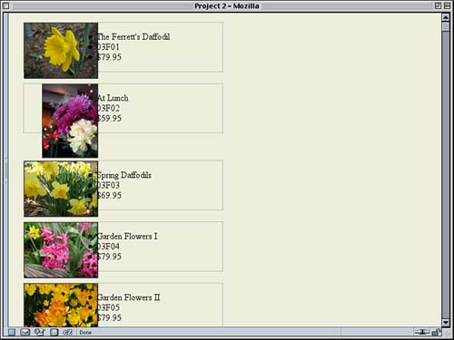
Figure 2.15. The text looks a lot better thanks to some alignment and color.
We could just stop here, but let's keep going. It would be kind of cool if the catalog number and price could sit side by side, wouldn't it? Well, maybe not cool, but more elegant perhaps. At any rate, let's do it. And let's do it without adding any floats to the layout. To make this work, we're going to have to pull the price upward by the height of one line. To make that work, we need to make sure the line heights are equal across browsers and that the catalog number won't be in the way. First we'll regularize the list item heights by explicitly defining a line-height and zeroing out the margin and padding.
div.pic li {list-style: none; font-size: small;

  line-height: 1.2em; margin: 0; padding: 0;}
Now we'll move the catalog number aside. We'll do this by giving it a right margin of 4.5em.
div.pic li.catno {color: #776; text-align: right;

  margin-right: 4.5em;}
Now all we need to do is slide the price up into the space we just created for it. Remember the line-height value? We'll just set a negative top margin equal to that value, and the text will drop into place, as shown in Figure 2.16.
div.pic li.price {color: #776; text-align: right;

  font-style: italic; margin: -1.2em 0 0 0;}
Figure 2.16. Placing text next to text through the magic of margins.
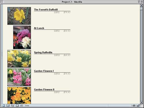
Boxing the InformationLet's take another step toward advanced layout by putting a vertical border to the left of the catalog number, another one between the number and price, and then enclosing the whole set of text information in a box. Explorer Watch To get the borders where we want them, we'll apply very similar styles to the catalog and price list items. The basic idea is to set a width for each one and then push them over as far to the right as needed. We'll do this by setting the left margin to be auto and the rest to be zero. So, for the price, we'll declare:
div.pic li.price {color: #776; text-align: right;

  font-style: italic; margin: -1.2em 0 0 auto;

  width: 4em; border-left: 1px solid;}
Then we'll replace the catalog number's margin-right with a margin declaration and give it the same width and border as we gave the price. You can see this in Figure 2.17.
div.pic li.catno {color: #776; text-align: right;

  margin: 0 4.5em 0 auto;

  width: 4em; border-left: 1px solid;}
Figure 2.17. Placing borders using more margin magic.
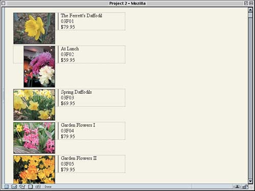
Now to add the box around all the text information梙ere's where things get a little tricky. If we just add a border and background to the ul element, IE6 for Windows will get hopelessly muddled and start making elements disappear for no good reason. So, rather than confuse the poor dear, we'll just hide the offending styles from its sight. Here's how:
div.pic ul {margin: 0 0 0 140px; padding: 0 0 0 0.5em;}

html>body div.pic ul {background: #CCB; border: 3px double #552;}

div.pic li {list-style: none; font-size: small;

  line-height: 1.2em; margin: 0; padding: 0;}
The first part of the selector, the html>body part, is what hides the rule from IE/Win. It's a child selector, which is perfectly valid CSS2 that IE/Win just doesn't understand. More capable browsers do, so they can see and apply those styles. With the addition of the borders, we need to move the price over to the left just a bit so that it isn't right up against the double border. We'll do that with a quick change of its right margin.
div.pic li.price {color: #776; text-align: right;

  font-style: italic; margin: -1.2em 3px 0 auto;

  width: 4em; border-left: 1px solid;}
Finally, let's add some separation between each listing in our Catalog view. We have two choices: We can add a bottom margin to the floated links or to the images inside those links. Adding a top margin to the divs won't work because of the way clear is defined. To avoid a few obscure bugs in Explorer, we'll place the margin on the image. Clear Rules
a.tn img {border: 1px solid #333; border-width: 1px 2px 2px 1px;

  margin: 0 0 1em;}
With that, we've arrived at the style sheet shown in Listing 2.5 and illustrated in Figure 2.18. Listing 2.5. The Complete "Catalog" Style Sheet
body {background: #EED; margin: 1em;}

div#footer {clear: both; padding-top: 3em;

  font: 85% Verdana, sans-serif;}

div.pic {margin: 10px; padding: 0;

  clear: left; width: 350px;}

div.pic a.tn {float: left;}

div.pt a.tn {width: 100px; margin-left: 32px;}

div.ls a.tn {width: 132px;}

a.tn img {border: 1px solid #333; border-width: 1px 2px 2px 1px;

  margin: 0 0 1em;}

div.pic ul {margin: 0 0 0 140px; padding: 0 0 0 0.5em;}

html>body div.pic ul {background: #CCB; border: 3px double #552;}

div.pic li {list-style: none; font-size: small;

  line-height: 1.2em; margin: 0; padding: 0;}

div.pic li.title {font: bold small Arial, Verdana, sans-serif;

  padding-top: 0.5em; border-bottom: 1px solid;}

div.pic li.catno {color: #776; text-align: right;

  margin: 0 4.5em 0 auto;

  width: 4em; border-left: 1px solid;}

div.pic li.price {color: #776; text-align: right;

  font-style: italic; margin: -1.2em 3px 0 auto;

  width: 4em; border-left: 1px solid;}
Figure 2.18. The information presented in catalog style.
|
|
|
< Day Day Up > |
|
