|
|
< Day Day Up > |
|
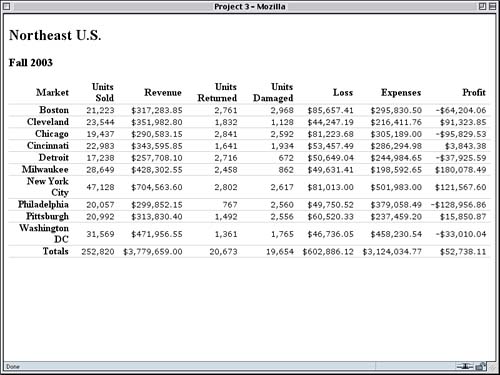
Styling for the ScreenSince all of the users will be accessing the reports via a Web browser, we'll start by creating screen styles. During this phase, we'll leave aside the print-style design goals and just focus on what will be put onto the monitor. Laying the FoundationsAs the basis for our work, we'll be using a report table that's been created for us by the database guys. Its markup is, as we requested earlier, as simple and unadorned as possible. The first few rows of the table are shown in Listing 3.1, and the whole table in its default rendering is shown in Figure 3.1. Listing 3.1. The Table's Beginning<table cellspacing="0" summary="Q3 Financial Results"> <thead> <tr> <th>Market</th> <th>Units Sold</th> <th>Revenue</th> <th>Units Returned</th> <th>Units Damaged</th> <th>Loss</th> <th>Expenses</th> <th>Profit</th> </tr> </thead> <tr> <th>Boston</th> <td>21,223</td> <td>$317,283.85</td> <td>2,761</td> <td>2,968</td> <td>$85,657.41</td> <td>$295,830.50</td> <td>-$64,204.06</td> </tr> <tr> <th>Cleveland</th> <td>23,544</td> <td>$351,982.80</td> <td>1,832</td> <td>1,128</td> <td>$44,247.19</td> <td>$216,411.76</td> <td>$91,323.85</td> </tr> Figure 3.1. The report in its (mostly) unstyled state.
Cell Spacing The first thing to note is that the th elements all have their contents boldfaced and centered. This is the browser's default rendering for th elements, and it can be represented like this:
th {font-weight: bold; text-align: center;}
In fact, many browsers on the market (such as those based on Mozilla) come with a default style sheet that probably contains a rule very much like this one. We'll have to override these default styles to meet our design goals. Revealing Style
The second thing to note is that we have th elements that are supposed to be styled differently but that don't appear to have anything that distinguishes them. So we'll have to take steps to make sure we can tell which th elements have which role and style them accordingly. Finally, we have h2 and h3 elements that come before the table. We'll actually put off styling these until the table's done. That way, we can make sure whatever heading styles we end up writing will fit in with the table's layout. Baseline StylesGiven our design goals, we can do a few things that will apply to all cells in the table, whether they're headers or data. For example, there's the directive that all labels (contained here in the th elements) should be right-justified. Then there's the requirement that the figures line up. These can both be covered, at least to some degree, by right-aligning everything.
<style type="text/css" media="screen">

th, td {text-align: right;}

</style>
This will get us most of the way there but not all the way. For the figures themselves, the periods and commas won't quite line up unless we use an appropriate font. That's because in a proportional font, like Times, each number can be a slightly different width than the others. Unless we convert them to a font that has the same width for every number, the dots and commas won't be in quite the same place. We could pick any monospace font for this, but we'll turn to the ever-popular Verdana instead, because its number glyphs are all the same width梥omething that isn't true of every sans-serif font. Just in case the user doesn't have Verdana available, we'll list some monospace alternatives. Character Alignment
<style type="text/css" media="screen">

th, td {text-align: right;}

td {font: smaller Verdana, "Andale Mono", Courier, "Courier New",

  monospace;}

</style>
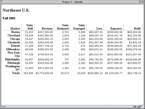
We've made the font's size small because monospace and sans-serif fonts tend to look bigger to the human eye than serif fonts. By setting the size to be smaller, we've counteracted that effect. The final step in our "global" styles is to add a little bit of padding to the sides of the cells. This will keep long numbers from crowding too close to their neighbors.
th, td {text-align: right; padding: 0 0.5em;}
Finally, let's set the row-separator lines at this stage. We'll actually apply a bottom border to all cells and override it where we need to later on.
th, td {text-align: right; padding: 0 0.5em;

  border-bottom: 1px solid #DDD;}
As we can see in Figure 3.2, the numbers are beginning to line up into columns rather nicely, and lines separate all the rows. Figure 3.2. Laying the foundations.
A few things will need to be fixed: Some of the rows are taller than others because of long city names, for example. Tackling the Table LabelsLet's turn our attention to the column headings across the top of the table. We know that these will end up being styled differently than the row headings down the left side. To be able to distinguish the one set of th elements from the other set, we'll make use of the thead element that encloses the table's head row. Doing this will allow us to target styles directly at these cells, and no others.
First let's vertically align the text of the column heads. These headings are usually bottom-aligned. Vertical Variance
td {font: smaller Verdana, "Andale Mono", Courier, "Courier New",

  monospace;}

thead th {vertical-align: bottom;}

</style>
We also need to add vertical lines to separate the column heads and a gray border to separate these headings from the figures in the data cells.
thead th {vertical-align: bottom; border: 1px solid gray;

  border-width: 0 1px 1px 0;}
Because the selector thead th has a higher specificity than the selector th, the border styles from this rule will win out over those we created earlier using the following rule:
th, td {text-align: right; padding: 0 0.5em;

  border-bottom: 1px solid #DDD;}
What's Specificity?
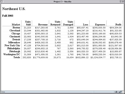
Now we can take similar steps with the left-side labels. For these, we actually only want a gray line that separates the row headings from the data cells. That's simple enough, as Figure 3.3 illustrates.
thead th {vertical-align: bottom; border: 1px solid gray;

  border-width: 0 1px 1px 0;}

th {border-right: 1px solid gray;}

</style>
Figure 3.3. Visually separating the column and row headings.
There are just a couple more things we can do to clean up the layout. Note that two of the rows are taller than the others, thanks to the row headings wrapping to two lines. If we prevent this wrapping, it will make all of the rows the same height. While we're at it, let's de-emphasize the borders between the row headings by making the border less solid.
th {border-right: 1px solid gray; border-bottom-style: dotted;

  white-space: nowrap;}
Having done this, the th elements will not wrap, and that's a problem because it means that all the th elements won't wrap, including the column heads. If we do that, some of the columns will become much too wide, so we counteract the effect for the column heads by updating its styles.
thead th {vertical-align: bottom; border: 1px solid gray;

  border-width: 0 1px 1px 0;

  white-space: normal;}
This will override the nowrap value from the th rule and will thus allow the column head text to wrap, as we can see in Figure 3.4. Figure 3.4. Getting consistent row height through wrap prevention.
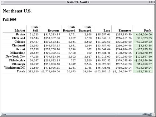
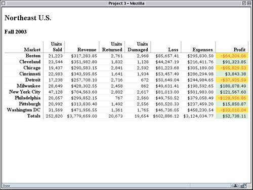
Profit StylesNow that we've dealt with the leftmost column, let's work on the rightmost one. Remember that we have a design goal of visually highlighting the profit figures, even though there's no specific guidance as to what kind of highlighting we should use. Here's the basic problem: We have no way, as the markup now stands, to style the profits differently than any of the other data cells. Let's look at a row of figures: <tr> <th>Cleveland</th> <td>23,544</td> <td>$351,982.80</td> <td>1,832</td> <td>1,128</td> <td>$44,247.19</td> <td>$216,411.76</td> <td>$91,323.85</td> </tr> Each cell looks like every other from a markup point of view, so we have to arrange for a way to tell the profit cells apart from the others. This should do the trick:
<td class="profit">$91,323.85</td>
This has to be done for every profit-column cell, including the th element in the column-heads row. Once these cells all share a class, they can be styled together. This is necessary because HTML tables don't actually contain columns; they only contain rows and cells. The columns are, at best, implied effects that arise from the way the cells in each row line up with each other. Thus, because all the rows in our report table have the same number of cells, the last cell in each row appears to share a column with all the other last cells. From a purely structural point of view, however, there is no column to style. HTML Columns Since we've been given a blank check, so to speak, regarding how to highlight the profit figures, let's give them a green background and separate them with white lines. This will create an interesting "punch-out" effect with regard to the row separators, as we can see in Figure 3.5.
th {border-right: 1px solid gray; border-bottom-style: dotted;

  white-space: nowrap;}

td.profit {background: #CEC; border-bottom-color: white;}

</style>
Figure 3.5. Highlighting our profit figures.
Accentuating the NegativesNow we need to bring attention to the down side of business: the negative profit figures (otherwise known as deficits). We've been told that they have to be red on yellow, but once again, we're faced with the problem of distinguishing the cells containing negative figures from those that don't. Here's one such cell: <td class="profit">-$64,204.06</td> We don't have any way to tell, other than with our own eyes, whether the contents of the cell represent a positive or negative amount. CSS, by its nature, is concerned with styling content based on structure. It doesn't have the capability to style content based on the content itself. So we'll need to add information to the structure itself. Let's do that by adding a neg class to any negative number.
<td class="profit neg">-$64,204.06</td>
Here we're taking advantage of the nature of HTML class values, which are defined to be a space-separated list of one or more words. Even better, we can target each word separately from the others. Thus, we can add a rule that will style any cell with a neg class whether or not it has any other classes.
td.profit {background: #CEC; border-bottom-color: white;}

td.neg {background: #FF3; color: red;}

</style>
This will apply the foreground and background colors we want without overriding any other styles. Note in Figure 3.6 that the negative-figure cells still have a white bottom border. That's coming in from the td.profit rule. Figure 3.6. Drawing attention to our deficits.
In theory, we could create rules that only apply to elements with two or more class words. For example, we might want to style any element that has class values of both profit and neg like this:
td.neg.profit {font-weight: bold;}
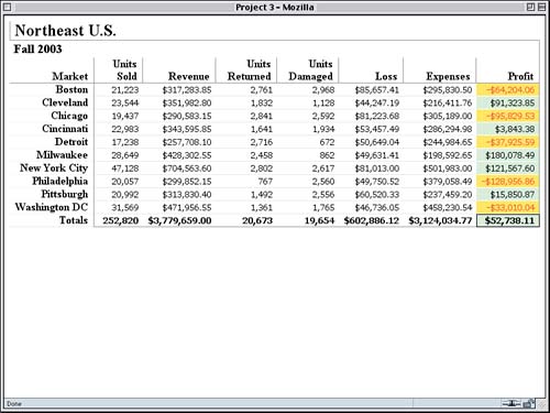
Internet Explorer doesn't handle this syntax very well, so it tends not to be used very often. The styles we used to create Figure 3.6, on the other hand, are supported by Explorer as well as every other modern browser. Total StylesOur last major screen-styling goal is to make the totals visually distinct through boldfacing. To do this, we'll class the row that contains the totals. Table Footers
<tr class="totals">
Now boldfacing the cell contents is a trivially simple matter.
td.neg {background: #FF3; color: red;}

tr.totals td {font-weight: bold;}

</style>
To give the table an extra touch, let's set a solid gray bottom border on the cells and solidify the bottom border on the row heading.
tr.totals td {font-weight: bold; border-bottom: 1px solid gray;}

tr.totals th {border-bottom-style: solid;}

</style>
Finally, we'll put a box around the total profit figure since it's probably the part about which people care the most.
tr.totals td {font-weight: bold; border-bottom: 1px solid gray;}

tr.totals td.profit {border: 1px solid black;}

tr.totals th {border-bottom-style: solid;}
The result of all these changes is shown in Figure 3.7. Figure 3.7. Bringing style to our totals.
This does expose one potential problem with our layout: If the table gets too wide, it will force a horizontal scrollbar. Of course, that's been true of tables since the day they were introduced into the Netscape 1.x line, so it isn't exactly new. With CSS, we have ways to deal with this situation. Some ideas include:
Let's try the last one. We'll introduce a new rule that applies to all the data cells.
th {border-right: 1px solid gray; border-bottom-style: dotted;

  white-space: nowrap;}

td {letter-spacing: -1px;}

td.profit {background: #CEC; border-bottom-color: white;}
We could take similar steps for the column and row headings, but we'll hold off for now. Finishing TouchesThere are a few more things we can do to make the report look better. First, we can put a gray border along the right side of the Profit column.
td.profit {background: #CEC; border-bottom-color: white;

  border-right: 1px solid gray;}
Now let's turn our attention to the h2 and h3 elements that come before the table itself. It would be interesting to have a line extend up from the right side of the table and wend its way between the report title and its date, so we'll do that. We can start by giving both headings a border and stripping off their margins. The result is shown in Figure 3.8.
<style type="text/css">

h2, h3 {margin: 0; border: 1px solid gray;}

th, td {text-align: right; padding: 0 0.5em;

  border-bottom: 1px solid #DDD;}
Figure 3.8. The beginning of style for the table headings.
Obviously, we don't want to leave things this way, so we'll add another rule to take away all of the h2 borders except for the left one, and we'll throw in some left padding while we're at it.
h2, h3 {margin: 0; border: 1px solid gray;}

h2 {border-width: 0 0 0 1px; padding: 0 0 0 0.25em}

th, td {text-align: right; padding: 0 0.5em;

  border-bottom: 1px solid #DDD;}
Now all we have to do is put a top and right border on the h3 and give it a little padding.
h2 {border-width: 0 0 0 1px; padding: 0 0 0 0.25em}

h3 {border-width: 1px 1px 0 0; padding: 0.1em 0.33em;}

th, td {text-align: right; padding: 0 0.5em;

  border-bottom: 1px solid #DDD;}
Because there is no separation between the h3 and the table (because neither has a margin), the right-side border on the h3 will line up with the right-hand border on the last th element in the table's first row. Similarly, the top border of the h3 and the left border of the h2 will come together to create the illusion of a continual line, as we can see in Figure 3.9. Figure 3.9. Visually integrating the headings with the table.
If the threading effect seems undesirable, we could simply remove the border from the h2 element and only put borders on the h3. Also, in order to keep the borders together at wider window widths, we need to add one little rule.
h3 {border-width: 1px 1px 0 0; padding: 0.1em 0.33em;}

table {width: 100%;}

th, td {text-align: right; padding: 0 0.5em;
With that last addition, the style sheet we've created is provided in Listing 3.2. Listing 3.2. The Complete Style Sheet
h2, h3 {margin: 0; border: 1px solid gray;}

h2 {border-width: 0 0 0 1px; padding: 0 0 0 0.25em}

h3 {border-width: 1px 1px 0 0; padding: 0.1em 0.33em;}

table {width: 100%;}

th, td {text-align: right; padding: 0 0.5em;

  border-bottom: 1px solid #DDD;}

td {font: small Verdana, "Andale Mono", Courier, "Courier New",

  monospace;}

thead th {vertical-align: bottom; border: 1px solid gray;

  border-width: 0 1px 1px 0;

  white-space: normal;}

th {border-right: 1px solid gray; border-bottom-style: dotted;

  white-space: nowrap;}

td {letter-spacing: -1px;}

td.profit {background: #CEC; border-bottom-color: white;

  border-right: 1px solid gray;}

td.neg {background: #FF3; color: red;}

tr.totals td {font-weight: bold; border-bottom: 1px solid gray;}

tr.totals td.profit {border: 1px solid black;}

tr.totals th {border-bottom-style: solid;}
|
|
|
< Day Day Up > |
|