|
|
< Day Day Up > |
|
Styling for PrintNow that we've created a style sheet for the screen, it's time to turn our attention to the print styles defined in the project goals. The goals specifically related to print are as follows:
These are in addition to the other project goals, but those have already been satisfied by the style sheet we've written. All we really need to do is override and adjust styles to optimize them for print. Starting OutThe first thing to do is set up a second style sheet. Although it's eventually intended for print styling, this is what we'll add after the previous style sheet: </style> <style type="text/css" media="screen"> </style> </head> The attribute media="screen" is there because we'll be using a Web browser to preview our changes. When we're all done, screen will be changed to print and梙ey presto!梐 print style sheet. A Better Way The other thing we need to do is modify the markup a little bit more so that we can accomplish the alternate-row highlighting called for in the project goals. As of this writing, browsers didn't make it possible to accomplish such things with CSS alone, so we'll need to add some classes to our markup. To be as flexible as possible, we'll use the classes even and odd. Thus, the table will generally have the basic structure shown in Listing 3.3. (The cells were removed from the rows for the sake of brevity.) Listing 3.3. Basic Table Structure<table cellspacing="0"> <thead> <tr>...</tr> </thead> <tbody> <tr class="odd">...</tr> <tr class="even">...</tr> <tr class="odd">...</tr> <tr class="even">...</tr> <tr class="odd">...</tr> <tr class="even">...</tr> <tr class="odd">...</tr> <tr class="even">...</tr> <tr class="odd">...</tr> <tr class="even">...</tr> <tr class="totals">...</tr> </tbody> </table> Row HighlightingNow that we've appropriately classed all the rows (remember that the first row is row 1, and 1 is an odd number), we can go ahead and highlight every other row. We'll choose to highlight the odd rows, as shown in Figure 3.10.
<style type="text/css" media="screen">

tr.odd {background: #EEE;}

</style>
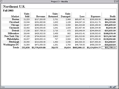
Figure 3.10. Alternate-row highlighting via even and odd classes.
Pretty nifty, but there's a problem. The profit figures aren't taking on the highlighting style, and we want them to do so. We could change the selector from tr.odd to tr.odd td, and that would get the profit cells to take on the highlight in odd rows. Since the city names are actually in th elements, though, they would lose the highlight effect. So we'll use a universal selector to select both. Being More Specific table tr.odd * {background: #EEE;} These simple little changes mean that all elements descended from a tr with a class containing the word odd that's descended from a table element will be selected and thus given a background color of #EEE. Both the th and td elements are descended from the odd rows, so both will be directly selected. This means, however, that the profit cells in the even rows are still being given a green background (from the rule in our first style sheet). We need to override that, with the result shown in Figure 3.11.
table tr.odd * {background: #EEE;}

td.profit, td.neg {color: #000; background: #FFF;}

</style>
Figure 3.11. Extending row highlighting and removing color highlights.
We've managed to remove the background and foreground colors from the profit and negative figures, but a close look at Figure 3.11 reveals another problem. The bottom border of each cell in the Profit column is white, whereas the bottom border of regular cells is still light gray. This made sense when the profit cells had background colors, but now it looks kind of ugly. Background Printing Because we have the alternate rows highlighted, we have the option to remove the borders between rows altogether, but instead we'll make them consistent with the highlight color used for alternate rows.
table tr.odd * {background: #EEE;}

tr.odd *, tr.even * {border-bottom: 1px solid #EEE;}

td.profit, td.neg {background: #FFF;}
This will ensure that, even if backgrounds aren't printed, the rows will have some visual separation. We should also drop in the column separators called for in the design goals.
tr.odd *, tr.even * {border-bottom: 1px solid #EEE;}

td {border-right: 1px solid #CCC;}

td.profit, td.neg {color: #000; background: #FFF;}
By placing the border on the right side of every td element, we get column separators. In cases like the profit cells, there is already a right border defined by a rule with a more specific selector (td.profit), so this latest rule won't change them. Speaking of the Profit column, we still need to make the profit figures stand out in a visual sense since that's one of the design goals. We've taken away the backgrounds, so let's boldface the numbers instead. We'll also italicize the negative numbers, as the goals require. This is illustrated in Figure 3.12.
td.profit, td.neg {color: #000; background: #FFF;}

td.profit {font-weight: bold;}

td.neg {font-style: italic;}

</style>
Figure 3.12. Drawing attention to both the profits and negative numbers.
The Totals RowThe last thing we'll do is clean up the Totals row. We're doing this mostly to make the final result look better, not because it's part of the explicit design goals. In examining Figure 3.12, we can see that a quick way to make the Totals row stand out a little more would be to add a solid top border. We'll make sure this applies to both td and th elements in the row.
td.neg {font-style: italic;}

tr.totals * {border-top: 1px solid gray;}

</style>
It might also be a good touch to remove the bottom border from the "Totals" cell since it's left sort of hanging in midair. And, as a last little touch, let's use uppercase to the word "TOTALS."
tr.totals * {border-top: 1px solid gray;}

tr.totals th {border-bottom: none; text-transform: uppercase;}

</style>
Thanks to text-transform, we've changed the capitalization of the text without having to touch the HTML source. In this case, we can make use of it because the cell in question contains actual letters梪ppercasing numbers generally doesn't have any useful effect. We can see the results in Figure 3.13. Figure 3.13. Putting on the finishing touches.
With that done, we're ready to have these styles apply only when printing. All we need to do is go back to the beginning of our second style sheet and change screen to print, as previously described. This last change is shown in Listing 3.4, which shows both style sheets we've created. Styles in All Media
Listing 3.4. Both Style Sheets Together
<style type="text/css">

h2, h3 {margin: 0; border: 1px solid gray;}

h2 {border-width: 0 0 0 1px; padding: 0 0 0 0.25em}

h3 {border-width: 1px 1px 0 0; padding: 0.1em 0.33em;}

th, td {text-align: right; padding: 0 0.5em;

  border-bottom: 1px solid #DDD;}

td {font: small Verdana, "Andale Mono", Courier, "Courier New",

  monospace;}

thead th {vertical-align: bottom; border: 1px solid gray;

  border-width: 0 1px 1px 0;

  white-space: normal;}

th {border-right: 1px solid gray; border-bottom-style: dotted;

  white-space: nowrap;}

td {letter-spacing: -1px;}

td.profit {background: #CEC; border-bottom-color: white;

  border-right: 1px solid gray;}

td.neg {background: #FF3; color: red;}

tr.totals td {font-weight: bold; border-bottom: 1px solid gray;}

tr.totals td.profit {border: 1px solid black;}

tr.totals th {border-bottom-style: solid;}

</style>

<style type="text/css" media="print">

table tr.odd * {background: #EEE;}

tr.odd *, tr.even * {border-bottom: 1px solid #EEE;}

td {border-right: 1px solid #CCC;}

td.profit, td.neg {color: #000; background: #FFF;}

td.profit {font-weight: bold;}

td.neg {font-style: italic;}

tr.totals * {border-top: 1px solid gray;}

tr.totals th {border-bottom: none; text-transform: uppercase;}

</style>
|
|
|
< Day Day Up > |
|