|
|
< Day Day Up > |
|
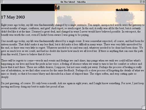
Style at DawnFor the first half of this project, we'll take the first of the two documents and add the styles necessary to create translucent effects using ordinary JPEG images. As we'll soon see, the images in question make it fairly easy to create an attractive design. Getting StartedAs usual, our first step should be to look at the structure of the document. As we can see from Listing 4.1, there isn't a whole lot to it really, just a masthead div with a heading and a "main" div containing the text of the entry. Without any styles, we get the very plain rendering shown in Figure 4.1. Listing 4.1. The Basic Document Structure<div id="masthead"> <h1>Mourning in Mansfield</h1> </div> <div id="main"> <h2>17 May 2003</h2> [...entry text...] </div> Figure 4.1. The journal entry in its unstyled state.
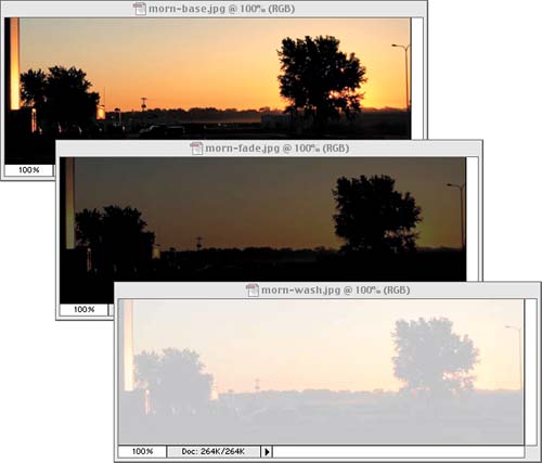
Now, with nothing more than what we already have in the document and some background images, we need to create a tasteful design that makes use of translucent effects. To aid us in this goal, we have the three images shown in Figure 4.2: a basic image (morn-base.jpg), a faded version of that same image (morn-fade.jpg), and a washed-out version (morn-wash.jpg). Figure 4.2. The three background images we have at our disposal.
To lay the groundwork, the first thing we want to do is strip the "gutter" from the body element itself. We'll do that with a familiar rule:
<style type="text/css">

body {margin: 0; padding: 0;}

</style>
The next thing to do is drop an image into the body's background. It's important to choose the right one since the background color will have to match the background image, and the body background is the one that will be seen throughout most of the design. For maximum readability, we'll pick the washed-out version of the image for the body. A quick check with a color-sampling tool reveals that the background value is a shade of gray that's 71% white, so we'll do the following:
body {margin: 0; padding: 0;

  background: rgb(71%,71%,71%) url(morn-wash.jpg);}
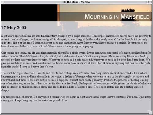
Words Instead of Numbers That's a start, but we'll need more. As this rule stands, the image will start out in the upper-left corner of the body's background and will tile infinitely both horizontally and vertically. For our design, we want the image to appear once and not repeat, and we want to place it in the top-right corner. We can do that by adding just a bit more to the background declaration, with the result shown in Figure 4.3.
body {margin: 0; padding: 0;

  background: rgb(71%,71%,71%) url(morn-wash.jpg) 100% 0 no-repeat;}
Figure 4.3. Starting out with some basic styles for the body element.
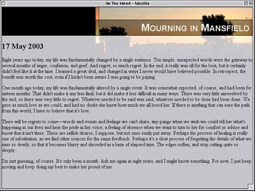
Masthead StylesThe document's masthead is next to fall under our scrutiny. We'll apply the basic background image (morn-base.jpg) to the masthead itself, but let's consider for a moment exactly how. Our aim is to have the background images line up with each other to create the illusion of translucency. To make that happen, we'll need to make sure the masthead's top edge is lined up with the body's top edge. We'll also need to get the background image to not repeat and to sit in exactly the same place as the body's. Thus, the values 100% 0 and no-repeat are going to make another appearance. A quick run through a color sampler gives us the background color we need to match the image.
body {margin: 0; padding: 0;

  background: rgb(71%,71%,71%) url(morn-wash.jpg) 100% 0 no-repeat;}

#masthead {background: rgb(2%,4%,4%) url(morn-base.jpg)

 100% 0 no-repeat;}

</style>
There is one more thing that needs to be done: We need to take the margins off the h1 element inside the masthead div. If we don't, the margins will actually stick out of the div in CSS-conformant browsers, which will push the top edge of the div down from the top of the document. By removing the margins, we get the result shown in Figure 4.4.
#masthead {background: rgb(2%,4%,4%) url(morn-base.jpg)

  100% 0 no-repeat;}

#masthead h1 {margin: 0;}

</style>
Figure 4.4. A different background image is added to the masthead.
Thanks to the masthead and body lining up along the top edge, their backgrounds do the same thing, which gives us exactly the kind of effect we wanted. Although the masthead's background is actually "on top" of the body's, it looks as if there is a grayish translucent layer between us and the "page background." It's an illusion, but a very useful one! Of course, we can't leave things as they are. The heading text is now basically black on a black background, so it isn't very readable. Let's change its color to a light color that reflects the "sunrise" theme and update its font styling to look a little more professional.
#masthead h1 {margin: 0;

  color: #EED;

  font: small-caps bold 2em/1em Arial, sans-serif;}

</style>
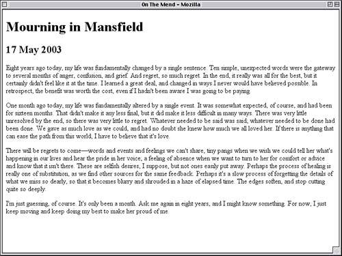
The font-size and line-height values were actually chosen with some care. By setting the font-size of the h1 to 2em, we've made the text twice as big as its parent element, the #masthead div, which inherits its font-size value from its parent, the body. With the line-height value of 1em, we've defined the height of the h1's content to be exactly equal to its font-size. Default Line Heights Actually, now that we've cleaned up the masthead text, it might be nice to increase the height of the masthead by dropping some top padding on the masthead div.
#masthead {padding: 2.5em 0 0;

  background: rgb(2%,4%,4%) url(morn-base.jpg) 100% 0 no-repeat;}
By doing this, we're basically wedging a space between the top border of the masthead div and the top margin edge of the h1. By making the top padding value 2.5em, we allow the spacing to stay in proportion to any changes in text size, no matter how they happen. With this done, we can see a lot of improvement in Figure 4.5, although we aren't home free just yet. Figure 4.5. Padding the masthead and styling the heading bring drastic improvements.
The light text is now on a background that's mixed light and dark, which will make the text very difficult to read no matter what color we assign. We could put the text over to the right side so that it's more over the light portion of the background, but the dark tree will still prevent us from changing the text to be dark. What we need is a background for the heading itself that's more consistent, and fortunately, we already have one: morn-fade.jpg. We can add that to the background of the h1 element.
#masthead h1 {margin: 0;

  background: rgb(4%,4%,4%) url(morn-fade.jpg) 100% 0 no-repeat;

  color: #EED;

  font: small-caps bold 2em/1em Arial, sans-serif;}
Since we now have a darker background for our light text, we can actually shift it over to the right side of the design. At the same time, we'll pad out the h1 element a little bit so that the text doesn't get too close to the edge of the dark area.
#masthead h1 {margin: 0; padding: 0.25em 0.33em;

  background: rgb(4%,4%,4%) url(morn-fade.jpg) 100% 0 no-repeat;

  color: #EED;

  font: small-caps bold 2em/1em Arial, sans-serif;

  text-align: right;}
The quarter-em top and bottom padding will nicely center the text in the dark background, and the third-em padding on the right and left will keep the title text from getting too cozy with the edge of the browser window, as illustrated in Figure 4.6. Figure 4.6. The third background is added, although it's out of alignment.
Whoops梩here's a problem. The background image we just added isn't lining up with the other images, and this is creating a discontinuous tree. That's because the top edge of the h1's background area isn't lined up with the tops of the other two. We could fix this by moving the h1 to the top of the page, but that wouldn't look very good. Instead, let's bring the h1's background into alignment with the others but leave the element where it is now. To pull this off, we'll have to do a little math. We know that the h1's top edge is 2.5em from the top of the masthead, thanks to the top padding we gave the masthead div. However, the h1's font-size is twice that of the masthead div's, due to the 2em value in the font declaration, so we have to divide that number in half to get the right offset. Therefore, if we position the background image of the h1 so that its top edge is actually ?.25em above the top edge of the h1's background area, then all the backgrounds should line up. Measuring Ems
#masthead h1 {margin: 0; padding: 0.25em 0.33em;

  background: rgb(4%,4%,4%) url(morn-fade.jpg) 100% -1.25em no-repeat;

  color: #EED;

  font: small-caps bold 2em/1em Arial, sans-serif;

  text-align: right;}
One more touch should make the masthead look more polished, and that's a solid black border along the top and bottom of the dark background. However, doing this means that the background area of the h1 will be effectively shifted downward by a pixel (thanks to the top border), which will cause the images to go out of alignment in CSS-conformant browsers. We can fix that with a negative one-pixel top margin.
#masthead h1 {margin: -1px 0 0; padding: 0.25em 0.33em;

  background: rgb(4%,4%,4%) url(morn-fade.jpg) 100% -1.25em no-repeat;

  color: #EED; border: 1px solid black; border-width: 1px 0;

  font: small-caps bold 2em/1em Arial, sans-serif;

  text-align: right;}
There's just one problem: IE/Win goes completely bonkers when the negative margin is introduced. So we'll actually need to change the margin back to what it was, and use another of IE's bugs against it to hide the negative margin.
#masthead h1 {margin: 0; padding: 0.25em 0.33em;

  background: rgb(4%,4%,4%) url(morn-fade.jpg) 100% -1.25em no-repeat;

  color: #EED; border: 1px solid black; border-width: 1px 0;

  font: small-caps bold 2em/1em Arial, sans-serif;

  text-align: right;}

html>body #masthead h1 {margin: -1px 0 0;}

</style>
Thanks to the html>body part of that rule, Explorer will just skip right over the new rule. Other browsers, such as Safari, Opera, and Gecko-based browsers like Mozilla, will understand and apply the rule. Thus, we get a good cross-browser layout. Although these new styles may be off by a pixel in some browsers, it's an acceptable price to pay. The difference will hardly be noticeable one way or the other, as Figure 4.7 illustrates. Figure 4.7. With a little negative positioning, the backgrounds are lined up nicely.
Cleaning UpAt this stage, the masthead is pretty well in hand; all that remains is to clean up the entry itself. Since the text doesn't have much to do with our background-alignment project, we'll just drop in all the styles at once. With some margins on the main div, no margins and a font-size for the h2, and some massaged margins for the paragraphs, we should be all set.
html>body #masthead h1 {margin: -1px 0 0;}

#main {margin: 1.25em 5em 0 5em;}

#main h2 {margin: 0; font-size: 1.25em;}

#main p {margin: 0.5em 0 1em;}

</style>
Thus, we arrive at the complete set of styles provided in Listing 4.2 and illustrated by Figure 4.8. Listing 4.2. The Full Style Sheet
body {margin: 0; padding: 0;

  background: rgb(71%,71%,71%) url(morn-wash.jpg) 100% 0 no-repeat;}

#masthead {padding: 2.5em 0 0;

  background: rgb(2%,4%,4%) url(morn-base.jpg) 100% 0 no-repeat;}

#masthead h1 {margin: 0; padding: 0.25em 0.33em;

  background: rgb(4%,4%,4%) url(morn-fade.jpg) 100% -1.25em no-repeat;

  color: #EED; border: 1px solid black; border-width: 1px 0;

  font: small-caps bold 2em/1em Arial, sans-serif;

  text-align: right;}

html>body #masthead h1 {margin: -1px 0 0;}

#main {margin: 1.25em 5em 0 5em;}

#main h2 {margin: 0; font-size: 1.25em;}

#main p {margin: 0.5em 0 1em;}

#masthead h1 is missing the margin declaration from above. Should read:

#masthead h1 {margin: -1px 0 0; (and so forth) - DS
Figure 4.8. The completed journal styles.
To a degree, our job in this part of the project was easy because two of the three elements with backgrounds lined up along the top edge. Because that was the case, we could give two of the background images exactly the same position values, and the third only required a vertical offset. Suppose, however, that we want to set up a translucency effect similar to those we've explored, but none of the element tops line up with each other. Given such a situation, we'd need to do a little more math and be careful about the length units we use. Let's move to the second document in our project and see how to handle such issues. |
|
|
< Day Day Up > |
|