|
|
< Day Day Up > |
|
Beached StylesIn this half of the project, we'll take a new document with a slightly different structure and give it a translucent-effect makeover. We'll use the principles explored in the first half of the project, but we'll use them in a more sophisticated way because in this document none of the elements will line up along the top edge. Assessing Structure and StyleAs always, our first order of business is to scout out the lay of the land, so to speak, by examining the document structure and any styles that may already exist. The basic structure looks like this:
<div id="main">

  <h1>Gathering Stormclouds</h1>

  <div id="content">

    [...content...]

  </div>

</div>
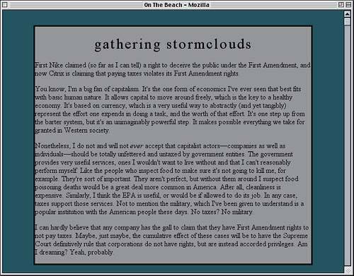
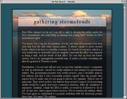
As it happens, there's already a basic style sheet embedded with the document, and this leads to the result shown in Figure 4.9.
<style type="text/css">

body {margin: 0; padding: 0;

  background: rgb(14%,26%,30%);}

#main {width: 600px; margin: 2em auto;

  border: 3px solid black;}

</style>
Figure 4.9. Basic, if dark, beginnings for our new document.
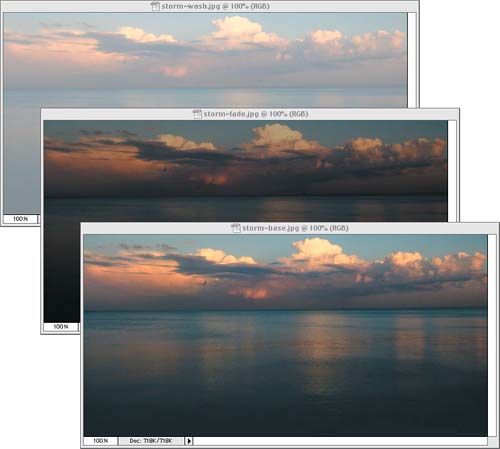
Auto-Margins Of course, we'll be filling in other backgrounds, so the text will be more legible by the time we're done. We've just set up these styles to start so that we can dive into the background positioning. Now we need to use each of the three images shown in Figure 4.10: a basic image (storm-base.jpg), a faded version of that same image (storm-fade.jpg), and a washed-out version (storm-wash.jpg). Figure 4.10. The background images we have at our disposal.
For this design, we aren't going to apply any of these images to the body element. Instead, we'll use the main div and some of its descendants, but first let's style the text and place the elements. Title StylesThe first thing we ought to do in setting up text and element styles is temporarily give the main div a background color. This will make it easier to see what we're doing.
#main {width: 600px; margin: 2em auto;

  border: 3px solid black;

  background: gray;}  /* temporary background */
Now we can get down to design. For the title of the page, we'll give it some size and height styles copied from the layout in the first half of the project.
#main {width: 600px; margin: 2em auto;

  border: 3px solid black;

  background: gray;}

#main h1 {font: 2em/1em "Times New Roman", serif;}

</style>
Quoted Fonts
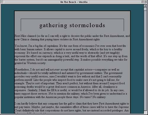
This will, as before, set the h1's text in relation to its parent (in this case, div#main) and make sure its line-height is exactly equal to its font-size. We'll also center and lowercase the text and spread out the letters just a bit, as demonstrated by Figure 4.11.
#main h1 {font: 2em/1em "Times New Roman", serif; letter-spacing: 0.1em;

  text-transform: lowercase; text-align: center;}
Figure 4.11. A temporary background helps us see the changes to the page title.
Having the title all jammed up against the edges of the box feels a little claustrophobic, so let's add some margins to the h1.
#main h1 {font: 2em/1em "Times New Roman", serif; letter-spacing: 0.1em;

  text-transform: lowercase; text-align: center;

  margin: 1.25em 1em 0;}
To give some definition to the area of the design that holds the text, it might look kind of cool to add some thin borders around the title and the content. We'll start with the title but have borders appear only on the top, right, and left sides.
#main h1 {font: 2em/1em "Times New Roman", serif; letter-spacing: 0.1em;

  text-transform: lowercase; text-align: center;

  margin: 1.25em 1em 0;

  border: 1px solid black; border-bottom: none;}
Of course, this means that the title text is up against a border again, so we'll add in some padding.
#main h1 {font: 2em/1em "Times New Roman", serif; letter-spacing: 0.1em;

  text-transform: lowercase; text-align: center;

  margin: 1.25em 1em 0; padding: 0.5em 0.25em;

  border: 1px solid black; border-bottom: none;}
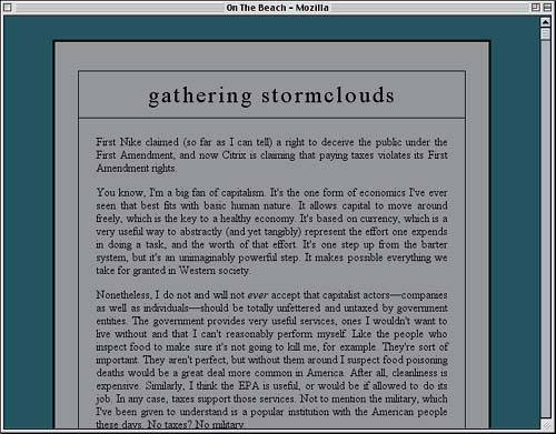
You may have noticed that we're sticking to margin and padding values that are evenly divisible by 0.25. This will make it much easier to do the math that's looming near the end of the project. In the meantime, let's see where we are now (see Figure 4.12). Figure 4.12. The addition of margins, padding, and a border makes the title stand out.
Content StylesBringing the main content of the page into line with the title shouldn't be too difficult. The first step is simple enough: We'll add a border to the content div that encloses all the text.
#main h1 {font: 2em/1em "Times New Roman", serif; letter-spacing: 0.1em;

  text-transform: lowercase; text-align: center;

  margin: 1.25em 1em 0; padding: 0.5em 0.25em;

  border: 1px solid black; border-bottom: none;}

#content {border: 1px solid black;}

</style>
That isn't sufficient, of course. If we left things there, the content div would be as wide as the main div, and the edges wouldn't line up with the edges of the title. Thus, we'll need to give the content div some margins. But how big? Well, the h1 was given a top margin 1.25em tall and side margins 1em wide. Recall, however, that the font-size value of the h1 is 2em. Since its em-based margins are calculated with respect to its calculated font-size, this means that we'll need to double the values for margins on our content div. That gives us 2em right and left margins and a 2.5em bottom margin. Since we want the content border right up against the title, that means no top margin.
#content {margin: 0 2em 2.5em;

  border: 1px solid black;}
As with the title, we don't want the content text getting too close to the borders around it. We could double the padding used on the title, but instead, let's give the content div a generous padding of an em and a half.
#content {margin: 0 2em 3em; padding: 1.5em;

  border: 1px solid black;}
Finally, let's add some styling to the content text. The first thing is to take the top margin off of all the paragraphs; this will ensure that the first paragraph is as close to the top of the content div as the div's padding will allow while still keeping all paragraphs separated by an em. We'll also fully justify the text, as seen in Figure 4.13.
#content {margin: 0 2em 3em; padding: 1.5em;

  border: 1px solid black;}

#content p {margin: 0 0 1em; text-align: justify;}

</style>
Figure 4.13. The main content integrates with the title.
At this point, we've done enough that we can start adding in the background images. So let's get started! Adding the BackgroundsLooking at the design in Figure 4.13 and the images we have available, let's take this approach: The main div will get the basic image (storm-base.jpg), the title will get the washed-out image, and the content div will get the faded image. This will necessitate changing the text color to something light, but we'll get to that in a minute. First, here's the main div's background. Top Left Zeroes
#main {width: 600px; margin: 2em auto;

  border: 3px solid black;

  background: rgb(7%,13%,15%) url(storm-base.jpg) 0 0 no-repeat;}
Next, we'll add a background to the title.
#main h1 {font: 2em/1em "Times New Roman", serif; letter-spacing: 0.1em;

  text-transform: lowercase; text-align: center;

  margin: 1.25em 1em 0; padding: 0.5em 0.25em;

  border: 1px solid black; border-bottom: none;

  background: url(storm-wash.jpg) 0 0 no-repeat;}
Finally, the content div gets its background.
#content {margin: 0 2em 2.5em; padding: 1.5em;

  border: 1px solid black;

  background: rgb(4%,8%,9%) url(storm-fade.jpg) 0 0 no-repeat;}
Alert readers will already have caught the problem: All of these elements set the background to start in their upper-left corner, but the elements don't line up. This means the backgrounds won't line up either, as we can see in Figure 4.14. Figure 4.14. The backgrounds make their appearance, but they don't line up yet.
So now we have to figure out the offsets needed to get the background images to line up. The main div can be left alone, of course, so we'll work on the title first. It's actually pretty simple. We know that it has a top margin of 1.25em and a left margin of 1em, so those are the offsets we'll use because the em for margins is the same em that's used for background offsets.
#main h1 {font: 2em/1em "Times New Roman", serif; letter-spacing: 0.1em;

  text-transform: lowercase; text-align: center;

  margin: 1.25em 1em 0; padding: 0.5em 0.25em;

  border: 1px solid black; border-bottom: none;

  background: url(storm-wash.jpg) -1em -1.25em no-repeat;}
Position and Order For the content div, the situation is a bit more complicated. The horizontal offset is easy: It's 2em, the same as the left margin. For the vertical, though, we have to figure out how far it is from the top of the content div to the top of the main div. Most of that distance is occupied by the h1 element, so let's figure it out first. Within its own frame of reference, the content of the h1 is effectively 1em tall, and it has top and bottom padding of 0.5em. It also has a top margin of 1.25em (and no bottom margin), and all that together adds up to 3.25em tall. We have to double that, remember, because of the doubled font-size of the h1. Therefore, in terms of the content div's ems, the h1 is 6.5em tall. With that information and a light red color in hand, we can update the rule appropriately.
#content {margin: 0 2em 2.5em; padding: 1.5em;

  border: 1px solid black;

  color: rgb(210,185,150);

  background: rgb(4%,8%,9%) url(storm-fade.jpg) -2em -6.5em no-repeat;}
That should do it梠r should it? We've forgotten one thing: the top borders of the h1 element and the content div, which cause a 2-pixel push downward for the background area of the content div. In fact, the h1's background is also offset by a pixel, but we can let it slide since it isn't nearly as noticeable. As it turns out, Explorer has forgotten those two pixels as well. Thanks to the way it places background images, the backgrounds already line up. So, if we were to change the offset to fix alignment in CSS-conforming browsers, the alignment would be thrown off in Explorer. So here's what we'll do: We'll leave the rule as it is and add in a new one that Explorer won't understand but more current browsers will.
#content {margin: 0 2em 2.5em; padding: 1.5em;

  border: 1px solid black;

  color: rgb(210,185,150);

  background: rgb(4%,8%,9%) url(storm-fade.jpg) -2em -6.5em no-repeat;}

html>body #content {margin-top: -2px;}

#content p {margin: 0 0 1em; text-align: justify;}
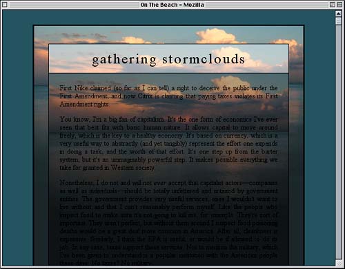
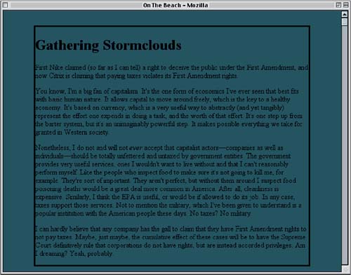
As in the previous half of the project, Explorer will just skip right over the rule we've just added. Other browsers, such as Safari, Opera, and Gecko-based browsers like Mozilla, will understand and apply the rule. Thus, we get a good cross-browser layout, as shown in Figure 4.15. Figure 4.15. The backgrounds are now lined up quite nicely.
Pros and ConsAs powerful as this technique can be visually, it does make for pages that are weightier than they might otherwise be. In addition to the HTML and CSS, designs like this also require the loading of multiple backgrounds, most of which will only be seen in part. Thus, some of the bandwidth required for the page to download might be considered wasted since it contains image portions that the user will not see. This is admittedly a drawback and one worth considering. In the examples used for this project, the background images were not too large, plus the faded and washed-out versions were highly compressed, which kept the weight down. A design that relied on five variations of a background image, with each one 800x600 or bigger, would create a monstrously weighty page! Downloading full images and placing them as we did in this project carries a benefit: If the text in the document is resized, the translucency effects will still hold true (that is, unless text starts wrapping in unexpected ways). For example, in the "stormclouds" example, if the title text wrapped to two or more lines, the alignment of the content div would be thrown off quite a bit. We could in theory avoid the problem with fixed-attachment backgrounds, but Explorer for Windows doesn't support such techniques. Fixed-Background Layout
We could also get around the alignment problems caused by wrapping text with a simple change in structure. Instead of putting the content div after the h1, we could put the h1 inside the content div. This, along with a suitable rearrangement of the CSS, would prevent misalignment if the title text ends up wrapping to multiple lines. A much simpler and less weighty approach, at least in cases in which you want to lighten or darken a background, is to use semi-opaque PNG graphics for the elements that need to be faded or lightened. The problem, again, is Explorer for Windows, which supports PNG images but not the alpha channel, which wrecks the translucency. Instead, Explorer just shows a fully opaque version of the PNG. It's also the case that you can really only achieve lightening or darkening effects with PNGs, which limit the range of visual effects. With the offset-alignment approach we've discussed, you could use a basic image, one with the image contours traced, and another with a rippled-glass effect. At any rate, it's important to employ the techniques explored in this project with care. They are most often useful in situations such as mastheads, section titles, or other places where the content is short and the area to be decorated is both wide and short. |
|
|
< Day Day Up > |
|