|
|
< Day Day Up > |
|
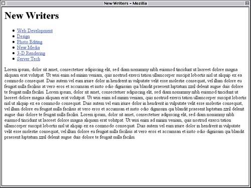
Laying the GroundworkThe template page for our project is pretty bare, as Figure 7.1 reveals. Figure 7.1. The unstyled template document.
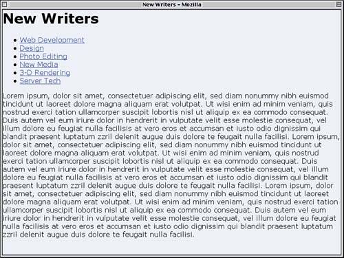
Before we get to work on the navigation elements, let's style the rest of the template. That will give us a framework for our button styles. The first step is to style the overall document itself, in effect writing "global" styles that will apply to the document and all its constituent elements. We'll do this by removing any "gutter space" around the edges of the document, setting foreground and background colors, and defining a list of possible fonts for the html and body elements. <style type="text/css"> html, body {margin: 0; padding: 0; color: #000; background: #EEF; font-family: Verdana, Arial, sans-serif;} </style> Why did we style both elements? For the same reason we set both padding and margins to zero梬e're covering our bases. Although all known browsers enforce "gutter spacing" with either margins or padding on the body, it's possible that a browser might use padding on the html element instead. Since it only requires six more characters to make sure, we added html to the mix. As we can see in Figure 7.2, the result is just what we wanted. Figure 7.2. Setting the "global" styles for the document.
Gutter Sniping
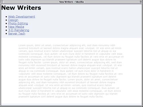
Let's next turn our attention to the main content. What we have is basically filler, meant to hold open space without being exactly representative of how a page will look. Nonetheless, we'll make the font size small because it will be in the final product. We'll also set a white background and a light gray foreground. This will visually de-emphasize the text without removing it entirely from sight.
html, body {margin: 0; padding: 0;

  color: #000; background: #EEF;

  font-family: Verdana, Arial, sans-serif;}

#main {font-size: small; color: #AAA; background: #FFF;}

</style>
The only real problem is that the text runs all the way out to the edges of the white background. Since this is just placeholder text, let's give it some distance from the edges of the main div. We can do this by adding some padding to the div itself, as shown in Figure 7.3.
#main {font-size: small; color: #AAA; background: #FFF;

  margin: 0; padding: 2.5% 12.5%;}
Figure 7.3. The main content gets a bit of style.
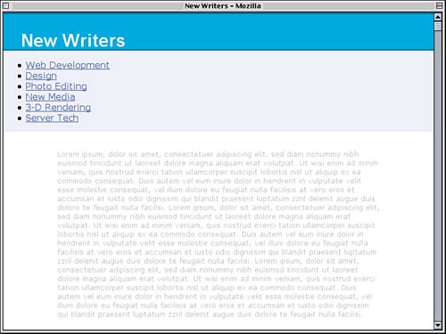
Now for the main title ("New Writers"). Marketing has told us we need to put white text over a particular blue, so we'll do that at the same time as we set the font size and family. The Height in Font
html, body {margin: 0; padding: 0;

  color: #000; background: #EEF;

  font-family: Verdana, Arial, sans-serif;}

h1 {color: #FFF; background: rgb(0%,56%,84%);

  font: bold 200%/1em Arial, Verdana, sans-serif;}

#main {font-size: small; color: #AAA; background: #FFF;

  margin: 0; padding: 2.5% 12.5%;}
Furthermore, we don't want the text crowding up against the edges of the blue background, and we want the heading to butt up against the edge of the page. We can accomplish both by adding some padding and removing the margins. While we're at it, let's drop a two-pixel border on the top and bottom of the h1. This will provide some subtle visual separation, as shown in Figure 7.4.
h1 {color: #FFF; background: rgb(0%,56%,84%);

  font: bold 200%/1em Arial, Verdana, sans-serif;

  padding: 1em 1em 0; margin: 0;

  border: 1px solid rgb(0%,31%,46%);

  border-width: 2px 0;}
Figure 7.4. Setting the title apart from the page.
|
|
|
< Day Day Up > |
|