|
|
< Day Day Up > |
|
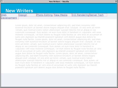
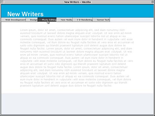
Styling the LinksHaving set up the rest of the page, we're ready to tackle our navigation. We can see it in Figure 7.4, sitting there as an unordered list wedged between the title and main content. Frankly, it's rather ugly, and it's up to us to fix it. Starting the StylesThere are two ways to take a list and make it into a horizontal set of links. One is to make the list items inline, and the other is to float them. The two approaches both have benefits and drawbacks, but one of the major benefits of the floating approach is that it lets us create graphically beautiful buttons that work in modern browsers梐s well as Internet Explorer! Let's consider the markup for the navigation elements, shown in Listing 7.1. Listing 7.1. The Navigation Markup<ul id="nav"> <li><a href="/webdev/">Web Development</a></li> <li><a href="/design/">Design</a></li> <li><a href="/photos/">Photo Editing</a></li> <li id="current"><a href="/newmed/">New Media</a></li> <li><a href="/render/">3-D Rendering</a></li> <li><a href="/server/">Server Tech</a></li> </ul> That's it梟othing else is needed. We'll make use of the id value current later in the project, but for now we don't need it. To make this technique work, we'll first make sure that the unordered list has no padding or margins. This will make it act, more or less, the same way a div would.
#main {font-size: small; color: #AAA; background: #FFF;

  margin: 0; padding: 2.5% 12.5%;}

#nav {margin: 0; padding: 0;}

</style>
Now we can get to work on the list items themselves. We're going to float all of them to the left so that they all line up horizontally, with the first link the furthest to the left. We'll also explicitly remove the bullets from the list items for Explorer's sake. Biting the Bullets
#nav {margin: 0; padding: 0;}

#nav li {list-style: none; float: left; margin: 0;}

</style>
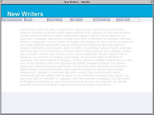
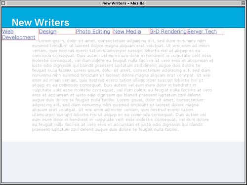
There are 6 navigation links, so we could make them all the same size by dividing 100 by 6. That yields 16 2/3, which means they could all have a width of 16.6667%. That would make things rather fragile, though梐 single rounding error could upset the whole design, and it leaves no room to add margins or borders to the list items (which we'll want to do soon). Let's play things safe and make the list items 15% wide. We'll add in dotted red borders so that we can see how they lay out, as illustrated by Figure 7.5.
#nav li {list-style: none; float: left; width: 15%;

  border: 1px dotted red;}
Figure 7.5. The raw beginnings of the navigation tabs.
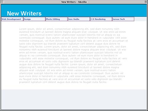
The tabs are now lined up more or less how we want, but there's a problem there on the left. The "Web Development" tab not only is wrapping to two lines, but it's caused some of the main text to flow around it. Text Wrapping
This is happening because we floated all the list items, of course. Normal-flow text (like that in the main content div) flows around floated elements (like the list items). What might not be so obvious is that the unordered list that contains those list items has zero height. If we were to give it a background color, it wouldn't appear on the screen. So the top of the main content div is actually lined up with the top of the navigation links, and the white background visible behind the links is actually the background of the content div. This may seem a little odd, but it's definitely what's supposed to happen. Since we don't actually want it to happen, we'll have to push the content div below the floated list items. This is, as it happens, very easily accomplished: We'll just clear the div below the floats.
#main {font-size: small; color: #AAA; background: #FFF;

  margin: 0; padding: 2.5% 12.5%; clear: left;}
Now the top border edge of the div will be placed just below the bottom margin edge of any leftward floats that come before the div in the document梖or example, the list items. This means that the body background will be visible between the h1 and the content div, as we can see in Figure 7.6, but that's all right. We'll actually use that to our advantage later on. Figure 7.6. Pushing the contents clear below the floated list items.
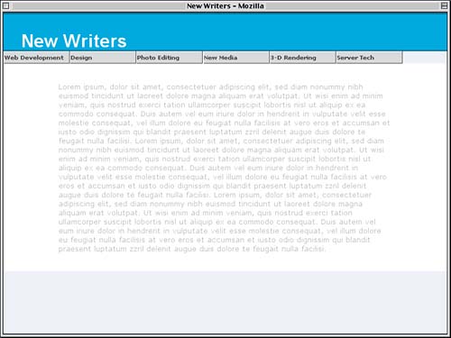
Refining the Tab LookThe preceding change solved the problem of the main content flowing around the links, but it didn't do anything to stop the "Web Development" text from wrapping to two lines. The fix for that is simple enough.
#nav li {list-style: none; float: left; width: 15%;

  white-space: nowrap;

  border: 1px dotted red;}
This is a lot like the old HTML nowrap attribute for table cells, except in CSS you can stop the wrapping of any element's content. Before we go any further, we need to consider how this text is going to be used. Our intent is to place it over images that will make the tabs look lovely. Thus, it's important for the text to be of a size that's appropriate to the context in which it will appear (the tabs). Since images are sized in pixels, we'll do the same for the text. In fact, both the font's size and the height of the line can be set in pixels.
#nav li {list-style: none; float: left; margin: 0; width: 15%;

  font-size: 10px; line-height: 20px; white-space: nowrap;

  border: 1px dotted red;}
The next step to consider is the links themselves, which are sitting inside the floated list items. We'll strip off the underlines and add a solid border so that we can see how the links are laid out inside the list items (see Figure 7.7).
#nav li {list-style: none; float: left; margin: 0; width: 15%;

  font-size: 10px; line-height: 20px; white-space: nowrap;

  border: 1px dotted red;}

#nav a {text-decoration: none; border: 1px solid;}

</style>
Figure 7.7. Examining the links in relation to the list items.
As Figure 7.7 shows us, the links are smaller boxes inside the floated list items. It would be better if we could get those links to fill out the list items or at least as much of them as possible. Let's take a moment to consider the situation. Each list item is floated and thus generates a block-level box, much like that created by a div. In fact, to elements inside the list item, they see only that they're inside a block box. Only elements outside the float react to it by wrapping around the element. The link is just a link, generating an inline box. So to get an inline link to fill out a block-level list item, we can just make the links generate block boxes.
#nav a {display: block;

  text-decoration: none; border: 1px solid;}
Note that we have not changed the nature of the links themselves. The a elements are still inline elements. What's happened is that the CSS is getting them to generate block boxes. This is a subtle but crucial difference. If CSS changed the elements themselves to be block level, document validation could easily break down. This isn't what happens, however, as CSS is about affecting presentation, not altering document structure. Speaking of presentation, the links in question look a little weak with normal-weight text. Let's boldface the links' text to make it stand out a little better.
#nav a {display: block;

  text-decoration: none; font-weight: bold;

  border: 1px solid;}
We can see the result of these two changes in Figure 7.8. Note how the borders of the links are right against the inside of the dotted red borders we set on the list items. Figure 7.8. Boldfaced links generating block boxes.
This is how it will appear in most browsers, anyway. The major exception is IE5/Mac, which incorrectly makes the links as wide as the unordered list instead of as wide as the list items. We definitely don't want that, so a solution is needed, and it turns out that the solution is to float the links themselves inside the floated list items.
#nav a {display: block; float: left;

  text-decoration: none; font-weight: bold;

  border: 1px solid;
This fixes the layout problem for IE5/Mac, but we don't really want to float the links in other browsers. What we need is a way to turn the floating back off for any browser that isn't IE5/Mac. Fortunately, Doug Bowman gave us a way when he came up with the Sliding Doors technique: There's a parsing bug that affects IE5/Mac only, and it can be used to hide the unfloating rule from IE5/Mac.
#nav a {display: block; float: left;

  text-decoration: none; font-weight: bold;

  border: 1px solid;

/* Commented Backslash Hack hides rule from IE5-Mac \*/

#nav a {float: none;}            /* End IE5-Mac hack */

</style>
How It Works
Thus, all browsers float the links (due to float: left), and then all browsers except for IE5/Mac defloat the links (thanks to float: none). This restores layout consistency in IE5/Mac, and we can move on. Before we go on to use the full capabilities of the Sliding Doors technique, let's look at a more basic way to style the links by turning them into gray "raised" buttons. The first step is to color the foreground (text) and background of the links in varying shades of gray.
#nav a {display: block; float: left;

  text-decoration: none; font-weight: bold;

  border: 1px solid;

  background: #CCC; color: #333;}
Now we just need to create a raised effect. There's already a solid border in place, and we could change the solid to outset. The problem is that there's no control over how the border colors are modified to create the outset effect. One browser might just make the top and left borders white and the bottom and right borders black, while another could use more subtle shades. In fact, there is very little cross-browser consistency in outset shading (as well as inset, ridge, and groove shading). So instead we'll leave the border solid and declare our own shading by setting the color of each border side.
#nav a {display: block; float: left;

  text-decoration: none; font-weight: bold;

  border: 1px solid; border-color: #FFF #333 #333 #FFF;

  background: #CCC; color: #333;}
It's time to remove the dotted red border, so we'll do that as well, with the result shown in Figure 7.9.
#nav li {list-style: none; float: left; margin: 0; width: 15%;

  font-size: 10px; line-height: 20px; white-space: nowrap;}
Figure 7.9. The links begin to look like buttons.
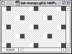
If we ever want to lower the contrast between the "highlight" and "shadow" edges, or introduce some subtle coloration, we need only alter the border-color values. Adding TextureWe've made some pretty good progress so far, but there's more to be done. The biggest visual problem at the moment is that the text of the links is hard up against the left border, which doesn't look too attractive. We could add some left padding to the links to shove the text over, and in fact we'll do so in just a bit. Since we're going to move the text over anyway, why don't we move it over enough to put an image into each link? That way, we could provide a little more visual texture to the links. Take, for example, the image in Figure 7.10, which is shown at 1600% magnification. Figure 7.10. A small image to add some texture to the links' backgrounds.
The large white and black pixels are visible, and the rest of the image is transparent (represented by the gray-and-white checkerboard pattern). Thus, placing this image into the links will allow the gray background color to "shine through" the transparent portions of the background image. We want this image to appear only once, inset just a bit from the left edge of the link and vertically centered, so we write the following:
#nav a {display: block; float: left;

  text-decoration: none; font-weight: bold;

  border: 1px solid; border-color: #FFF #333 #333 #FFF;

  background: #CCC url(tab-bumps.gif) 2px 50% no-repeat;

  color: #333;}
If we left things as they are now, the bumpy image would appear behind the text of the links. We'll fix that by adding some padding to the link; the image will appear within the padding, but the text will not. Since the image is 14 pixels wide and is inset a bit, we'll add 20 pixels of padding to the left sides of the links, with the result shown in Figure 7.11.
#nav a {display: block; float: left; padding: 0 0 0 20px;

  text-decoration: none; font-weight: bold;

  border: 1px solid; border-color: #FFF #333 #333 #FFF;

  background: #CCC url(tab-bumps.gif) 2px 50% no-repeat;

  color: #333;}
Figure 7.11. The links gain some texture via a background image.
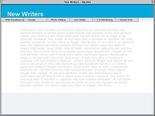
It looks great except for one thing: The text of the "Web Development" link has been shoved over far enough that it's being cut off. For the moment, we're going to have to ignore this, although we will see a way around it later in the project. Text Handling Hovering and FinishingNow that we have these nice buttons, let's add a hover effect to the links. Perhaps the simplest hover effect is to "invert" the colors of a link, and that's what we'll do here. We'll swap the foreground and background colors while we change the border colors to be the inverse of their unhovered state.
#nav a {float: none;}            /* End IE5-Mac hack */

#nav a:hover {background-color: #333; color: #CCC;

  border-color: #000 #CCC #CCC #000;}

</style>
The last touch to this phase of the project is to add a gray border to the top of the main content div. This will "box in" the links, visually placing them into a stripe that contains them alone, as we can see in Figure 7.12.
#main {font-size: small; color: #AAA; background: #FFF;

  margin: 0; padding: 2.5% 12.5%; clear: left;

  border-top: 1px solid gray;}
Figure 7.12. Hover styles and a border on the main content finish the look.
The style sheet we've created so far is shown in Listing 7.2. Listing 7.2. The Styles So Far
html, body {margin: 0; padding: 0;

  color: #000; background: #EEF;

  font-family: Verdana, Arial, sans-serif;}

h1 {color: #FFF; background: rgb(0%,56%,84%);

  font: bold 200%/1em Arial, Verdana, sans-serif;

  padding: 1em 1em 0; margin: 0;

  border: 1px solid rgb(0%,31%,46%);

  border-width: 2px 0;}

#main {font-size: small; color: #AAA; background: #FFF;

  margin: 0; padding: 2.5% 12.5%; clear: left;

  border-top: 1px solid gray;}

#nav {margin: 0; padding: 0;}

#nav li {list-style: none; float: left; margin: 0; width: 15%;

font-size: 10px; line-height: 20px; white-space: nowrap;}

#nav a {display: block; float: left; padding: 0 0 0 20px;

  text-decoration: none; font-weight: bold;

  border: 1px solid; border-color: #FFF #333 #333 #FFF;

  background: #CCC url(tab-bumps.gif) 2px 50% no-repeat;

  color: #333;}

/* Commented Backslash Hack hides rule from IE5-Mac \*/

#nav a {float: none;}            /* End IE5-Mac hack */

#nav a:hover {background-color: #333; color: #CCC;

  border-color: #000 #CCC #CCC #000;}
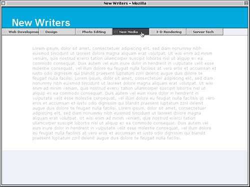
Cut Off Text and Shrunken HotspotsThis is an appropriate point at which to address two potential problems with the styles we've written so far. These are:
Let's consider the first problem first. The text is cut off because we prevented the text from wrapping with white-space: nowrap and gave the list items an explicit width of 15%. Thus, the list items have to each be 15% as wide as their parent element (the ul element), regardless of whether or not their content actually fits into that space. The same would be true of any explicit width, whether set in percentages, pixels, ems, or any other length measure. Excession We could allow the text to wrap by removing the white-space declaration, but then some links might have wrapped text whereas others would not, resulting in uneven heights for the links. This is definitely not the desired effect. Now let's consider the second problem, the resolution of which will also help us solve the first problem. In IE/Win, a bug prevents it from considering the entirety of a block-box link as "clickable." Unless some kind of explicit width is given, only the content area of the link is treated as clickable. We could set the links to have a width of 100%, except then we couldn't add any padding to the links without making them stick out of the list items (because width defines the width of the content area plus any padding, borders, and margins that are added to it). In that case, we couldn't add images to the link backgrounds, which is too limiting. In grappling with these issues, Doug Bowman came up with a solution that exploits a different bug in IE/Win to trick it into considering the whole link as clickable. It turns out that if you give the links a tiny width value, IE/Win will automatically (and incorrectly) expand the value to include all of the content, plus it will suddenly consider the padding clickable. This is fairly strange, but it works. Thus:
#nav a {display: block; float: left; padding: 0 0 0 20px;

  text-decoration: none; font-weight: bold;

  border: 1px solid; border-color: #FFF #333 #333 #FFF;

  background: #CCC url(tab-bumps.gif) 2px 50% no-repeat;

  color: #333;

  width: .1em;}
The problem is that more conformant browsers will take that value seriously and make the link content area exactly a tenth of an em wide, with the text overflowing that thin sliver. So we need to undo the damage for these more advanced browsers by showing them a rule that IE/Win doesn't see. In this case, we rely on the fact that IE/Win doesn't understand child selectors, and we add a rule that sets the width back to auto for more advanced browsers.
#nav a {display: block; float: left; padding: 0 0 0 20px;

  text-decoration: none; font-weight: bold;

  border: 1px solid; border-color: #FFF #333 #333 #FFF;

  background: #CCC url(tab-bumps.gif) 2px 50% no-repeat;

  color: #333;

  width: .1em;}

html>body #nav a {width: auto;}    /* fixes IE6 hack */

/* Commented Backslash Hack hides rule from IE5-Mac \*/
So all browsers will see the width as .1em, and those that understand child selectors will also see width: auto and use it to override the .1em. Either way, the width of the link's content will equal the width of the text content, thanks to the way floats tend to shrink-wrap their contents, and the whole link will become clickable, as shown in Figure 7.13. Figure 7.13. Shrink-wrapping the links to their contents.
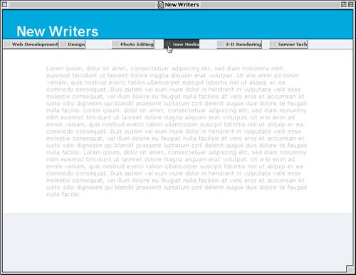
Uh-oh梬hat happened? Exactly what was described: The content area of the links became as wide as the contents. The list items, however, are still 15% wide, so the links are no longer filling out the list items. At least, that's what happens in some browsers. (Figure 7.13 was taken in IE5/Mac, and IE/Win should look similar.) In others, the links will still fill out the list items. Clearly, this isn't much better than before, when our only problem was that one of the links had text sticking out of the button. We can bring everything back to a kind of harmony by letting the list items also shrink themselves to fit their contents. To do this, we need the list items to have auto width, which we can accomplish by simply removing the width: 15% from the #nav li rule.
#nav li {list-style: none; float: left;

  font-size: 10px; line-height: 20px; white-space: nowrap;}
Now, for every button, the link will shrink around its content, and the list item will shrink around the link. This gives us the situation shown in Figure 7.14. Figure 7.14. Shrink-wrapping both the list items and the links.
So what have we learned in this interlude?
So the reasonable conclusion is that, in general, it's better to have autosized links than explicitly sized links. In fact, this is the approach used in the original Sliding Doors technique: tabs that autosize themselves to their contents. There are other reasons why the technique uses shrink-wrapping, as we're about to find out. |
|
|
< Day Day Up > |
|