|
|
< Day Day Up > |
|
Creating Actual TabsAlthough the link styles we've created are nice in their own way, they share something in common with most links these days. They're boxy and somewhat boring. We need some more attractive link styles梥ome nice rounded-corner tabs, for example, with smooth highlighting and shading. As you already guessed, we can do just that, and we won't even need to change the HTML markup to do it. All we need is some modified CSS and a large (yet compact) image. Making Some ChangesBefore we get to the really pretty stuff, let's make a few changes to the style sheet in Listing 7.2. The first change is to make the document background white instead of a pale gray-blue.
html, body {margin: 0; padding: 0;

  color: #000; background: #FFF;

  font-family: Verdana, Arial, sans-serif;}
Next we're going to remove the gray border from the top of the main content div so that the #main rule looks like this:
#main {font-size: small; color: #AAA; background: #FFF;

  margin: 0; padding: 2.5% 12.5%; clear: left;}
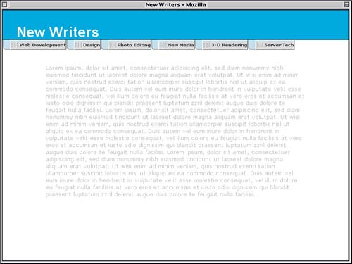
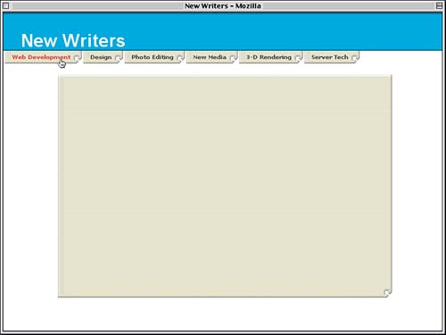
Finally, we're going to add a left margin and some left padding to the floated list items. This will separate them slightly and open up some space between the left edge of the list items and the left edge of the links they contain, as shown in Figure 7.15.
#nav li {list-style: none; float: left;

  margin-left: 1px; padding-left: 16px;

  font-size: 10px; line-height: 20px; white-space: nowrap;}
Figure 7.15. Pushing the links apart in preparation for more advanced styling.
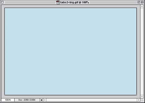
Why have we done this? To open up room for some eye candy. Putting in a TabOur general goal here is to place a visually sophisticated image into the backgrounds of both the list items and the links. We'll style these backgrounds in such a way that they blend seamlessly and look good on links of varying widths. To make this effect work, we first need a background image suitable for the effect we want. In fact, we need a fairly big image… an image like the one in Figure 7.16, which is called tabs2-big.gif. Figure 7.16. The über-tab image.
Notice the rounded corners at the bottom of the image. Those represent the two sides of our tabs, which will appear to stick downward from the page title. One Image or Two? Let's take this a step at a time. First we'll add the tab image to the list items.
#nav li {list-style: none; float: left;

  margin-left: 1px; padding-left: 16px;

  font-size: 10px; line-height: 20px; white-space: nowrap;

  background: #BBB url(tabs2-big.gif);}
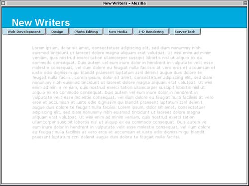
Remember that we gave the list items 16 pixels of left padding, so the image will appear in that space. The rest of each list item is filled up with the links, which have opaque backgrounds and so will obscure the image given to the list items' backgrounds. What we can see, though, indicates that the top-left corner of tabs2-big.gif is aligned with the top-left corner of the list items. We want the lower-left corner of the image in the same corner of the list item, and for that matter we don't want the image to tile. Adding a few bits to the background declaration suffices to address these points and has the result shown in Figure 7.17.
#nav li {list-style: none; float: left;

  margin-left: 1px; padding-left: 16px;

  font-size: 10px; line-height: 20px; white-space: nowrap;

  background: #BBB url(tabs2-big.gif) 0 100% no-repeat;}
Figure 7.17. The über-tab image is placed into the list items' backgrounds.
That by itself is, or could easily become, an interesting visual effect. We're going to take it to the next level, though. To have the tabs come together, we need to apply tabs2-big.gif to the links, only this time we'll have the bottom-right corner of the image align with the bottom-right corner of the links.
#nav a {display: block; float: left; padding: 0 0 0 20px;

  text-decoration: none; font-weight: bold;

  border: 1px solid; border-color: #FFF #333 #333 #FFF;

  background: #DDD url(tabs2-big.gif) 100% 100% no-repeat;

  color: #333;

  width: .1em;}
There's another change that is necessitated by changing the background image. Remember that, before, we had a background image on the left and added some padding to open up space for it to appear. Now we have the background image aligned to the right. Therefore, we need to adjust the padding of the links accordingly. We'll remove the left padding and add 16 pixels of right padding (to match the padding-left: 16px on the list items), with the result shown in Figure 7.18.
#nav a {display: block; float: left; padding: 0 16px 0 0;

  text-decoration: none; font-weight: bold;

  border: 1px solid; border-color: #FFF #333 #333 #FFF;

  background: #DDD url(tabs2-big.gif) 100% 100% no-repeat;

  color: #333;

  width: .1em;}
Figure 7.18. The über-tab image is placed into the links' backgrounds.
We're very close to being done, but there is the small matter of the link borders. They're no longer needed; in fact, they actively interfere with the effect we're trying to create. So we need to pull out the borders completely, leaving the #nav a rule looking like this:
#nav a {display: block; float: left; padding: 0 16px 0 0;

  text-decoration: none; font-weight: bold;

  background: #DDD url(tabs2-big.gif) 100% 100% no-repeat;

  color: #333;

  width: .1em;}
We also need to adjust the hover styles, which don't work nearly as well with the light blue tabs. Since we can only affect the links, we'll just change the text color.
#nav a:hover {color: rgb(62%,35%,22%);}
We could also change the background image, but that would leave us with just a changed link background. The background of the list item wouldn't change. Thus, it's quite difficult to apply hover effects to anything besides the link in these situations. Fortunately, it's usually enough, as we can see in Figure 7.19. Figure 7.19. Adding a hover style to the links.
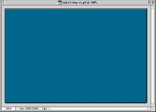
Indicating the Current TabRemember the id="current" that we've been ignoring ever since the beginning of the chapter? Here's where it comes back with a vengeance. Using that hook, we can uniquely style the tab to be different from the others. To do it, though, we'll need a new tab image, one that looks different from the normal tab image. Figure 7.20 shows us precisely that. Figure 7.20. The current page über-tab image.
The file's name is tabs2-big-ct.gif (ct for "current tab"). The base color of the tab was taken from the borders running along the top and bottom of the page title, which is rgb(0%,31%,46%), by the way, for reasons we'll see very shortly. With that image ready to go, all we need to do is write a rule that will switch the basic tab image for this new one and modify the text color. That's right, all we need is one rule.
#nav a:hover {color: rgb(62%,35%,22%);}

#nav #current, #nav #current a {color: #FDB;

  background-image: url(tabs2-big-ct.gif);}

</style>
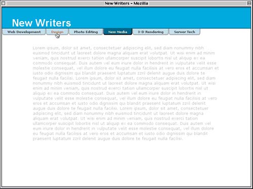
This will substitute the current-tab image for the default tab image while leaving the styles for its position, repetition, and so forth intact. The color will stay constant even when the tab is hovered because the selector #nav #current a has a higher specificity than #nav a:hover (that it comes after the hover rule is irrelevant in this case). As we can see in Figure 7.21, the tab appears to grow out of the border above it while still maintaining visual consistency with the other tabs. Figure 7.21. Altering the appearance of the current tab.
So, with two images, we can lay out some nice-looking tabs using nothing more than an unordered list and some links. Our new style sheet is shown in Listing 7.3. Listing 7.3. The Tabbed Styles
html, body {margin: 0; padding: 0;

  color: #000; background: #FFF;

  font-family: Verdana, Arial, sans-serif;}

h1 {color: #FFF; background: rgb(0%,56%,84%);

  font: bold 200%/1em Arial, Verdana, sans-serif;

  padding: 1em 1em 0; margin: 0;

  border: 1px solid rgb(0%,31%,46%);

  border-width: 2px 0;}

#main {font-size: small; color: #AAA; background: #FFF;

  margin: 0; padding: 2.5% 12.5%; clear: left;}

#nav {margin: 0; padding: 0;}

#nav li {list-style: none; float: left;

  margin-left: 1px; padding-left: 16px;

  font-size: 10px; line-height: 20px; white-space: nowrap;

  background: #BBB url(tabs2-big.gif) 0 100% no-repeat;}

#nav a {display: block; float: left; padding: 0 16px 0 0;

  text-decoration: none; font-weight: bold;

  background: #DDD url(tabs2-big.gif) 100% 100% no-repeat;

  color: #333;

  width: .1em;}

html>body #nav a {width: auto;}    /* fixes IE6 hack */

/* Commented Backslash Hack hides rule from IE5-Mac \*/

#nav a {float: none;}            /* End IE5-Mac hack */

#nav a:hover {color: rgb(62%,35%,22%);}

#nav #current, #nav #current a {color: #FDB;

  background-image: url(tabs2-big-ct.gif);}
Odds and EndsJust in case you're concerned about the additional page weight of having two large images used just to set up some tabs, take heart. The two images are less than 3KB each, with the normal tab being slightly smaller in file size (2,763 bytes). This means that use of this particular technique added less than 6KB to the page weight. Of course, one doesn't have to use images that are 600 pixels wide by 400 pixels tall either, so the files could be smaller. Alternatively, in some cases it's possible to combine the current-tab and normal-tab appearances into a single image and make use of background-position to show the appropriate effect. We won't explore that technique here since Doug Bowman did it so well in his article "Sliding Doors of CSS, Part II," which you should definitely read (along with its prequel, which also shows how to make tabs visually merge with the main content area). Another point is that it's really easy to change the appearance of your tabs梐ll you need to do is update the über-tab image, and you're done. (If you want to change the orientation of the tabs, you'll have to update the CSS, too.) Take, for example, the tabs shown in Figure 7.22, which were created using the über-tab image shown below them. Figure 7.22. Radically altering the tabs by changing the über-tab.
This brings us to the last point: the kinds of visual styles that can be created using the Sliding Doors technique. In general, any tab that uses a solid background color or that has horizontally oriented decorations will work just fine. For example, the tabs in Figure 7.22 have horizontal lines running through the background. The vertical lines on the left were carefully placed in the area that would appear in the list items' background; that is, the vertical lines stop before the left edge of the link. Similarly, diagonal lines are difficult to pull off. The problem is that where the "doors" come together, diagonal lines might not meet up cleanly. This doesn't mean that diagonal lines can never be used in tabs. It just means you have to be more visually creative so that you can overcome the limitations just mentioned. |
|
|
< Day Day Up > |
|
