| [ Team LiB ] |
|
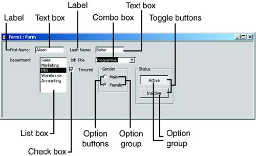
Selecting the Correct Control for the JobWindows programming in general, and Access programming in particular, isn't limited to just writing code. Your ability to design a user-friendly interface can make or break the success of an application. Access and the Windows programming environment offer a variety of controls, and each one is appropriate in different situations. The following sections discuss each type of control and describe when and how it should be used. Figure 11.14 shows each control. As you go through each section, you can refer to this figure to get an idea of how each control looks and behaves. Figure 11.14. An introduction to the available controls.
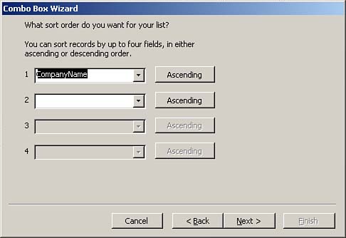
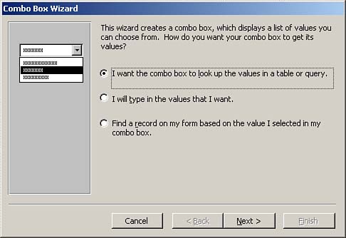
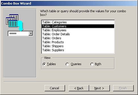
LabelsYou use labels to display information to users. Access automatically adds attached labels to a form when you add other controls, such as text boxes and combo boxes, to the form. You can delete or modify these attached labels as necessary. The default caption of a label is based on the Caption property of the field that underlies the control it's attached to. If you enter nothing into a field's Caption property, Access uses the field name for the label's caption. You can use the Label tool, found in the toolbox, to add any text to a form. To do so, you click the Label tool and then click and drag the label to place it on the form. Labels are often used to provide descriptions of forms or to supply instructions to users. You can customize labels by modifying their font, size, color, and so on. Although developers can use Visual Basic for Applications (VBA) code to modify label properties at runtime, users don't have this ability. Text BoxesYou use text boxes to get information from users. Bound text boxes display and retrieve field information stored in a table; unbound text boxes gather from the user information that's not related to a specific field in a specific record. For example, you can use a text box to gather information about report criteria from a user. Access automatically adds text boxes to a form when you click and drag a field from the field list to the form. The Display Control property for the field must be set to Text Box. Another way to add a text box is to select the Text Box tool from the toolbox and then click and drag to place the text box on the form. This process adds an unbound text box to the form. If you want to bind the text box to data, you must set its Control Source property. Combo BoxesCombo boxes allow users to select from a list of appropriate choices. Access offers several easy ways to add a combo box to a form. If you have set a field's Display Control property to Combo Box, Access adds a combo box to a form when you add the field to the form. The combo box automatically knows the source of its data as well as all its other important properties. If a field's Display Control property hasn't been set to Combo Box, the easiest way to add a combo box to a form is to use the Control Wizards tool. The Control Wizards tool helps you add combo boxes, list boxes, option groups, and subforms to forms. Although you can manually set all the properties set by the Combo Box Wizard, using the wizard saves both time and energy. If you want Access to launch the Combo Box Wizard when you add a combo box to the form, you need to make sure you click the Control Wizards tool in the toolbox before you add the combo box. Then you select the Combo Box tool in the toolbox and then click and drag to place the combo box on the form. This launches the Combo Box Wizard. As shown in Figure 11.15, the first step of the Combo Box Wizard gives you three choices for the source of the combo box's data. You use the first option if the combo box will select the data that's stored in a field, such as the state associated with a particular customer. I rarely, if ever, use the second option, which requires that you type the values for the combo box. Populating a combo box this way makes it difficult to maintain. Every time you want to add an entry to the combo box, you must modify the application. You use the third option when you want to use the combo box as a tool to search for a specific record. For example, a combo box can be placed in a form's header to display a list of valid customers. After you select a customer, the user is moved to the appropriate record. This option is available only when the form is bound to a record source. Figure 11.15. The first step of the Combo Box Wizard: selecting the source of the data.
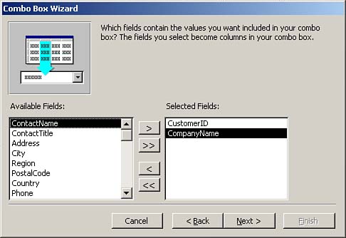
If you select to have the combo box look up the values in a table or query, in the second step of the Combo Box Wizard (shown in Figure 11.16), you select a table or query to populate the combo box and then click Next. In the third step of the wizard (shown in Figure 11.17), you select the fields that appear in the combo box. We'll use the combo box being built in the example to select the customer associated with the current order. Although the CompanyName field will be the only field visible in the combo box, I have selected both CustomerID and CompanyName because CustomerID is a necessary element of the combo box. After the user has selected a company name from the combo box, Access stores the CustomerID associated with the company name in the CustomerID field of the Orders table. Figure 11.16. The second step of the Combo Box Wizard: selecting a table or query.
Figure 11.17. The third step of the Combo Box Wizard: selecting fields.
Figure 11.18. The fourth step of the Combo Box Wizard: selecting the sort order.
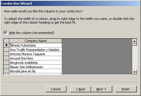
The fifth step of the wizard lets you specify the width of each field in the combo box. Notice in Figure 11.19 that Access recommends that you hide the key column, CustomerID. The idea is that the user will see the meaningful English description, while Access worries about storing the appropriate key value in the record. Figure 11.19. The fifth step of the Combo Box Wizard: setting column widths.
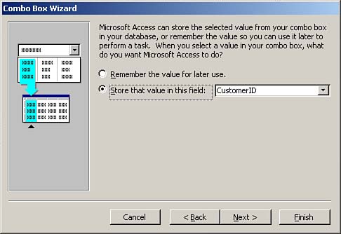
In the wizard's sixth step, you specify whether you want Access to simply remember the selected value or store it in a particular field in a table. In the example shown in Figure 11.20, I have told Access to store the selected combo box value in the CustomerID field of the Orders table. Figure 11.20. The sixth step of the Combo Box Wizard: indicating where the selected value will be stored.
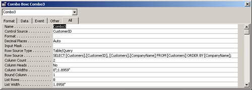
The seventh and final step of the Combo Box Wizard prompts for the text that will become the attached label for the combo box. After you click the Finish button, Access completes the process, building the combo box and filling in all its properties with the appropriate values. Although the Combo Box Wizard is a helpful tool, it's important that you understand the properties it sets. Figure 11.21 shows the Properties window for a combo box. We're going to take a moment to go over the properties set by the Combo Box Wizard in this example. Figure 11.21. Properties of a combo box, showing that the CustomerID field has been selected as the control source for the Combo3 combo box.
The Control Source property indicates the field in which the selected entry is stored. In Figure 11.21, you can see that the selected entry will be stored in the CustomerID field of the Orders table. The Row Source Type property specifies whether the source used to populate the combo box is a table/query, value list, or field list. In the example, the Row Source Type property is set to Table/Query. The Row Source property is the name of the actual table or query used to populate the combo box. In the example, the Row Source property is a SQL SELECT statement that selects the CustomerID and CompanyName from the Customers table. The Column Count property designates how many columns are in the combo box, and the Column Widths property indicates the width of each column. In the example, the width of the first column is zero, which renders the column invisible. Finally, the Bound Column property is used to specify which column in the combo box is being used to store data in the control source. In the example, this is column 1. List BoxesList boxes are similar to combo boxes, but they differ from them in three major ways:
If you set the Display Control property of a field to List Box, Access adds a list box to the form when the field is clicked and dragged from the field list to the form. The List Box Wizard is almost identical to the Combo Box Wizard. After you run the List Box Wizard, the list box properties affected by the wizard are the same as the combo box properties. Check BoxesYou use check boxes when you want to limit the user to entering one of two values, such as yes/no, true/false, or on/off. You can add a check box to a form in several ways:
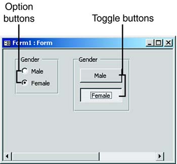
Option and Toggle ButtonsYou can use option buttons and toggle buttons alone or as part of an option group. You can use an option button or toggle button alone to display a true/false value, but this isn't a standard use of an option or toggle button. (Check boxes are standard for this purpose.) As part of an option group, option buttons and toggle buttons force the user to select from a mutually exclusive set of options, such as choosing among American Express, MasterCard, Visa, and Discover for a payment type. This use of option buttons and toggle buttons is covered in the next section, "Option Groups." In summary, although you can use option and toggle buttons outside an option group, you will almost always associate them with an option group. The difference between option buttons and toggle buttons is in their appearance. Personally, I find toggle buttons confusing to users. I find that option buttons provide a much more intuitive interface (see Figure 11.22). Figure 11.22. Option buttons versus toggle buttons.
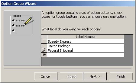
Option GroupsOption groups allow the user to select from a mutually exclusive set of options. They can include check boxes, toggle buttons, or option buttons, but the most common implementation of an option group is option buttons. The easiest way to add an option group to a form is to use the Option Group Wizard. To do so, you select the Control Wizards button in the toolbox, click Option Group in the toolbox, and then click and drag to add the option group to the form. This launches the Option Group Wizard. The first step of the Option Group Wizard, shown in Figure 11.23, allows you to type the text associated with each item in the option group. Figure 11.23. The first step of the Option Group Wizard: adding text to options.
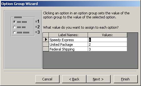
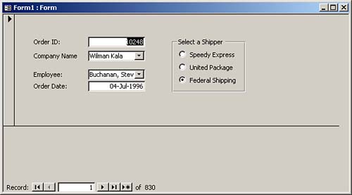
The second step of the wizard gives you the option of selecting a default choice for the option group. This choice goes into effect when the user adds a new record to the table underlying the form. The third step of the wizard lets you select values associated with each option button (see Figure 11.24). The text displayed with the option button isn't stored in the record; instead, Access stores the underlying numeric value in the record. In Figure 11.24, Access stores the number 2 in the field if the user selects United Package. Figure 11.24. The third step of the Option Group Wizard: selecting values for options.
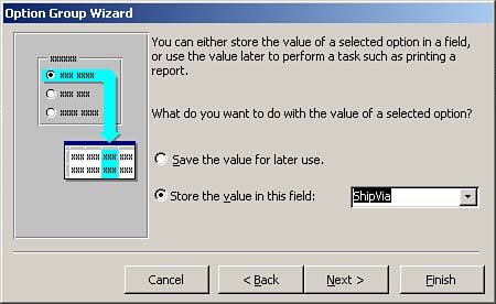
The fourth step of the Option Group Wizard asks whether you want to remember the option group value for later use or store the value in a field. In Figure 11.25, for example, the option group value is stored in the ShipVia field. Figure 11.25. The fourth step of the Option Group Wizard: tying the group to data.
In the fifth step of the wizard, you can select from a variety of styles for the option group buttons, including option buttons, check boxes, and toggle buttons. You can also select from etched, flat, raised, shadowed, or sunken effects for the buttons. The wizard lets you preview each option. The sixth and final step of the wizard allows you to add an appropriate caption to the option group. The completed group of option buttons created in this section is shown in Figure 11.26. Figure 11.26. The results of running the Option Group Wizard.
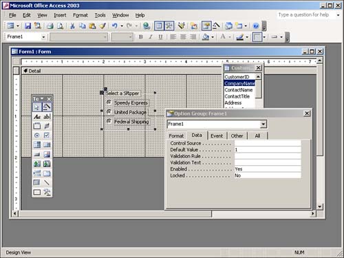
It's important to understand that the Option Group Wizard sets properties of the frame, the option buttons within the frame, and the labels attached to the option buttons. Figure 11.27 shows the properties of the frame. The Option Group Wizard sets the control source of the frame and the default value of the option group. Each individual option button is assigned a value, and the caption of the attached label associated with each button is set. Figure 11.27. An option group frame, showing the properties of the selected button.
 |
| [ Team LiB ] |
|