| [ Team LiB ] |
|
Control Properties and Why to Use ThemAvailable control properties vary quite a bit, depending on the type of control. The following sections cover the most common properties. To view the properties of a control, you select the control and then open the Properties window. The Format Properties of a ControlThe Format properties of a control affect the appearance of the control. You use these properties to change the color, size, font, and other physical attributes of the control. To view the Format properties of a control, with the control already selected and the Properties window open, you click the Format tab (see Figure 16.2). The following sections discuss each of these properties and their uses. Figure 16.2. The Format properties of a control.
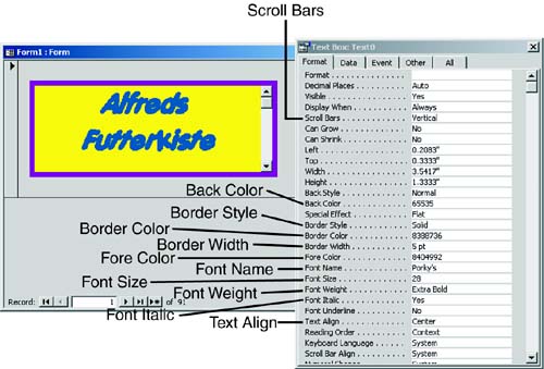
The TextBox control in Figure 16.3 uses many of the Format properties. It has the Scroll Bars property set to Vertical so that the control appears with a vertical scrollbar. The Back Color property has been modified, and the Border Style property is set to Solid, its color has been modified, and it is very wide. The font has been enlarged and made bold and italic. Finally, the text is aligned so that it is centered within the control. Notice that you can see all these changes graphically, as well as the properties that affect the control. Figure 16.3. A TextBox control using many of the Format properties.
FormatThe Format property of a control determines how Access displays the data in the control. A control's format is automatically inherited from its underlying data source. Access lets you use this property in three situations: when the Format property is not set for the underlying field, when you want to override the existing Format setting for the field, and when you want to apply a format to an unbound control. You can select from a multitude of predefined values for a control's format, or you can create a custom format. I often modify the Format property at runtime to vary the format of a control, depending on a certain condition. For example, the format for a Visa card number is different from the format for an ATM card number. Decimal PlacesThe Decimal Places property specifies how many decimal places you want to appear in the control. This property is used with the Format property to determine the control's appearance. CaptionYou use the Caption property to specify information that is helpful to the user. It's available for labels, command buttons, and toggle buttons. Hyperlink AddressThe Hyperlink Address property is available only for command buttons, images, and unattached labels. It contains a string that is used to specify a UNC (path to a file) or a URL (Web page address) associated with a control. When a form is active and the cursor is placed over the control, clicking the control displays the specified object or Web page. Hyperlink SubAddressLike the Hyperlink Address property, the Hyperlink SubAddress property is available only for command buttons, images, and unattached labels. The Hyperlink SubAddress property is a string that represents a location in the document specified in the Hyperlink Address property. VisibleThe Visible property indicates whether a control is visible. This property can be toggled at runtime, depending on specific circumstances. For example, a question on the form might apply only to records in which the gender is set to Female; if the gender is set to Male, the question isn't visible. Display WhenThe Display When property is used when you want certain controls on a form to be sent only to the screen or only to the printer. The three settings for this property are Always, Print Only, and Screen Only. An example of the use of the Display When property is for a label containing instructions. You can use the Display When property to have the instructions appear onscreen but not on the printout. Scroll BarsThe Scroll Bars property determines whether scrollbars appear when the data in a control doesn't fit within the control's size. The options are None and Vertical. I often set the Scroll Bars property to Vertical when the control is used to display data from a memo field. The scrollbar makes it easier for the user to work with a potentially large volume of data in the memo field. Can Grow and Can ShrinkThe Can Grow and Can Shrink properties apply only to a form's printed version. When the Can Grow property is set to Yes, the control expands when the form is being printed so that all the data in the control fits on the printout. When the Can Shrink property is set to Yes and the user has not entered any data, the control shrinks so that blank lines aren't printed. Left, Top, Width, and HeightYou use the Left, Top, Width, and Height properties to set a control's position and size. Back Style and Back ColorYou can set the Back Style property to Normal or Transparent. When this property is set to Transparent, the form's background color shows through the control. This is often the preferred setting for an option group. The control's Back Color property specifies the background color (as opposed to text color) for the control.
Special EffectThe Special Effect property adds 3D effects to a control. The settings for this property are Flat, Raised, Sunken, Etched, Shadowed, and Chiseled. Each of these effects gives a control a different look. Border Style, Border Color, and Border WidthThe Border Style, Border Color, and Border Width properties affect the look, color, and thickness of a control's border. The settings for the Border Style property are Transparent, Solid, Dashes, Short Dashes, Dots, Sparse Dots, Dash Dot, and Dash Dot Dot. The Border Color property specifies the color of the border; you can select from a variety of colors. The Border Width property can be set to one of several point sizes.
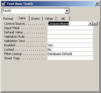
Fore Color, Font Name, Font Size, Font Weight, Font Italic, and Font UnderlineThe Fore Color, Font Name, Font Size, Font Weight, Font Italic, and Font Underline properties control the appearance of the text in a control. As their names imply, they let you select a color, font, size, and thickness of the text and determine whether the text is italicized or underlined. You can modify these properties in response to a runtime event. For example, you can modify a control's text color if the value in that control exceeds a certain amount. The Font Weight property settings generally exceed what is actually available for a particular font and printernormally, you have a choice of only Regular and Bold in whatever value you select for this property. Text AlignThe Text Align property is often confused with the ability to align controls, but the Text Align property affects how the data is aligned within a control. Reading OrderThe Reading Order property was introduced with Access 2002. As its name implies, the Reading Order property allows you to specify the reading order for text in a control. This feature is available only if you are using a version of Microsoft Office that supports right-to-left features. Keyboard LanguageThe Keyboard Language property, which was introduced with Access 2002, allows you to override the keyboard language currently in use. This means that when a specific control receives the focus, the language specified in this property becomes the keyboard language in effect while you're typing data into the control. Scroll Bar AlignThe Scroll Bar Align property is a language-related property that was introduced with Access 2002. You use this property to place the vertical scrollbar in the appropriate left-to-right or right-to-left position. If this property is set to System, the position of the scrollbar is based on the selected user interface language. The scrollbar is placed on the right for left-to-right languages and on the left for right-to-left languages. If this property is set to Left or Right, the scrollbar is placed on the left or right side of the control, respectively. Numerical ShapeThe Numerical Shape property, which was introduced with Access 2002, allows you to designate whether numeric shapes are displayed in the Arabic or Hindi style. The available choices for this property are System, Arabic, National, and Context. System bases the numeric shape on the operating system. Arabic and National use the Arabic and Hindi styles, respectively. Context bases the numeric shape on the text adjacent to the control. Left Margin, Top Margin, Right Margin, and Bottom MarginThe Left Margin, Top Margin, Right Margin, and Bottom Margin properties determine how far the text appears from the left, top, right, and bottom of the control. They are particularly useful with controls such as text boxes based on memo fields, which are generally large controls. Line SpacingThe Line Spacing property is used to determine the spacing between lines of text in a multiline control. This property is most commonly used with text boxes based on memo fields. Is HyperlinkWhen the Is Hyperlink property is set to Yes, the data in the control is formatted as a hyperlink. If the data in the control is a relevant link (for example, http://microsoft.com), the data functions as a hyperlink. The Data Properties of a ControlWhereas Format properties affect the appearance of a control, Data properties affect the data that displays in a control. The following sections explore the various Data properties. You'll learn about everything from the Control Source property, which determines what data displays in a control, to the Input Mask property, which determines what data the user can enter into each character of the control. As you'll see, there's a very rich list of Data properties for a control. They appear in Figure 16.4 and are described in the following sections. To access the Data properties of a control, you select the control, open the properties sheet, and click to select the Data tab. Figure 16.4. The Data properties of a control.
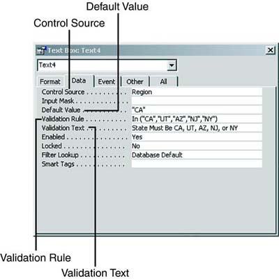
Take a look at the example in Figure 16.5. Notice that the TextBox control has its Control Source property set to Region, indicating that it is bound to the Region field in the underlying data source. Its Default Value property is set to CA. This means that when the user adds a new record, the Region field defaults to CA. The Validation Rule property connotes that the region must be CA, UT, AZ, NJ, or NY. The Validation Text property provides the error message the user will receive if the user violates the validation rule. Figure 16.5. The Display Control property, on the Lookup tab of the Table Design window.
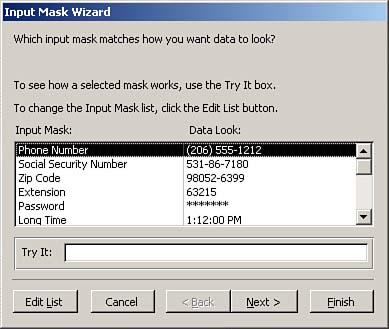
Control SourceThe Control Source property specifies the field from the record source that's associated with a particular control. The Control Source property can also be set to any valid Access expression. Input MaskWhereas the Format and Decimal Places properties affect the appearance of a control, the Input Mask property affects what data the user can enter into the control. The input mask of the field underlying the control is automatically inherited into the control. If no input mask is entered as a field property, the input mask can be entered directly in the form. If you entered the input mask for the field, you can use the input mask of the associated control on a form to further restrict what the user enters into that field via the form. If you select the Input Mask property and click the Build button, the Input Mask Wizard appears (see Figure 16.6). This wizard is covered in Hour 14, "Power Table Techniques." Figure 16.6. The Input Mask Wizard.
Default ValueThe Default Value property of a control determines the value assigned to new records entered in a form. You can set this property within the field properties of the underlying table. A default value set at the field level of the table is automatically inherited into the form. The default value set for the control overrides the default value set at the field level of the table. Validation Rule and Validation TextThe Validation Rule and Validation Text properties of a control perform the same functions as they do for a field. This means that the Validation Rule allows you to validate the data that the user enters into the control and the Validation text allows you to supply the user with the error message that appears when he enters a value that violates the Validation Rule.
EnabledThe Enabled property determines whether you allow a control to get the focus. If this property is set to No, the control appears dimmed. LockedThe Locked property determines whether the user can modify the data in a control. When the Locked property is set to Yes, the control can get the focus but can't be edited. The Enabled and Locked properties of a control interact with one another. Table 16.1 summarizes their interactions. Where you see the Enabled column equal to Yes in the table, that means that the Enabled property is set to Yes. Where you see the Locked property equal to Yes in the table, that means that the Locked property is set to Yes. The third column shows the effect of the combination of those two property settings. For example, if you set Enabled to Yes and Locked to Yes, the control can get the focus and its data can be copied but not modified.
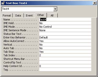
Filter LookupThe Filter Lookup property indicates whether you want the values associated with a bound text box to appear in the Filter by Form window (covered in Hour 4, "Forms Introduced"). The Other Properties of a ControlThe Other properties of a control are properties that do not fit neatly into any of the other categories. This does not mean that they are unimportant. In fact, you can find some of the most important and useful control properties under the Other properties of a control. To access these properties, you select a control, invoke the Properties window, and then click the Other tab of the Properties window (see Figure 16.7). The following sections describe the Other properties of a control. Figure 16.7. The Other properties of a control.
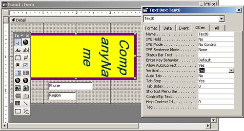
NameThe Name property allows you to name a control. You use the name that is set in this property when you refer to the control in code, and this name is also displayed in various drop-down lists that show all the controls on a form. It's important to name controls because named controls improve the readability of code and make working with Access forms and other objects easier. IME Hold, IME Mode, and IME Sentence ModeThe Input Method Editor (IME) is a program that converts keystrokes into East Asian character sets. The IME Hold, IME Mode, and IME Sentence Mode properties, which were introduced with Access 2002, are used to designate the settings in effect when an IME is used. Status Bar TextThe Status Bar Text property specifies the text that appears in the status bar when a control gets focus. The setting of this property overrides the Description property that you can set in a table's design. Enter Key BehaviorThe Enter Key Behavior property determines whether the Enter key causes the cursor to move to the next control or to add a new line in the current control. You are likely to change the setting of this property for text boxes that you use to display the contents of memo fields. Allow AutoCorrectThe Allow AutoCorrect property specifies whether the AutoCorrect feature is available in a control. The AutoCorrect feature automatically corrects common spelling errors and typos. VerticalThe Vertical property is used to control whether the text in a control is displayed horizontally or vertically. The default setting is No, or horizontal. When you select Yes (vertical display), Access rotates the text in the control 90 degrees (see Figure 16.8). Figure 16.8. The CompanyName text box with the Vertical property set to Yes.
Auto TabWhen the Auto Tab property is set to Yes, the cursor automatically advances to the next control when the user enters the last character of an input mask. Some users like this option, and others find it annoying, especially if they must tab out of some fields but not others. DefaultThe Default property applies to a command button or to an ActiveX control and specifies whether the control is the default button on a form. CancelThe Cancel property applies to a command button or to an ActiveX control. It indicates that you want the control's code to execute when the user presses the Esc key while the form is active. Auto RepeatThe Auto Repeat property specifies whether you want an event procedure or a macro to execute repeatedly while the user is pressing its command button. Status Bar TextThe Status Bar Text property specifies the message that appears in the status bar when a control has the focus. Tab StopThe Tab Stop property determines whether the user can use the Tab key to enter a control. It's appropriate to set this property to No for controls whose values rarely get modified. The user can opt to click in the control when necessary. Tab IndexThe Tab Index property sets the tab order for a control. I generally set the Tab Index property by using View | Tab Order rather than by setting the value directly in the control's Tab Index property. This allows me to set the tab order graphically, which is more intuitive, easier, and saves me a lot of time. Shortcut Menu BarThe Shortcut Menu Bar property attaches a specific menu to a control. The menu bar appears when the user right-clicks the control. ControlTip TextThe ControlTip Text property specifies the ToolTip associated with a control. The ToolTip automatically appears when the user places the mouse pointer over the control and leaves it there for a moment. Help Context IDThe Help Context ID property designates the Help topic associated with a control. TagThe Tag property is used to store information about a control. Your imagination determines how you use this property. The Tag property can be read and modified at runtime. |
| [ Team LiB ] |
|