I have been around long enough to have used hundreds of programs to accomplish a certain task. I have even written a few of them myself. I have also been a longtime Windows user.
What I see in Windows programs from Microsoft is consistency in navigation and use. What I see in most programs from vendors other than Microsoft is the same type of consistency. However, sometimes I come across a program whose screen layout defies description. Not only is the layout different and unintuitive, but the help is usually obscure as well.
I will generalize here and say that most people's frustration level at a computer program increases in direct proportion to how much they paid for it. I know this is true for me. What do I mean here? If I am paying tens or hundreds of dollars for a program, I expect it to work intelligently and be relatively bug-free. I expect the help to be comprehensive and I expect the program to work as advertised. If this type of program is unusable, I get frustrated easily.
If I get shareware for $5.00 or freeware, I have no such expectations. Instead, I consider these types of programs to be disposable and I pretty much use them only for the task at hand. If this type of program is difficult to use, I do not get all twisted; I figure I got what I paid for.
What kind of program do you want to write? Whenever I write a program that I put any kind of time into, I prefer to make it intuitive for other users. I do this no matter how much I sell it for. I think you should too. The user should already know how to use your program (somewhat) before he or she ever unwraps it.
The first step in creating a program with consistency is screen layout. You need to try to lay out your screens so that navigation is easy. You also need to make sure the information the user needs about your program is readily available. Figure 2-1 shows a screen shot of a simple auto parts entry program. This screen is meant to be used by someone who enters information in the database for use by the auto parts shop's front counter staff later.
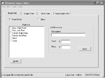
Anyone who has used a Windows PC before will pretty much know how to run this program. There are some exceptions, but they can be learned pretty quickly. For instance, look at the menu. It is pretty standard. Before I even click a menu item, I already know what the subchoices will be for the most common things. I know that loading and saving a database will be under the File menu. I also know this is where the Exit choice is.
The Tab control segregates the different categories of car parts in a logical manner. Radio buttons are kept at a minimum and are used as navigation tools in this case.
The screen is set up for maximum usability. I know just by looking at it that I will be able to check off some items in the list and click the Delete key to remove them. If the program is written well, I have a good idea that clicking the Apply button will make the new part immediately show up in the parts list. This is instant feedback.
Look at the status bar at the bottom of the screen. I know who is using the system, what file is being edited and, of course, the time and date.
Notice that the two buttons, Delete and Apply, have their first letters underlined. This means that I can press Alt-D to invoke the Delete key. I can press Alt-A to apply a new part to the database. These hot keys are very important to data entry screens. You will find that as a person uses a program often, he or she will try to find the fastest way to use it. If you help the user out with hot keys and other shortcuts, your program will be more successful.
By the way, what is the most common shortcut key in all the Windows programs ever made? The F1 key, of course. Users know this key will always bring up help. These days, it should bring up context-sensitive help. More on this subject later.
OK, I showed you a pretty good data input screen in the previous section. Now for a little contrast.
I have worked with a number of programs that are rather bizarre to use. I have seen data that should be connected spread all out over several different tabs. I have seen incomprehensible menu systems. I have seen all kinds of strange things that make me scratch my head and wonder, what were they thinking? I am sure you have as well.
Figures 2-2, 2-3, and 2-4 show a mythical screen for an employee data record. Although the screen itself is not used in any program that I know of, it does represent the design of a screen for a program that I have actually worked with.[1]
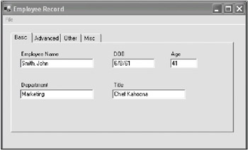
So let me first list the things that are wrong with this screen and this tab. First, the menu has only one top-level entry. This tells me that everything is bunched under one entry. In fact, here are the entries in the order in which they appear:
This is bad. This menu has entries that are in the wrong order, and it also has entries that do not belong under the File heading. The Load menu item actually loads a new employee screen for data input. This is not very intuitive at all.
In addition, the tabs are labeled incorrectly. The Basic and Advanced data tabs are OK, but the other two tabs, to me, mean the same thing. What is the difference between Other and Misc?
Next, the first tab, Basic, uses all TextBoxes for data entry fields. This is prone to error, especially when users enter the date. If a user enters a date in a plain old TextBox, you need quite a bit of validation code to make sure the entry is correct. Not only that, the dates must be shown according to the culture setting of the computer. In other words, the date shown here must read "8/6/61" in places other than the United States.
Now look at the Employee Name field. There is only one field for both first and last names. I have seen this method of entering names in several different programs. I can see all kinds of errors being introduced here. For instance, suppose a user enters the name Kenneth James? Which is the first name and which is the last name? It could be either.
The DOB and Age fields bring up something that I have seen before. Why ask for a birth date then ask for an age? Hello! This is a computer we are working with here. Just because Age is a field in the database does not mean a user has to enter an age manually if his or her birth date is known. Entering the age here is not only a waste of time, but it's also a drain on my older brain cells.
The Department and Title fields are OK here.[2]
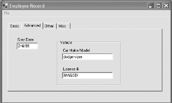
Figure 2-3 shows the next tab in this screen.
This tab is typical of a screen that I have worked with. Somehow this type of information is not "advanced" in my mind. Also note that a TextBox is again used for a date field.
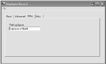
So how about the tabs, Other and Misc? Figure 2-4 shows an example of what I found in such a tab.
As you can see, the parking space for the employee is noted on a completely different tab than the rest of the car information.
You can tell from the design of this screen that some of these tabs were added at a later date to provide for extra fields. The person designing the software must have thought that keeping the existing screen layout was more important than keeping consistent data.
One last thing to note about this screen: Once you get past the first tab, you no longer have any idea which employee's data you are editing. Unnecessary flipping back and forth between screens is a very bad thing.
Now I have obviously left off quite a few of the data fields in these tabs for demonstration purposes. But think about this. If there were, say, 20 other fields per tab and the flow was as bad as these few data fields, how much time would it take to learn this program? How much frustration would it cause?
| Tip |
I once saw this quote about software programs: "Writing software is about relieving pain." I have no idea where the quote came from, but it always stuck with me. If you can relieve some of the pain of doing a task by using software, then that software is successful. If your software is painful to use, you have failed. |